# HarmonyOsDialog
**Repository Path**: 1059232202/HarmonyOsDialog
## Basic Information
- **Project Name**: HarmonyOsDialog
- **Description**: No description available
- **Primary Language**: TypeScript
- **License**: Not specified
- **Default Branch**: master
- **Homepage**: None
- **GVP Project**: No
## Statistics
- **Stars**: 0
- **Forks**: 0
- **Created**: 2024-09-29
- **Last Updated**: 2024-11-26
## Categories & Tags
**Categories**: Uncategorized
**Tags**: None
## README
## 介绍
HarmonyOsDialog是一个便捷的弹窗,**一行代码便可以搞定**,**无须初始化**,便在任何地方都可以弹出,Dialog中也封装了包含常见的弹窗样式,并且支持自定义组件形式。
目前功能项:
- 1、**支持自定义组件弹窗形式**
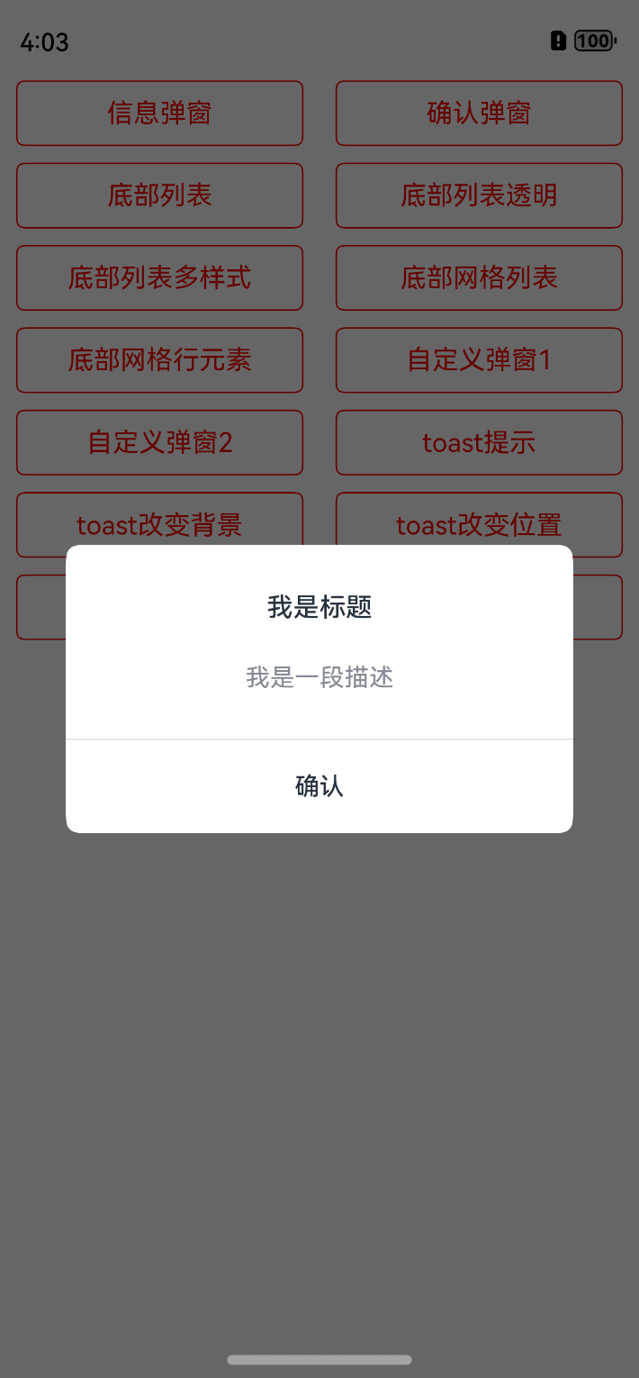
- 2、**支持信息弹窗样式**
- 3、**支持确认/取消弹窗样式**
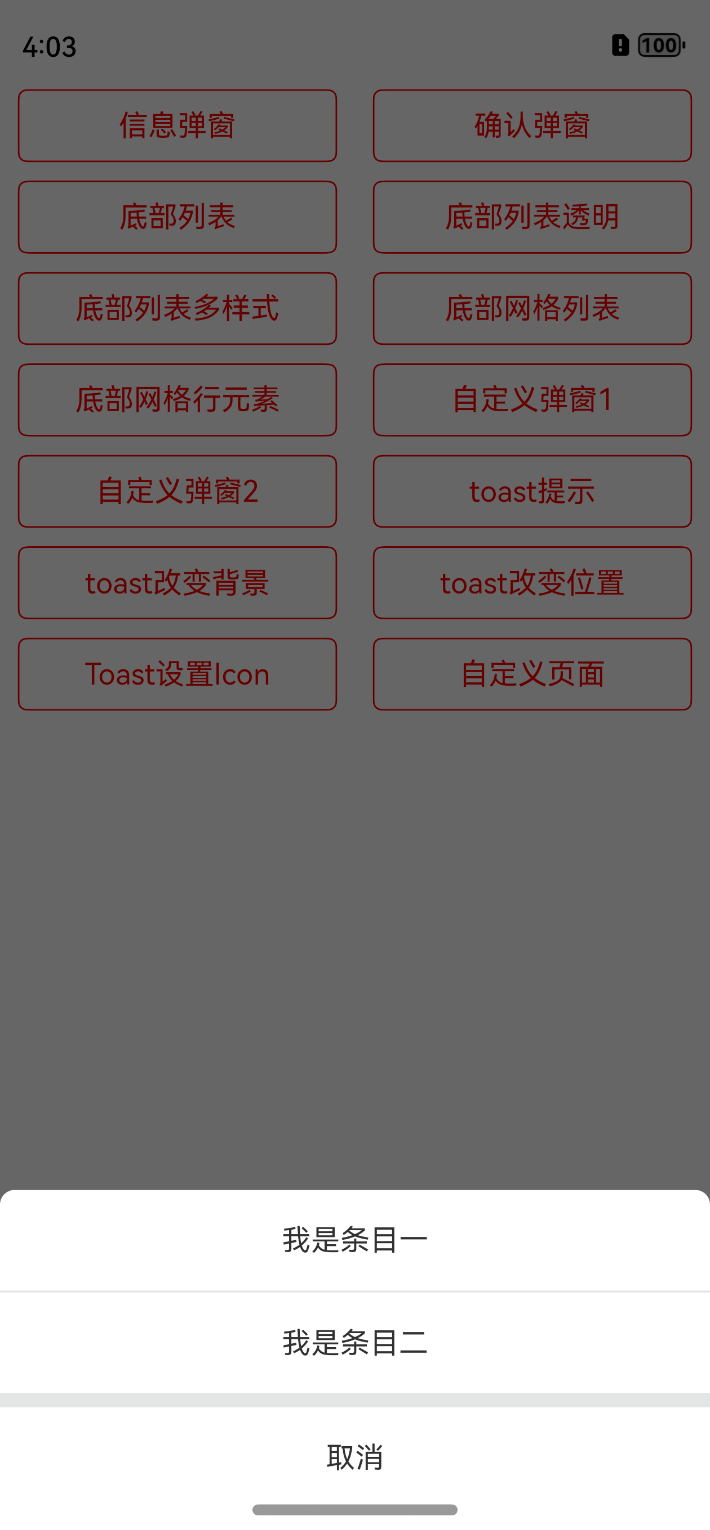
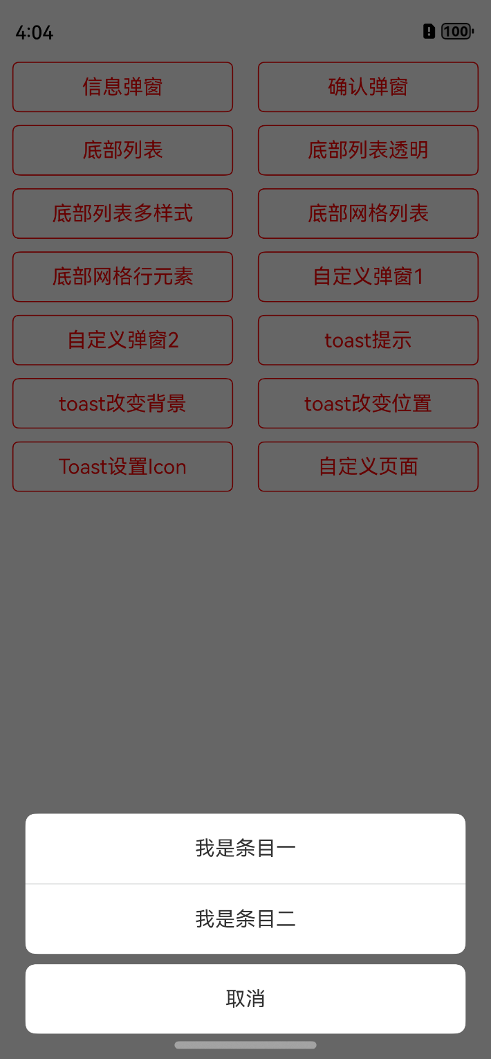
- 4、**支持底部列表弹窗(可动态修改样式)**
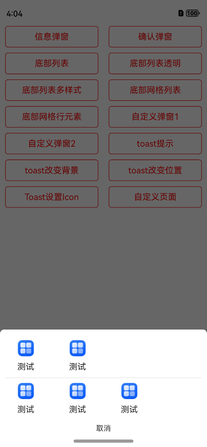
- 5、**支持底部网格列表形式(如常见的分享)**
- 6、**支持城市地址选择**
- 7、**支持各种时间格式选择**
- 8、**支持Toast提示,可任意修改属性,可设置图片,支持左上右下四个方位设置**
- 9、**支持任意位置弹出**
- 10、**支持PopupWindow弹出,可在组件的任何位置**
## 开发环境
DevEco Studio NEXT Developer Beta1,Build Version: 5.0.3.706
Api版本:**11**
modelVersion:5.0.0
## 效果
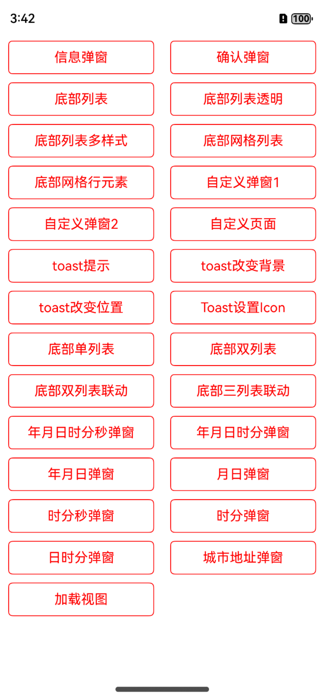


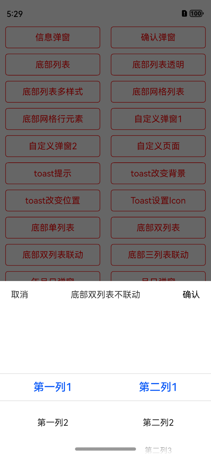
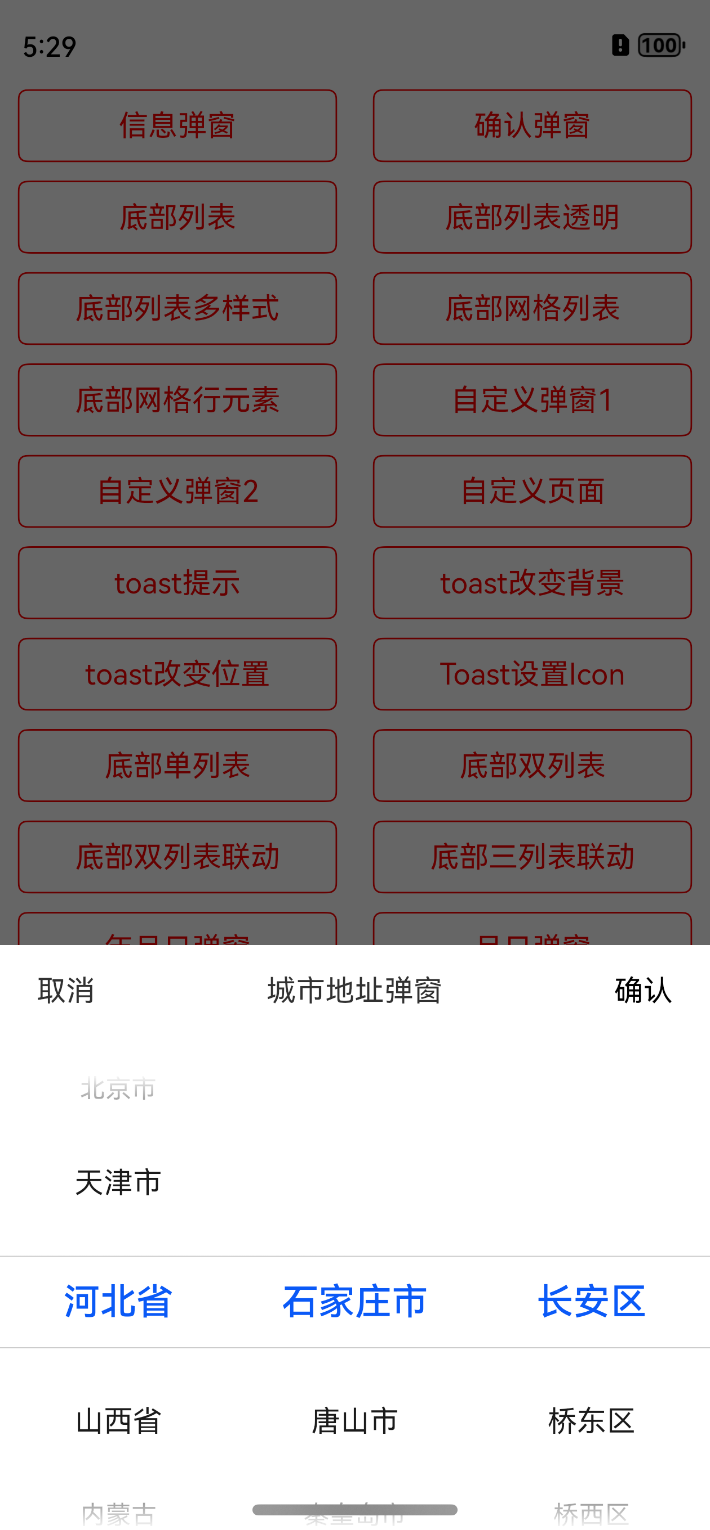
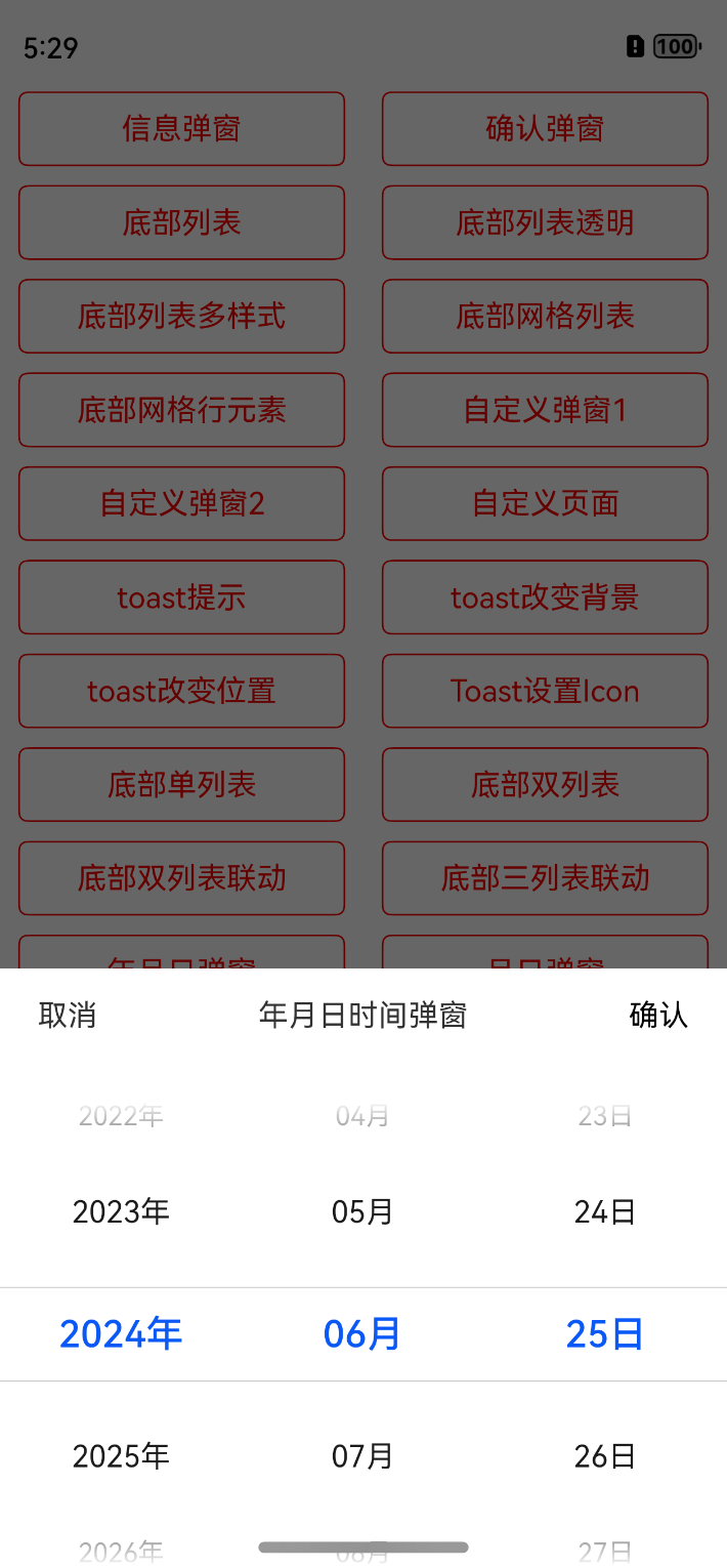
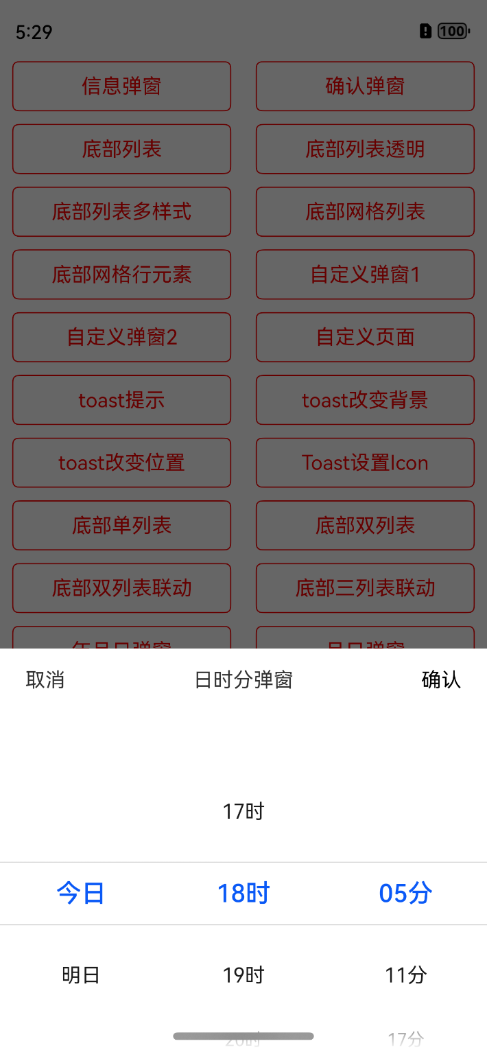
## 动态效果
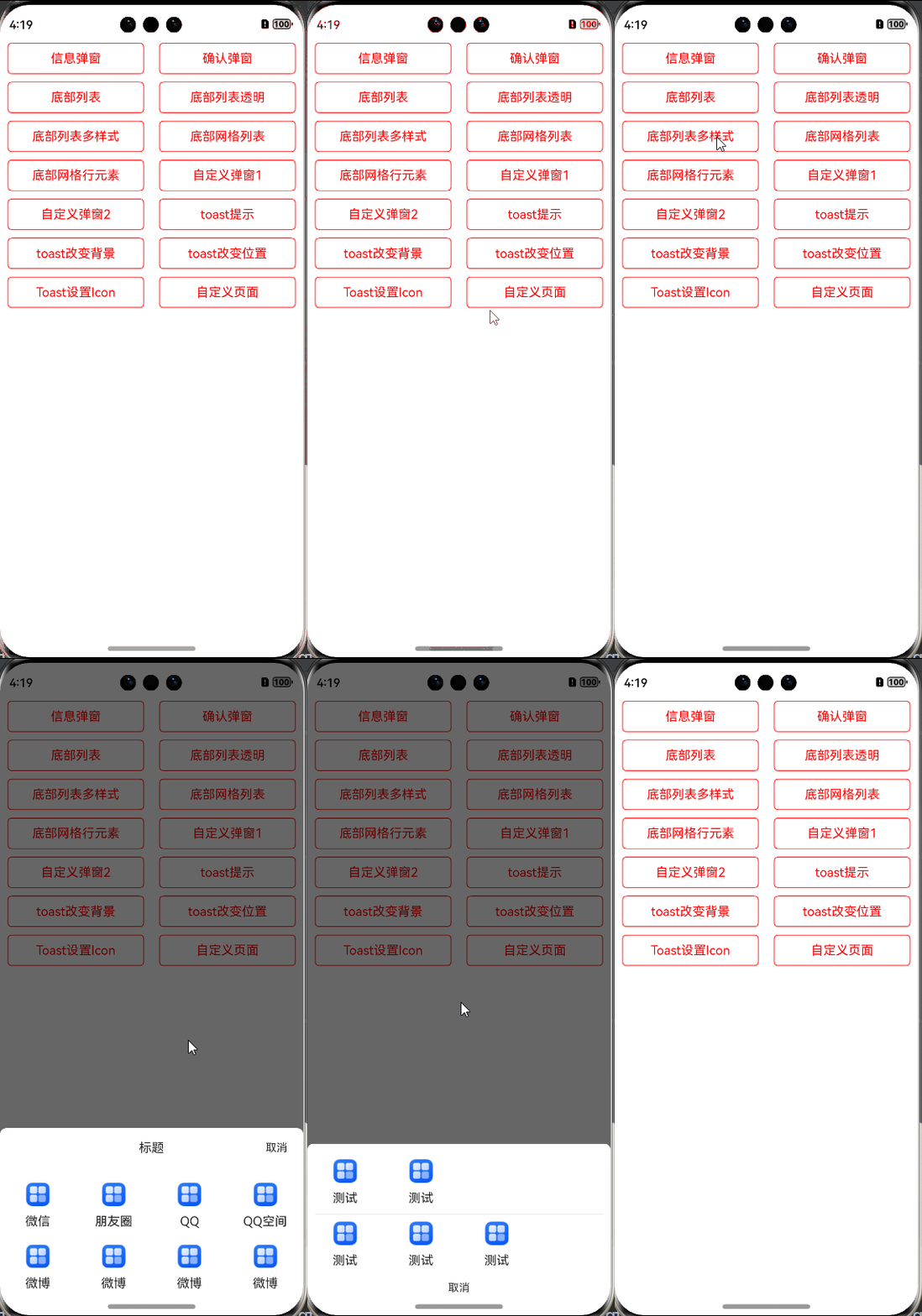
## 快速使用
有多种使用方式,比如远程依赖、本地静态共享包依赖,源码方式依赖,推荐使用**远程依赖**,方便快捷,有最新修改可以及时生效。
### 1、远程依赖方式使用【推荐】
方式一:在Terminal窗口中,执行如下命令安装三方包,DevEco Studio会自动在工程的oh-package.json5中自动添加三方包依赖。
**建议:在使用的模块路径下进行执行命令。**
```
ohpm install @abner/dialog
```
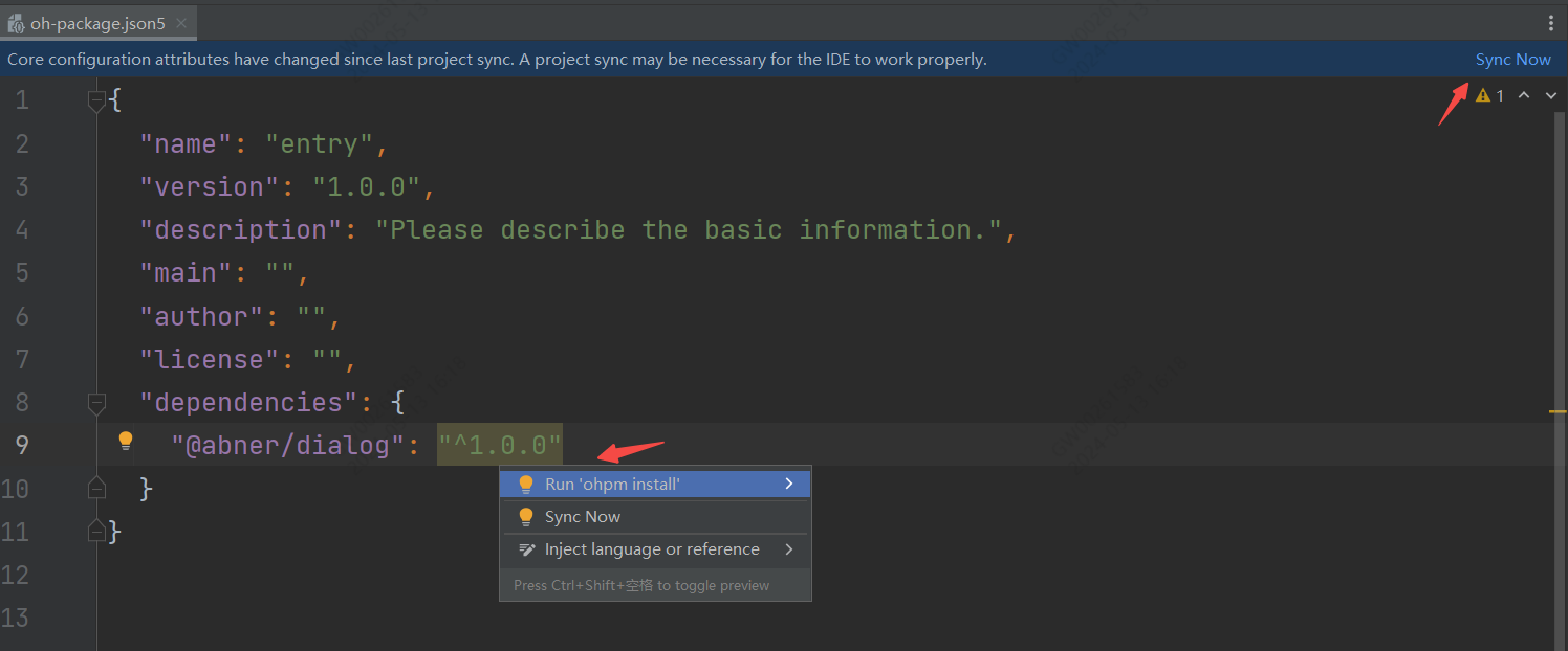
方式二:在工程的oh-package.json5中设置三方包依赖,配置示例如下:
```
"dependencies": { "@abner/dialog": "^1.0.7"}
```
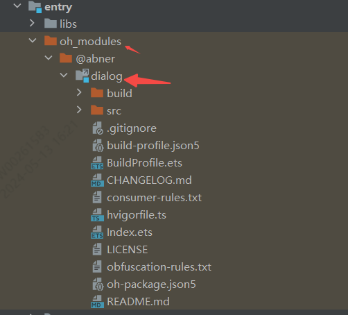
### 查看是否引用成功
无论使用哪种方式进行依赖,最终都会在使用的模块中,生成一个oh_modules文件,并创建源代码文件,有则成功,无则失败,如下:
## 代码使用
### 1、初始化
初始化可以更改统一的配置,比如宽高,比如大小、比如背景等等,当然是在需要的情况下,如果默认的样式满足需求,全局初始化可以省略,您也可以在单独调用的时候进行修改样式。
```typescript
initDialog(attribute)
```
**属性介绍**
| 属性 | 类型 | 概述 |
|-------------|--------------------|-----------------------------------------|
| attribute | FusionAttribute | 可选参数,dialog属性全局配置,用于修改弹窗样式,可根据UI在这里进行配置 |
#### FusionAttribute属性
FusionAttribute是全局的dialog属性配置,如果默认提供的dialog样式和您的项目中样式不一样,可通过此参数进行设置,全局配置一次
页面中的所有使用地方均会生效,方便您后续使用。
| 属性 | 类型 | 概述 |
|---------------------------|---------------------------|---------------------|
| infoOrConfirmAttribute | ContentAttribute | 可选参数,信息或者确认形式弹窗属性配置 |
| bottomListAttribute | BottomListAttribute | 可选参数,底部列表弹窗属性配置 |
| bottomGridAttribute | BottomGridAttribute | 可选参数,底部网格列表弹窗属性配置 |
| bottomListScrollAttribute | BottomListScrollAttribute | 可选参数,底部的滑动列表属性 |
| toastAttribute | ToastAttribute | 可选参数,Toast属性配置 |
| loadingAttribute | LoadingAttribute | 可选参数,loading提示 |
| isUseMainWindow | boolean | 是使用主window还是子window,默认是子 |
##### ContentAttribute属性
ContentAttribute是信息或者确认形式弹窗属性配置。
| 属性 | 类型 | 概述 |
|-------------------|-------------------------|----------------------|
| title | string / Resource | 可选参数,标题,全局初始化中无需配置 |
| message | string / Resource | 可选参数,描述信息,全局初始化中无需配置 |
| cancelText | string / Resource | 可选参数,取消文字 |
| confirmText | string / Resource | 可选参数,确认文字 |
| clickCancelHide | boolean | 可选参数,默认点击取消隐藏 |
| isHideTitle | boolean | 可选参数,是否隐藏标题,默认不隐藏 |
| clickCancel | 回调 | 可选参数,点击取消回调事件 |
| clickConfirm | 回调 | 可选参数,点击确认回调事件 |
| bottomMenuHeight | Length | 可选参数,底部按钮高度 |
| backgroundColor | ResourceColor | 可选参数,背景颜色 |
| radius | BorderRadiuses / Length | 可选参数,角度 |
| titleAttribute | TitleAttribute | 可选参数,标题样式属性 |
| messageAttribute | MessageAttribute | 可选参数,描述样式属性 |
| dividerHAttribute | DividerHAttribute | 可选参数,横向分割线样式属性 |
| dividerVAttribute | DividerVAttribute | 可选参数,垂直分割线样式属性 |
| confirmAttribute | ConfirmAttribute | 可选参数,确认样式属性 |
| cancelAttribute | CancelAttribute | 可选参数,取消样式属性 |
| dialogAttribute | DialogAttribute | 可选参数,弹窗总体属性 |
##### BottomListAttribute属性
BottomListAttribute是底部列表弹窗属性配置。
| 属性 | 类型 | 概述 |
|-----------------|-------------------------|-------------|
| backgroundColor | ResourceColor | 背景颜色 |
| items | string[] | 列表条目 |
| itemClick | (position: number) | 条目点击回调 |
| cancelClick | () | 取消点击回调 |
| isHideCancel | boolean | 是否隐藏取消按钮 |
| isTransparent | boolean | 是否透明展示 |
| itemRadius | Length / BorderRadiuses | 透明后条目整体的角度 |
| cancelRadius | Length / BorderRadiuses | 透明后取消按钮角度 |
| topLeftRadius | Length | dialog左上角角度 |
| topRightRadius | Length | dialog右上角角度 |
| itemAttr | BottomListItem | 条目属性 |
| itemDivider | ListItemDivider | 分割线属性 |
| cancelAttr | BottomListCancel | 底部取消属性 |
| dialogAttribute | DialogAttribute | 弹窗总体属性 |
##### BottomGridAttribute属性
| 属性 | 类型 | 概述 |
|-----------------------|-----------------------------|-----------------------------|
| items | BottomGridModel[] | 条目数据,用于网格 |
| itemLineArray | Array | 条目数据,用户每行展示几个,每行几个就几个数据 |
| columnSize | number | 列数,默认是2列 |
| barTitleAttr | BarTitleGridAttribute | 网格上边的titlebar属性 |
| barHeight | number | 网格上边的titleBar的高度 |
| barCancelTextAttr | BarCancelTextGridAttribute | titleBar中的取消属性 |
| barCancelImageAttr | BarCancelImageGridAttribute | titleBar中的取消图片属性,和文字二选一 |
| isBarCancelImage | boolean | titleBar中的取消是否图片方式,默认是false |
| itemMarginTop | number | item每一行距离顶部 |
| backgroundColor | ResourceColor | 背景颜色 |
| topLeftRadius | Length | dialog左上角角度 |
| topRightRadius | Length | dialog右上角角度 |
| isHideBar | boolean | 是否隐藏titlebar |
| dialogAttribute | DialogAttribute | 全局dialog属性 |
| isItemAttrGlobal | boolean | 条目属性是否使用全局,默认是 |
| itemAttr | ItemGridAttribute | 条目属性 |
| itemClick | (position: number) | 条目点击回调 |
| cancelClick | () | 取消点击回调 |
| dividerColor | ResourceColor | 分割线颜色 |
| dividerHeight | number | 分割线高度 |
| isLastDividerShow | boolean | 最后一个是否显示,默认展示 |
| dividerMarginTop | Margin / Length | 分割线距离上边高度 |
| isShowBottomCancel | boolean | 是否展示底部取消按钮,默认不展示 |
| bottomCancelTextAttr | CancelTextGridAttribute | 底部的取消按钮属性 |
##### ToastAttribute属性
| 属性 | 类型 | 概述 |
|-----------------|--------------------------------------------|----------------|
| msg | string / Resource | 提示信息,初始化时无需 |
| duration | number | 弹出时间,默认2000 |
| backgroundColor | ResourceColor | 背景颜色 |
| fontColor | ResourceColor | 字体颜色 ,默认ffffff |
| fontWeight | number / FontWeight / string | 字体粗细设置,默认400 |
| fontSize | number / string / Resource | 字体大小,默认16 |
| fontFamily | string / Resource | 字体样式 |
| borderRadius | Length / BorderRadiuses | 角度 |
| padding | Padding / Length | 内边距 |
| flexAlign | FlexAlign | 位置方向 |
| leftSrc | PixelMap / ResourceStr/ DrawableDescriptor | 左边图片 |
| rightSrc | PixelMap / ResourceStr/ DrawableDescriptor | 右边图片 |
| topSrc | PixelMap / ResourceStr/ DrawableDescriptor | 上边图片 |
| bottomSrc | PixelMap / ResourceStr/ DrawableDescriptor | 下边图片 |
| imageMargin | Length | 图片距离文字距离 |
| imageWidth | Length | 图片宽度 |
| imageHeight | Length | 图片高度 |
| imageAlt | string /Resource | 加载时显示的占位图 |
### 2、信息弹窗
```typescript
showDialogInfo({
title: "我是标题",
message: "我是一段描述",
clickConfirm: () => {
//确认
console.log("===确认")
}
})
```
### 3、确认/取消弹窗
```typescript
showDialogConfirm({
title: "我是一个标题",
message: "我是一段描述",
clickCancel: () => {
//取消
console.log("===取消")
},
clickConfirm: () => {
//确认
console.log("===确认")
}
})
```
### 3、底部列表
```typescript
showBottomListDialog({
items: ["我是条目一", "我是条目二"],
itemClick: (position: number) => {
hideDialog()
}
})
```
### 4、确认提示信息弹窗
```typescript
showDialogConfirm({
title: "我是一个标题",
message: "我是一段描述",
isShowInformation: true, //展示信息
informationAttribute: {
checkboxSelect: true, //是否默认选中
iconAttribute: {
srcSelect: $r("app.media.startIcon"), //选中
srcUnselected: $r("app.media.loading001"), //未选中
},
onChange: (isChange) => {
//点击改变了状态
console.log("===" + isChange)
}
},
clickCancel: () => {
//取消
console.log("===取消")
},
clickConfirm: () => {
//确认
console.log("===确认")
}
})
```
### 5、底部列表
```typescript
showDialogBottomList({
items: ["我是条目一", "我是条目二"],
itemClick: (position: number) => {
console.log("==========:" + position)
}
})
```
### 6、底部列表透明
```typescript
showDialogBottomList({
items: ["我是条目一", "我是条目二"],
itemClick: (position: number) => {
console.log("==========:" + position)
},
isTransparent: true,
dialogAttribute: {
dialogMarginLeft: 20,
dialogMarginRight: 20
}
})
```
### 7、底部列表多样式
```typescript
showDialogBottomList({
itemModels: [new BottomListModel("条目一", { fontColor: Color.Red }), new BottomListModel("条目二")],
itemClick: (position: number) => {
hide()
}
})
```
### 8、底部网格列表
```typescript
showDialogBottomGrid({
columnSize: 4,
items: [new BottomGridModel("微信", $r("app.media.app_icon")),
new BottomGridModel("朋友圈", $r("app.media.app_icon")),
new BottomGridModel("QQ", $r("app.media.app_icon")),
new BottomGridModel("QQ空间", $r("app.media.app_icon")),
new BottomGridModel("微博", $r("app.media.app_icon")),
new BottomGridModel("微博", $r("app.media.app_icon")),
new BottomGridModel("微博", $r("app.media.app_icon")),
new BottomGridModel("微博", $r("app.media.app_icon"))
],
itemClick: (position) => {
console.log("==============:" + position)
}
})
```
### 9、底部网格按行区分
```typescript
showDialogBottomGrid({
columnSize: 4,
isShowBottomCancel: true,
isHideBar: true,
itemLineArray: [
[new BottomGridModel("测试", $r("app.media.app_icon")),
new BottomGridModel("测试", $r("app.media.app_icon"))],
[new BottomGridModel("测试", $r("app.media.app_icon")),
new BottomGridModel("测试", $r("app.media.app_icon")),
new BottomGridModel("测试", $r("app.media.app_icon"))]
],
itemClick: (position) => {
console.log("==============" + position)
}
})
```
### 10、自定义组件弹窗
首先要自定义一个**全局组件**,可传入自定义的组件,或者直接写布局
```typescript
/*
* Author:AbnerMing
* Describe:自定义弹窗,布局自己定义
*/
@Builder
function BuilderDialog() {
Column() {
Text("我是一个自定义弹窗")
.margin({ top: 30 })
Row() {
Button("取消").onClick(() => {
//隐藏dialog
hide()
})
Button("确定")
.margin({ left: 30 })
}.margin({ top: 20 })
.margin({ top: 30 })
}.backgroundColor(Color.White)
.width("60%")
}
```
代码调用
```typescript
showDialog(wrapBuilder(BuilderDialog))
```
### 11、自定义组件弹窗带参数
首先要自定义一个**全局组件**,可传入自定义的组件,或者直接写布局
```typescript
class DialogParams {
title?: string
}
@Builder
function BuilderDialogParams(params: DialogParams) {
Column() {
Text(params.title)
.margin({ top: 30 })
Row() {
Button("取消").onClick(() => {
//隐藏dialog
hide()
})
Button("确定")
.margin({ left: 30 })
}.margin({ top: 20 })
.margin({ top: 30 })
}.backgroundColor(Color.White)
.width("60%")
}
```
代码调用
```typescript
let params = new DialogParams()
params.title = "我是传递的参数"
showDialogParams(wrapBuilder(BuilderDialogParams), params)
```
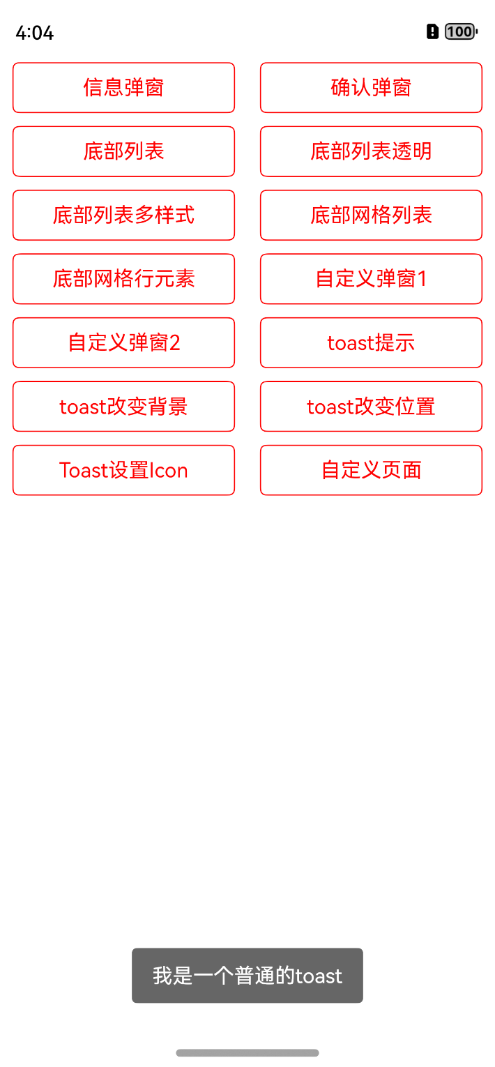
### 12、toast提示
```typescript
toast("我是一个普通的toast")
```
### 13、toast改变背景
```typescript
toast("我是一个改变背景的Toast", { backgroundColor: Color.Red })
```
### 14、toast改变位置
```typescript
toast("我是一个改变位置的Toast", { alignment: DialogAlignment.Center })
```
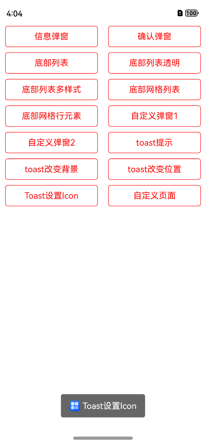
### 15、toast图片设置
```typescript
toast("Toast设置Icon", { leftSrc: $r("app.media.app_icon") })
```
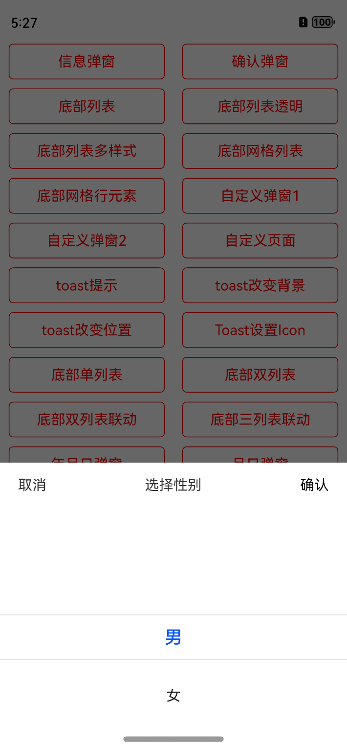
### 16、底部单列表
```typescript
showDialogBottomListScroll({
items: ["男", "女"],
titleBarAttribute: {
titleText: "选择性别"
},
confirmClick: (value, index) => {
console.log(value + "=========" + index)
}
})
```
### 17、底部双列表不联动
```typescript
showDialogBottomListScroll({
selected: [1, 2],
items: [["第一列1", "第一列2"], ["第二列1", "第二列2", "第二列3"]],
titleBarAttribute: {
titleText: "底部双列表不联动"
},
confirmClick: (value, index) => {
console.log(value + "=========" + index)
}
})
```
### 18、底部双列表联动
```typescript
showDialogBottomListScroll({
items: this.doubleList,
titleBarAttribute: {
titleText: "底部双列表联动"
},
confirmClick: (value, index) => {
console.log(value + "=========" + index)
}
})
```
### 19、底部三列表联动
```typescript
showDialogBottomListScroll({
items: this.thirdList,
titleBarAttribute: {
titleText: "底部三列表联动",
},
confirmClick: (value, index) => {
console.log(value + "=========" + index)
}
})
```
### 20、年月日时分秒时间弹窗
```typescript
showDialogTime({
titleBarAttribute: {
titleText: "年月日时分秒-弹窗",
},
timeAttribute: {
timeType: TimeDialogType.YMDHMS,
},
timeConfirmClick: (date) => {
//时间回调
console.log("===时间结果:" + date)
},
confirmClick: (value, index) => {
//内容和索引回调
console.log("===内容结果:" + value + "===索引结果:" + index)
}
})
```
### 21、年月日时分弹窗
```typescript
showDialogTime({
titleBarAttribute: {
titleText: "年月日时分-弹窗",
},
timeAttribute: {
timeType: TimeDialogType.YMDHM
},
timeConfirmClick: (date) => {
//时间回调
console.log("===时间结果:" + date)
},
confirmClick: (value, index) => {
//内容和索引回调
console.log("===内容结果:" + value + "===索引结果:" + index)
}
})
```
### 22、年月日弹窗
```typescript
showDialogTime({
titleBarAttribute: {
titleText: "年月日-弹窗",
},
timeAttribute: {
startTime: "2022-6-12",
endTime: "2025-8-20",
},
timeConfirmClick: (date) => {
//时间回调
},
confirmClick: (value, index) => {
//内容和索引回调
}
})
```
### 23、月日弹窗
```typescript
showDialogTime({
titleBarAttribute: {
titleText: "月日-弹窗",
},
timeAttribute: {
timeType: TimeDialogType.MD
},
timeConfirmClick: (date) => {
//时间回调
},
confirmClick: (value, index) => {
//内容和索引回调
}
})
```
### 24、时分秒弹窗
```typescript
showDialogTime({
titleBarAttribute: {
titleText: "时分秒-弹窗",
},
timeAttribute: {
timeType: TimeDialogType.HMS,
},
timeConfirmClick: (date) => {
//时间回调
},
confirmClick: (value, index) => {
//内容和索引回调
}
})
```
### 25、城市地址弹窗
```typescript
showDialogAddress({
titleBarAttribute: {
titleText: "城市地址弹窗",
},
confirmClick: (value, index) => {
}
})
```
### 26、PopupWindow弹出
首先要定义弹出的组件,自定义即可,支持自定义组件形式,传入即可
```typescript
/**
* AUTHOR:AbnerMing
* INTRODUCE:popup 弹出框,可以自定义,任意组件
* */
@Builder
function BuilderWindowView() {
Text("我是任意的组件")
.backgroundColor(Color.Pink)
}
```
#### 任意位置
```typescript
showPopupWindow({
view: wrapBuilder(BuilderWindowView),
x: 60,
y: 300
})
```
#### 上边
```typescript
showPopupWindow({
id: "popupTop",//要弹出的组件id,也就是你要在哪一个组件进行弹出
view: wrapBuilder(BuilderWindowView)
})
```
#### 下边
```typescript
showPopupWindow({
id: "popupBottom",//要弹出的组件id,也就是你要在哪一个组件进行弹出
view: wrapBuilder(BuilderWindowView),
direction: PopupDirection.BOTTOM
})
```
#### 左边
```typescript
showPopupWindow({
id: "popupLeft",
view: wrapBuilder(BuilderWindowView),
direction: PopupDirection.LEFT
})
```
#### 右边
```typescript
showPopupWindow({
id: "popupRight",
view: wrapBuilder(BuilderWindowView),
direction: PopupDirection.RIGHT
})
```
#### 左上
```typescript
showPopupWindow({
id: "popupTopLeft",
view: wrapBuilder(BuilderWindowView),
direction: PopupDirection.TOP_LEFT
})
```
#### 右上
```typescript
showPopupWindow({
id: "popupTopRight",
view: wrapBuilder(BuilderWindowView),
direction: PopupDirection.TOP_RIGHT
})
```
#### 左下
```typescript
showPopupWindow({
id: "popupBottomLeft",
view: wrapBuilder(BuilderWindowView),
direction: PopupDirection.BOTTOM_LEFT
})
```
#### 右下
```typescript
showPopupWindow({
id: "popupBottomRight",
view: wrapBuilder(BuilderWindowView),
direction: PopupDirection.BOTTOM_RIGHT
})
```
#### 携带参数
```typescript
class WindowParams {
title?: string
}
@Builder
function BuilderWindowParams(params: WindowParams) {
Text(params.title)
.backgroundColor(Color.Pink)
}
//代码调用
let params = new WindowParams()
params.title = "我是携带的参数"
showPopupWindow({
id: "popupParams",
params: params,
viewParams: wrapBuilder(BuilderWindowParams),
direction: PopupDirection.BOTTOM
})
```
## 更多案例
可以查看相关Demo。
## 关注公众号
鸿蒙先驱者,只分享精华的鸿蒙或者移动端技术文章,可微信扫码关注

[鸿蒙精华技术文章列表](https://juejin.cn/column/7269566781248389178)
## 一对一指导【收费】
每个人的时间都是宝贵的,做为开发者的我,已经做到了技术上的免费开源,但仍然有很多问题无法做到及时处理。
也考虑到,鸿蒙是一个新的系统,大家在使用上会遇到各种各样的问题,也为了能够及时的解决及回复问题,大家可以付费进行一对一指导。
### 开源库使用指导

**重要信息:一定要在付款时备注您的微信号,我会主动加您!切记!切记!!切记!!!**
**诚信经营,来自一个北漂的老程序员心声!**
**一杯饮料的钱,您可以获取权益如下**
- 1、针对dialog库使用1对1辅导使用,并跟踪相关问题排查。
- 2、针对我的所有鸿蒙开源库,1对1辅导使用,并跟踪相关问题排查。
- 3、涉及到我的开源库,您提的业务需求,率先第一时间满足,并及时针对性开发。
- 4、未来我的鸿蒙开源库,可先遣体验。
- 5、鸿蒙脚手架,正在研发中,可首批次体验使用。
## License
```
Copyright (C) AbnerMing, HarmonyOsDialog Open Source Project
Licensed under the Apache License, Version 2.0 (the "License");
you may not use this file except in compliance with the License.
You may obtain a copy of the License at
http://www.apache.org/licenses/LICENSE-2.0
Unless required by applicable law or agreed to in writing, software
distributed under the License is distributed on an "AS IS" BASIS,
WITHOUT WARRANTIES OR CONDITIONS OF ANY KIND, either express or implied.
See the License for the specific language governing permissions and
limitations under the License.
```