# react-native-swiper-r
**Repository Path**: Agrement/react-native-swiper-r
## Basic Information
- **Project Name**: react-native-swiper-r
- **Description**: 一个简单的react-native轮播
- **Primary Language**: Unknown
- **License**: MIT
- **Default Branch**: master
- **Homepage**: None
- **GVP Project**: No
## Statistics
- **Stars**: 3
- **Forks**: 0
- **Created**: 2021-04-19
- **Last Updated**: 2023-01-30
## Categories & Tags
**Categories**: Uncategorized
**Tags**: None
## README
# react-native-swiper-r 🥝
一个基于用于 react-native 的轮播组件,参考[react-native-ezswiper]([easyui/react-native-ezswiper: swiper component for react-native (github.com)](https://github.com/easyui/react-native-ezswiper)) 的概念,并改用 hook 重写,修复闪屏问题。动画方面做了点改进,但是仍有问题,欢迎 issues。不过目前只写了`ts` 的版本,后续会加入`js`, `仅用于学习交流喔~`
## Api 🍡
| 参数 | 说明 | 类型 | 默认值 |
| --------------- | :-------------------------- | ------------------------------------------------------- | ---------------------------------------- |
| autoplay | 是否自动切换 | boolean | true |
| cardSetting | 卡片设置,详见下图 | {cardSide:number;cardSpace:number;cardSmallSide:number} | {cardSide:0,cardSpace:0;cardSmallSide:0} |
| mode | normal 和 cardSide,详见下图 | 'normal' \|'cardSide' | 'normal' |
| interval | 轮播间隔 | number | 2000 |
| isShowIndicator | 是否显示指示器 | boolean | true |
#### cardSetting 参数说明
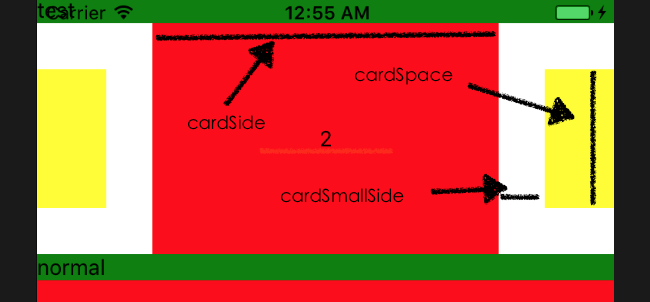
mode 模式分为"normal"和"CardSide",normal 下默认平铺,以下是演示
#### "normal"模式

###### 演示代码
```typescript
...
const App = () => {
return (
// eslint-disable-next-line react-native/no-inline-styles
1
2
3
4
);
};
...
```
#### "cardSide"模式

###### 演示代码
```typescript
const App = () => {
return (
// eslint-disable-next-line react-native/no-inline-styles
1
2
3
4
);
};
```
接下来要做的
- [x] 添加滚动指示器(暂不支持自定义)
- [ ] 考虑加入竖向滚动
## 开源协议 🥟
MIT