# react-native-search-list
**Repository Path**: UnPourTous/react-native-search-list
## Basic Information
- **Project Name**: react-native-search-list
- **Description**: A searchable ListView which supports Chinese PinYin and alphabetical index.
- **Primary Language**: JavaScript
- **License**: Not specified
- **Default Branch**: master
- **Homepage**: None
- **GVP Project**: No
## Statistics
- **Stars**: 0
- **Forks**: 0
- **Created**: 2020-02-13
- **Last Updated**: 2024-12-13
## Categories & Tags
**Categories**: Uncategorized
**Tags**: None
## README
# A searchable ListView which supports Chinese PinYin and alphabetical index.
[](https://badge.fury.io/js/%40unpourtous%2Freact-native-search-list)
[](https://app.fossa.io/projects/git%2Bgithub.com%2FUnPourTous%2Freact-native-search-list?ref=badge_shield)
 [](https://github.com/ellerbrock/open-source-badge/)
### React Native Search List
A searchable ListView which supports Chinese PinYin and alphabetical index.
[](https://github.com/ellerbrock/open-source-badge/)
### React Native Search List
A searchable ListView which supports Chinese PinYin and alphabetical index.
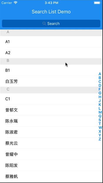
The following pic may be helpful when understanding the structure and APIs:

## Installation
`$ npm install @unpourtous/react-native-search-list --save`
## Usage
To Use SearchList, need a array of object as data source,and each object has searchStr property, eample code are put in `./entry.js`.
```js
export default class example extends Component {
constructor (props) {
super(props)
this.state = {
dataSource: demoList
}
}
// custom render row
renderRow (item, sectionID, rowID, highlightRowFunc, isSearching) {
return (
{
Alert.alert('Clicked!', `sectionID: ${sectionID}; item: ${item.searchStr}`,
[
{text: 'OK', onPress: () => console.log('OK Pressed')},
],
{cancelable: true})
}}>
{/*use `HighlightableText` to highlight the search result*/}
)
}
// render empty view when datasource is empty
renderEmpty () {
return (
No Content
)
}
// render empty result view when search result is empty
renderEmptyResult (searchStr) {
return (
No Result For {searchStr}
Please search again
)
}
render () {
return (
null}
renderEmpty={this.renderEmpty.bind(this)}
rowHeight={rowHeight}
toolbarBackgroundColor={'#2196f3'}
title='Search List Demo'
cancelTitle='取消'
onClickBack={() => {}}
searchListBackgroundColor={'#2196f3'}
searchBarToggleDuration={300}
searchInputBackgroundColor={'#0069c0'}
searchInputBackgroundColorActive={'#6ec6ff'}
searchInputPlaceholderColor={'#FFF'}
searchInputTextColor={'#FFF'}
searchInputTextColorActive={'#000'}
searchInputPlaceholder='Search'
sectionIndexTextColor={'#6ec6ff'}
searchBarBackgroundColor={'#2196f3'}
/>
)
}
}
```
## APIs
prop name | type | description | default value
--- | --- | --- | ---
data | array | The rows of list view.each object should contain `searchStr`, it will be used for search source. If you have custom row id,you should set `searchKey` for each object. |
renderRow | number | Render your custom row content. |
rowHeight | number | The height of the default row content, it will be used for scroll calculate. | `40`
sectionHeaderHeight | number | The height of section header content. | `24`
searchListBackgroundColor | string | BackgroundColor for searchList. | `#171a23`
toolbarBackgroundColor | string | Toolbar background color. | `#171a23`
searchBarToggleDuration | number | Custom search bar animation duration. | `300`
searchBarBackgroundColor | string | Custom search bar background color. | `#171a23`
searchInputBackgroundColor | string | Custom search input default state background color. |
searchInputBackgroundColorActive | string | Custom search input searching state background color. |
searchInputPlaceholder | string | Custom search input placeholder text. |
searchInputPlaceholderColor | string | Custom search input placeholder text color. |
searchInputTextColor | string | Custom search input default state text color. |
searchInputTextColorActive | string | Custom search input searching state text color. |
searchBarBackgroundColor | string | Custom search bar background color. |
title | string | Toolbar title. |
titleTextColor | string | Toolbar title text color. |
cancelTextColor | string | Search bar cancel text color. |
cancelTitle | string | Search bar cancel text color. |
sectionIndexTextColor | string | Section index text color. |
hideSectionList | bool | Whether to hide the alphabetical section listing view or not. |
renderSectionIndexItem | func | Custom render SectionIndexItem. |
sortFunc | func | The sort function for the list view data source,sorting alphabetical by default |
resultSortFunc | func | The sort function for the search result,sorting first match position by default |
onScrollToSection | func | The callback of alphabetical section view be clicked or touch. |
renderBackButton | func | Render a custom back buttom on Toolbar. |
renderEmpty | func | Render a view when data is empty. |
renderEmptyResult | func | Render a view when search result is empty. |
renderSeparator | func | Render row separator. |
renderSectionHeader | func | `renderSectionHeader` for the internal ListView |
renderHeader | func | `renderHeader` for the internal ListView |
renderFooter | func | `renderFooter` for the internal ListView |
renderRow | func | `renderRow` for the internal ListView |
onSearchStart | func | Callback when searching start. |
onSearchEnd | func | Callback when searching end. |
## Thanks
* [js-pinyin](https://github.com/waterchestnut/pinyin)
* [md5](https://github.com/pvorb/node-md5)
* [react-native-selectablesectionlistview](https://github.com/johanneslumpe/react-native-selectablesectionlistview)
## TODO
1. ~~add hightlight demo~~
1. ~~test ios & android & android with status bar and without~~
## License
This library is distributed under MIT Licence.