 *An instantly ready, full-featured alerts for development on any platform with flutter. Enabling you to complete projects and deploy quickly. With **QuickAlert**, you can display animated alert dialogs such as success, error, warning, confirm, loading or even a custom dialog.*
## Key Features 🔮
**Easy To Use**
> The alerts are very flexible and can be customized very easily. In QuickAlert, the QuickAlert.show() triggers the alert, which informs the user about the situations that need acknowledgment.
**Predefined Beautiful Alert Styles**
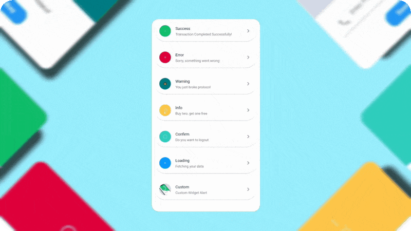
> Make use of the predefined alerts are very beautiful and can also be customized very easily. In QuickAlert there are 6 different types of alerts, they are Success, Error, Warning, Info, Confirm & Loading.
**Predefined Title & Actions**
> In QuickAlert all the 6 different types of alerts have predefined title & actions matching the alert type.
**Super Customizable**
> Build your custom alert with power of QuickAlert using the flutter widgets.
**Change Animation**
> Set your favorite animation by choosing from scale, rotate, slideInDown, slideInUp, slideInLeft, slideInRight.
**Set Auto close**
> Auto close the alert by setting auto close duration.
**Set Overlay Tap to Dismiss**
> Control the alert's Barrier Dismissible Property by setting barrierDismissible to true or false.
**And Many More...**
*An instantly ready, full-featured alerts for development on any platform with flutter. Enabling you to complete projects and deploy quickly. With **QuickAlert**, you can display animated alert dialogs such as success, error, warning, confirm, loading or even a custom dialog.*
## Key Features 🔮
**Easy To Use**
> The alerts are very flexible and can be customized very easily. In QuickAlert, the QuickAlert.show() triggers the alert, which informs the user about the situations that need acknowledgment.
**Predefined Beautiful Alert Styles**
> Make use of the predefined alerts are very beautiful and can also be customized very easily. In QuickAlert there are 6 different types of alerts, they are Success, Error, Warning, Info, Confirm & Loading.
**Predefined Title & Actions**
> In QuickAlert all the 6 different types of alerts have predefined title & actions matching the alert type.
**Super Customizable**
> Build your custom alert with power of QuickAlert using the flutter widgets.
**Change Animation**
> Set your favorite animation by choosing from scale, rotate, slideInDown, slideInUp, slideInLeft, slideInRight.
**Set Auto close**
> Auto close the alert by setting auto close duration.
**Set Overlay Tap to Dismiss**
> Control the alert's Barrier Dismissible Property by setting barrierDismissible to true or false.
**And Many More...**
QuickAlert.show() and define the type of alert.
```dart
QuickAlert.show(
context: context,
type: QuickAlertType.success,
); // That's it to display an alert, use other properties to customize.
```
## Examples ⚡
There is a detailed example project in the example folder. You can directly run and play on it. There are code snippets from example project below.
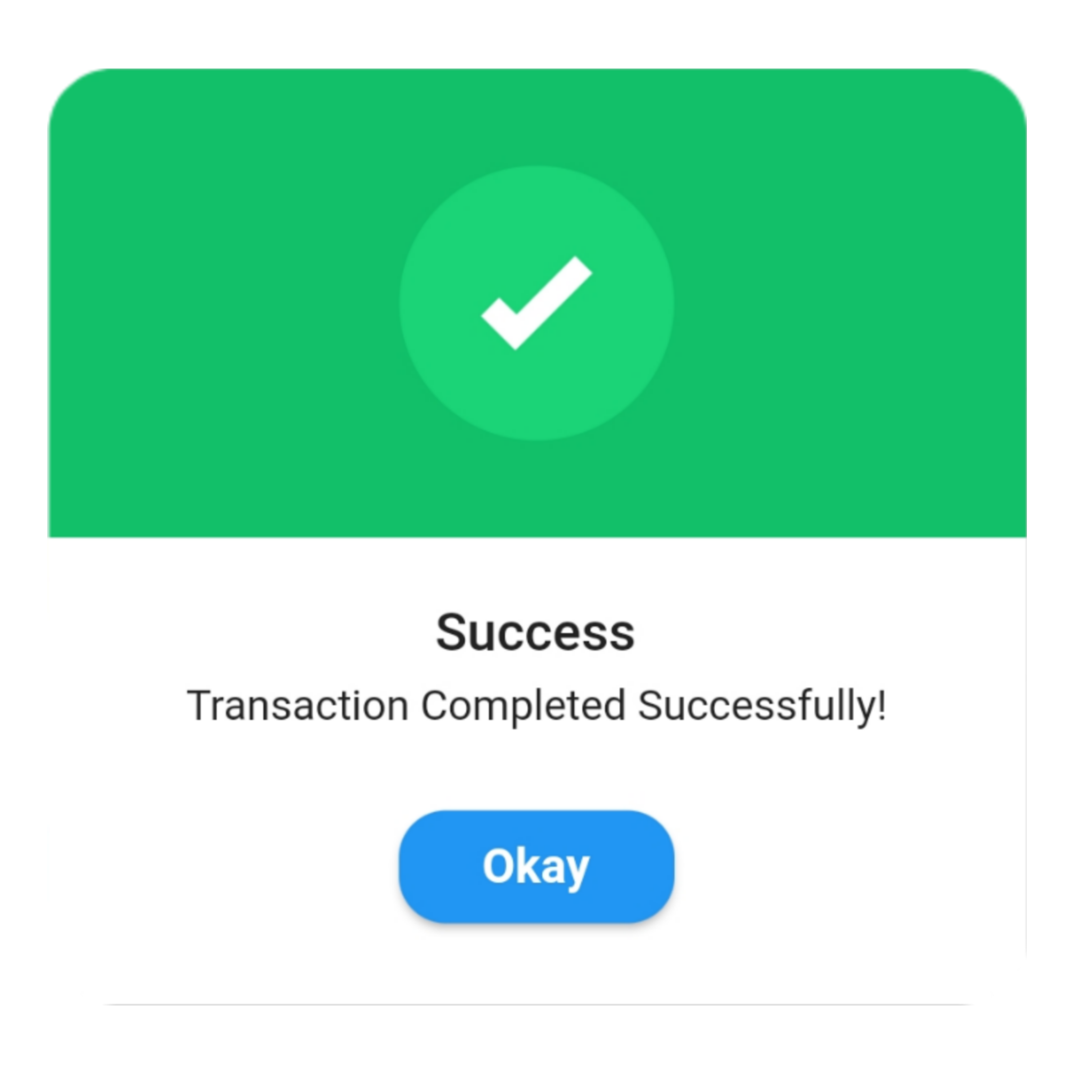
> ### Success
```dart
QuickAlert.show(
context: context,
type: QuickAlertType.success,
text: 'Transaction Completed Successfully!',
);
```
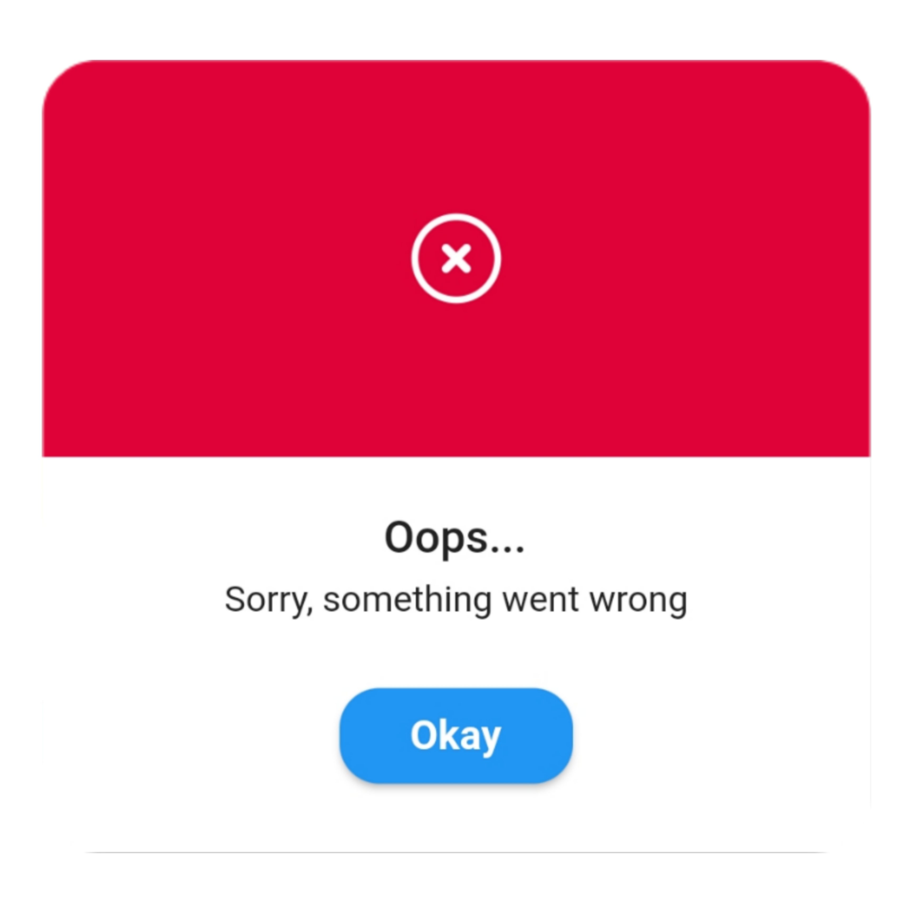
> ### Error ```dart QuickAlert.show( context: context, type: QuickAlertType.error, title: 'Oops...', text: 'Sorry, something went wrong', ); ```
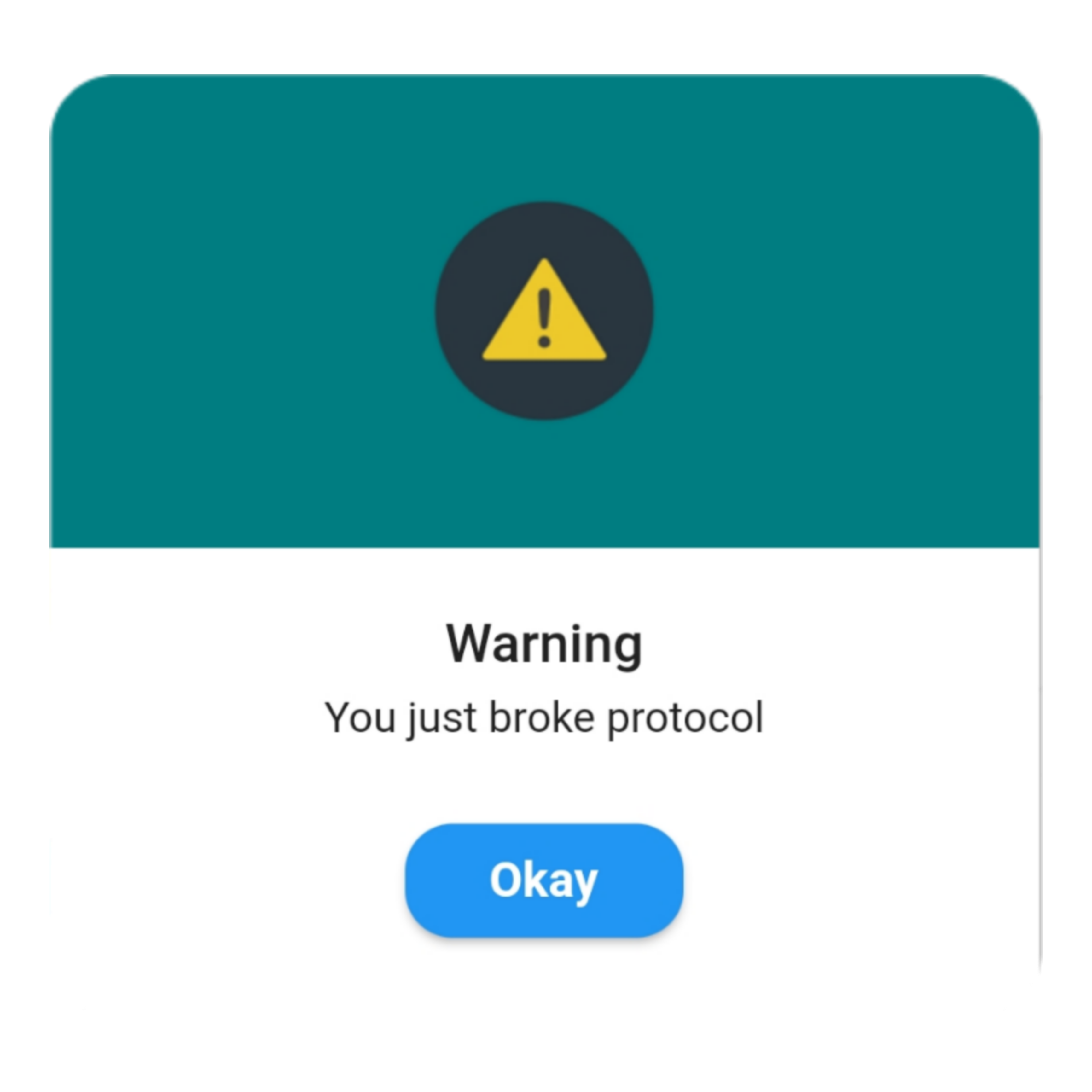
> ### Warning ```dart QuickAlert.show( context: context, type: QuickAlertType.warning, text: 'You just broke protocol', ); ```
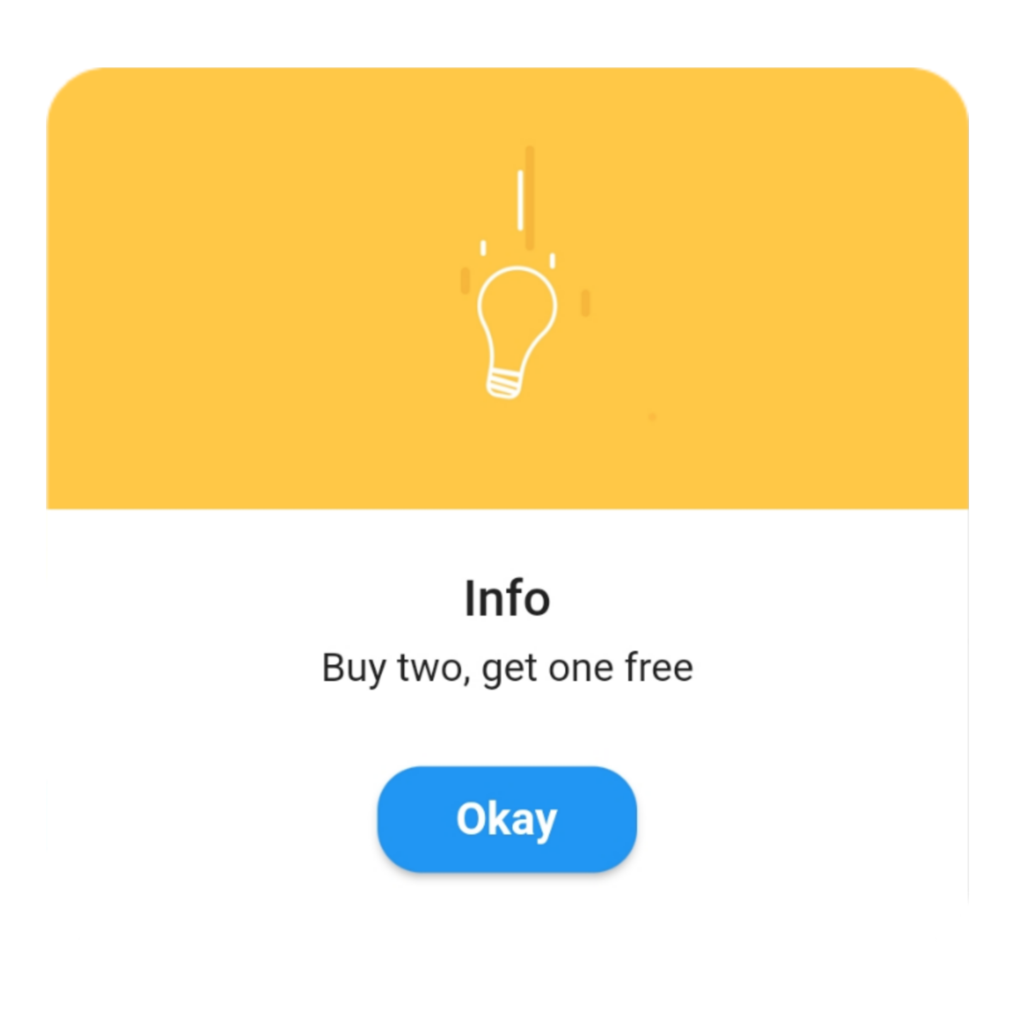
> ### Info ```dart QuickAlert.show( context: context, type: QuickAlertType.info, text: 'Buy two, get one free', ); ```
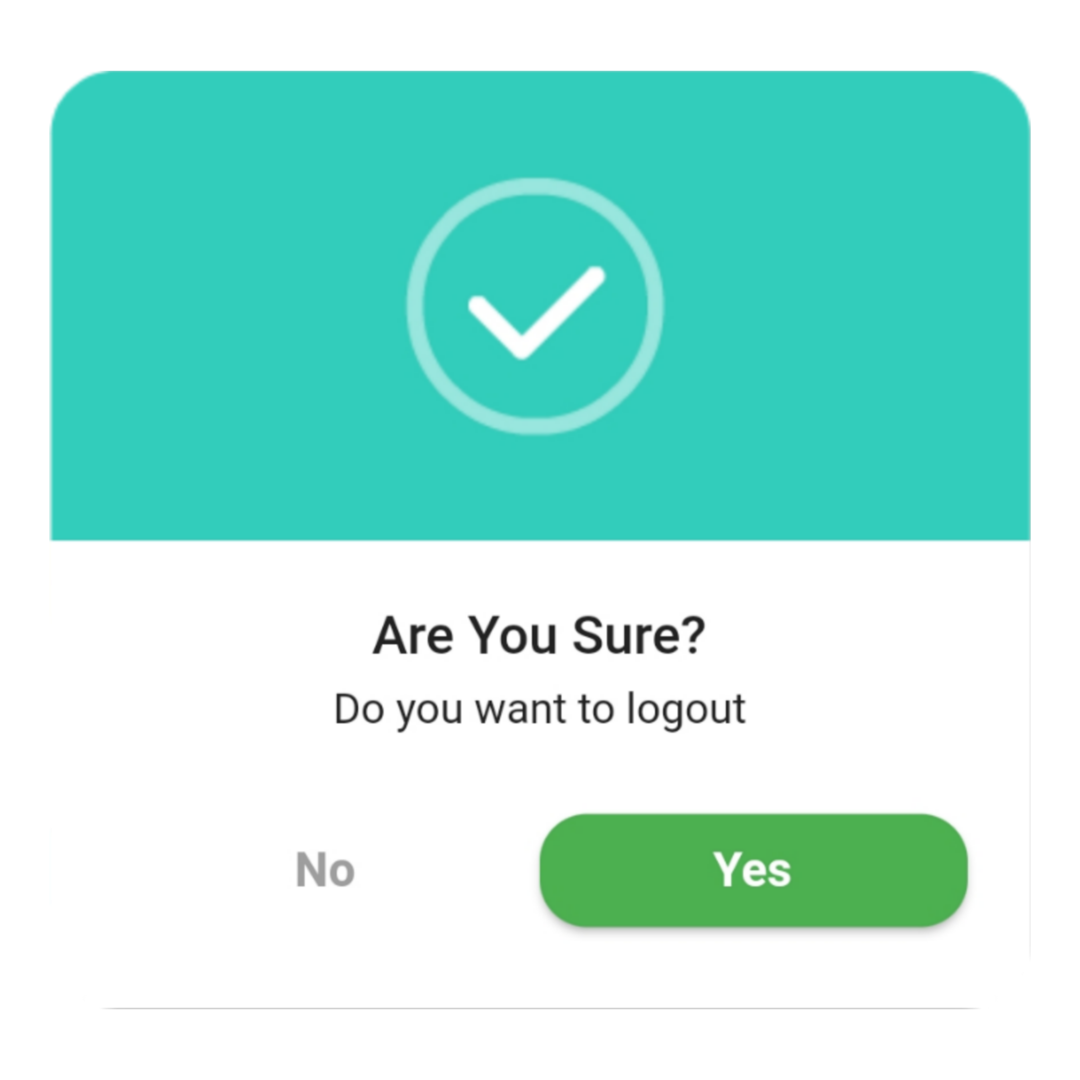
> ### Confirm ```dart QuickAlert.show( context: context, type: QuickAlertType.confirm, text: 'Do you want to logout', confirmBtnText: 'Yes', cancelBtnText: 'No', confirmBtnColor: Colors.green, ); ```
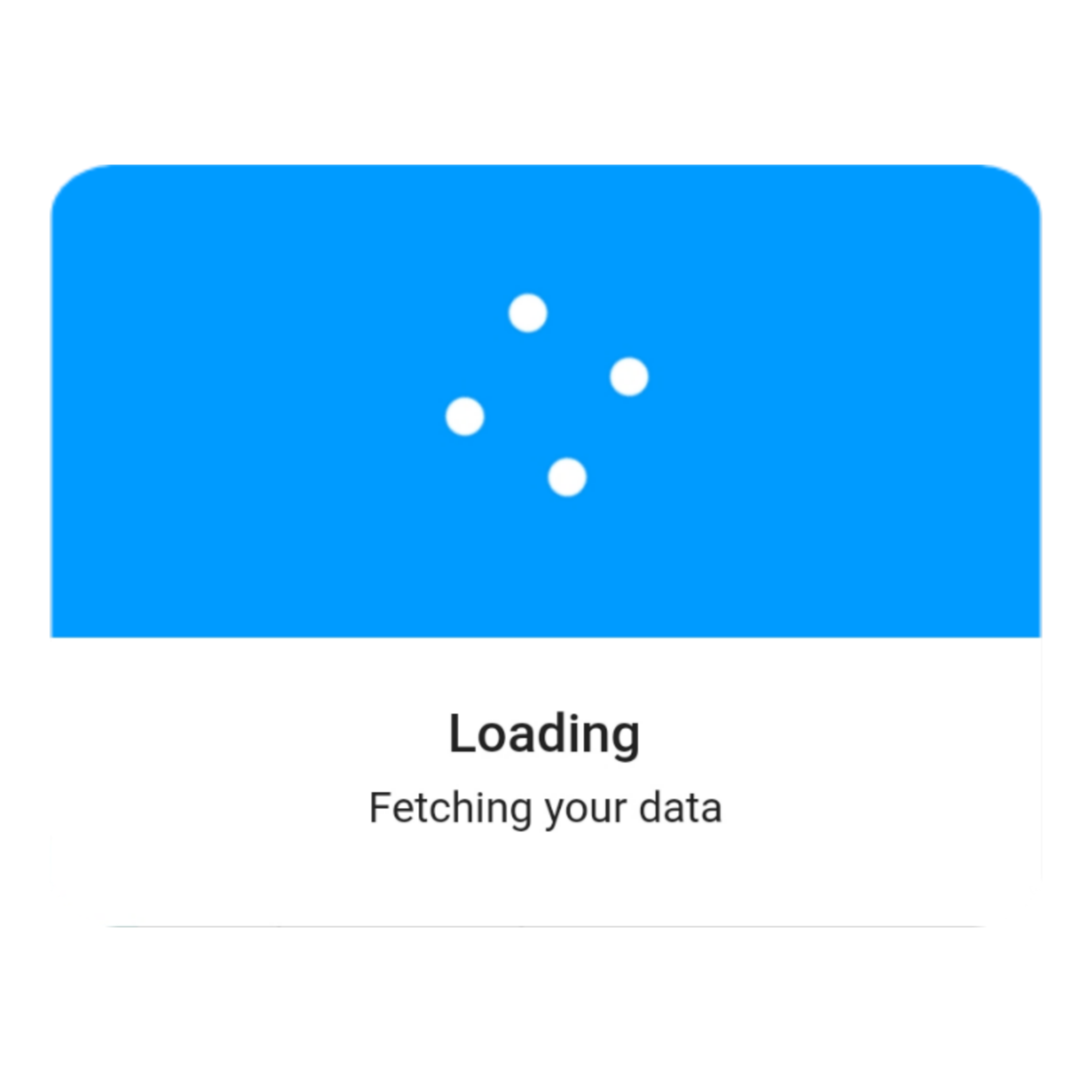
> ### Loading ```dart QuickAlert.show( context: context, type: QuickAlertType.loading, title: 'Loading', text: 'Fetching your data', ); ```
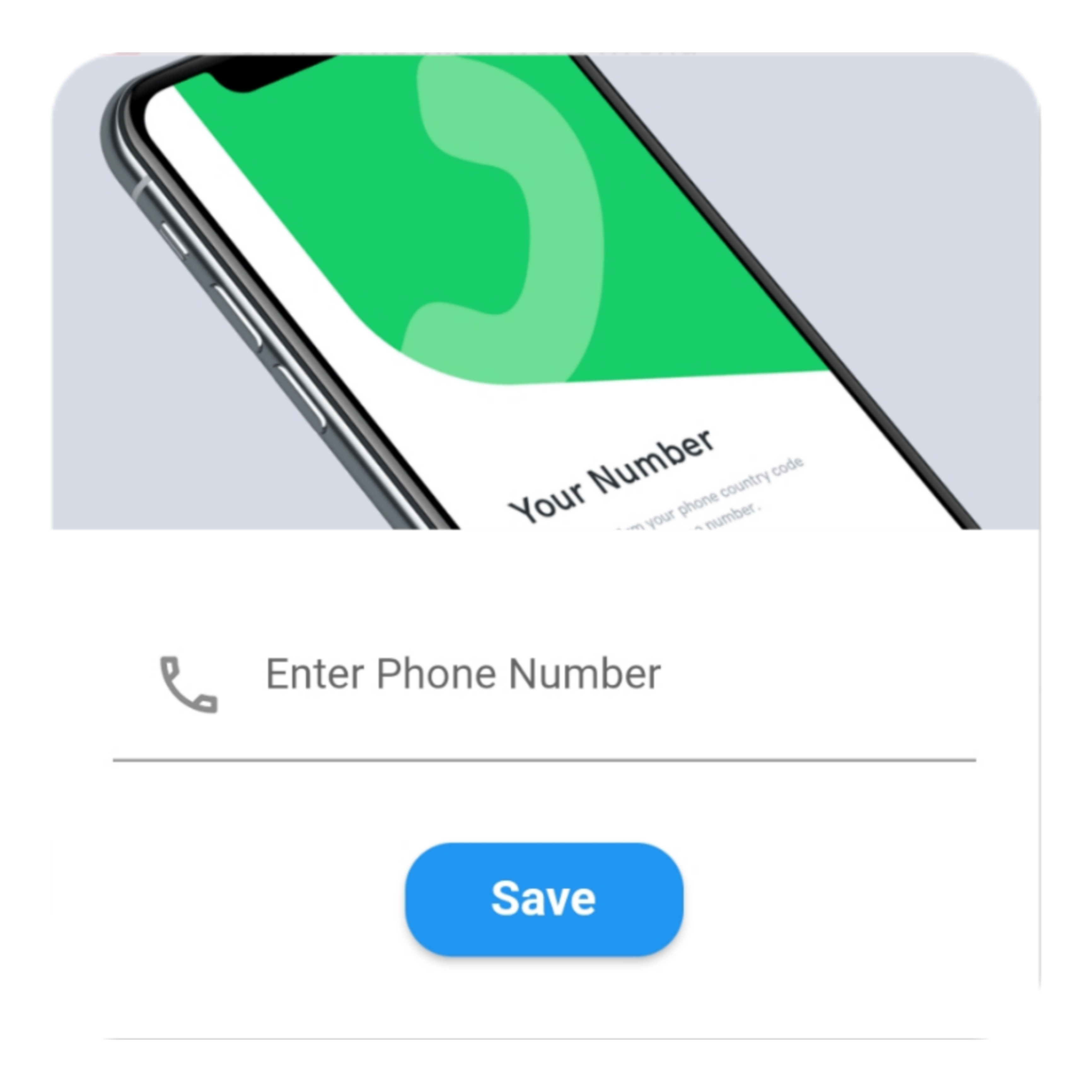
> ### Custom ```dart QuickAlert.show( context: context, type: QuickAlertType.custom, barrierDismissible: true, confirmBtnText: 'Save', customAsset: 'assets/custom.gif', widget: TextFormField( decoration: const InputDecoration( alignLabelWithHint: true, hintText: 'Enter Phone Number', prefixIcon: Icon( Icons.phone_outlined, ), ), textInputAction: TextInputAction.next, keyboardType: TextInputType.phone, onChanged: (value) => message = value, ), onConfirmBtnTap: () async { if (message.length < 5) { await QuickAlert.show( context: context, type: QuickAlertType.error, text: 'Please input something', ); return; } Navigator.pop(context); await Future.delayed(const Duration(milliseconds: 1000)); await QuickAlert.show( context: context, type: QuickAlertType.success, text: "Phone number '$message' has been saved!.", ); }, ); }, title: 'Custom', text: 'Custom Widget Alert', leadingImage: 'assets/custom.gif', ); ``` ## Screenshots ✨ Here are some screenshots of the **QuickAlert** Dialogs.
QuickAlert Class.
| Attribute | Data type | Description | Default Value |
|:----------------------|:-------------------|:--------------------------------------------------------------------------------------------------------------------------------------------------------------|:-----------------------------------:|
| context| BuildContext | @required BuildContext | N/A |
| type | QuickAlertType | @required - Type of alert dialog, ex: QuickAlertType.success for success dialogs | Null |
|title| String | Set a custom title for dialog | Based on the QuickAlertType selected |
|text| String | Set the description text of the dialog. | Null |
| widget| Widget | Set custom widget of the dialog. | Null |
| confirmBtnText | String | Text of confirm button | 'Okay' | |
| confirmBtnTap| Function | Function that handle click of confirm button | () => Navigator.pop(context)|
| confirmBtnColor| Color | Color of confirm Button | Colors.blue |
| showCancelBtn | bool| Determines if cancel button is shown or not | false |
| cancelBtnText| String | Text of cancel button| 'Cancel' |
| cancelBtnTap| Function| Function that handle click of cancel button|() => Navigator.pop(context) |
| barrierDismissible| bool| Dismiss dialog on touch overlay| true |
| animType| QuickAlertAnimType| Type of dialogue enter animation| QuickAlertAnimType.scale|
| confirmBtnTextStyle | TextStyle | Confirm button text theme| TextStyle(color: Colors.white, fontWeight:FontWeight.w600,fontSize: 18.0)|
| cancelBtnTextStyle | TextStyle | Cancel button text theme|TextStyle(color: Colors.grey, fontWeight:FontWeight.w600,fontSize: 18.0)|
| backgroundColor | Color | Color of dialog background | Colors.white |
| titleColor | Color | Color of title | Colors.black |
| textColor | Color | Color of text | Colors.black |
| barrierColor | Color | Color of Barrier | Null |
| customAsset| String | Asset path of your custom asset | Null |
|autoCloseDuration|Duration|Determines how long the dialog stays open for before closing|Null|
|width|double|Dialog width|MediaQuery.of(context).size.shortestSide|