# MaterialDateTimePicker
**Repository Path**: djun100/MaterialDateTimePicker
## Basic Information
- **Project Name**: MaterialDateTimePicker
- **Description**: Pick a date or time on Android in style
- **Primary Language**: Java
- **License**: Apache-2.0
- **Default Branch**: master
- **Homepage**: None
- **GVP Project**: No
## Statistics
- **Stars**: 0
- **Forks**: 0
- **Created**: 2021-11-08
- **Last Updated**: 2021-11-08
## Categories & Tags
**Categories**: Uncategorized
**Tags**: None
## README
Material DateTime Picker - Select a time/date in style
======================================================

Material DateTime Picker tries to offer you the date and time pickers as shown in [the Material Design spec](http://www.google.com/design/spec/components/pickers.html), with an
easy themable API.
The library uses [the code from the Android frameworks](https://android.googlesource.com/platform/frameworks/opt/datetimepicker/) as a base and tweaked it to be as close as possible to Material Design example.
Support for Android 4.0 and up.
Feel free to fork or issue pull requests on github. Issues can be reported on the github issue tracker.
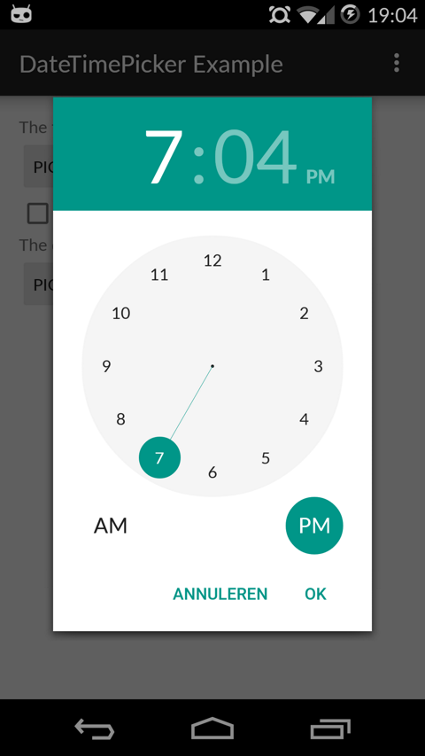
Date Picker | Time Picker
---- | ----
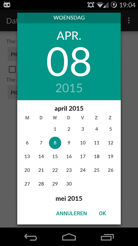 | 
Setup
-----
The easiest way to add the Material DateTime Picker library to your project is by adding it as a dependency to your `build.gradle`
```java
dependencies {
compile 'com.wdullaer:materialdatetimepicker:1.4.2'
}
```
You may also add the library as an Android Library to your project. All the library files live in ```library```.
Using Material Date/Time Pickers
--------------------------------
The library follows the same API as other pickers in the Android framework.
For a basic implementation, you'll need to
1. Implement an `OnTimeSetListener`/`OnDateSetListener`
2. Create a `TimePickerDialog`/`DatePickerDialog` using the supplied factory
3. Theme the pickers
### Implement an `OnTimeSetListener`/`OnDateSetListener`
In order to receive the date or time set in the picker, you will need to implement the `OnTimeSetListener` or
`OnDateSetListener` interfaces. Typically this will be the `Activity` or `Fragment` that creates the Pickers. The callbacks use the same API as the standard Android pickers.
```java
@Override
public void onTimeSet(RadialPickerLayout view, int hourOfDay, int minute) {
String time = "You picked the following time: "+hourOfDay+"h"+minute;
timeTextView.setText(time);
}
@Override
public void onDateSet(DatePickerDialog view, int year, int monthOfYear, int dayOfMonth) {
String date = "You picked the following date: "+dayOfMonth+"/"+(monthOfYear+1)+"/"+year;
dateTextView.setText(date);
}
```
### Create a `TimePickerDialog`/`DatePickerDialog` using the supplied factory
You will need to create a new instance of `TimePickerDialog` or `DatePickerDialog` using the static `newInstance()` method, supplying proper default values and a callback. Once the dialogs are configured, you can call `show()`.
```java
Calendar now = Calendar.getInstance();
DatePickerDialog dpd = DatePickerDialog.newInstance(
MainActivity.this,
now.get(Calendar.YEAR),
now.get(Calendar.MONTH),
now.get(Calendar.DAY_OF_MONTH)
);
dpd.show(getFragmentManager(), "Datepickerdialog");
```
### Theme the pickers
You can theme the pickers by overwriting the color resources `mdtp_accent_color` and `mdtp_accent_color_dark` in your project.
```xml
#009688
#00796b
```
Additional Options
------------------
* `TimePickerDialog` dark theme
The `TimePickerDialog` has a dark theme that can be set by calling
```java
tdp.setThemeDark(true);
```
* `DatePickerDialog` dark theme
The `DatePickerDialog` has a dark theme that can be set by calling
```java
tdp.setThemeDark(true);
```
* `TimePickerDialog` `setTitle(String title)`
Shows a title at the top of the `TimePickerDialog`
* `setSelectableDays(Calendar[] days)`
You can pass a `Calendar[]` to the `DatePickerDialog`. This values in this list are the only acceptable dates for the picker. It takes precedence over `setMinDate(Calendar day)` and `setMaxDate(Calendar day)`
* `setHighlightedDays(Calendar[] days)`
You can pass a `Calendar[]` of days to highlight. They will be rendered in bold. You can tweak the color of the highlighted days by overwriting `mdtp_date_picker_text_highlighted`
* `OnDismissListener` and `OnCancelListener`
Both pickers can be passed a `DialogInterface.OnDismissLisener` or `DialogInterface.OnCancelListener` which allows you to run code when either of these events occur.
```java
tpd.setOnCancelListener(new DialogInterface.OnCancelListener() {
@Override
public void onCancel(DialogInterface dialogInterface) {
Log.d("TimePicker", "Dialog was cancelled");
}
});
```
* `vibrate(boolean vibrate)`
Set whether the dialogs should vibrate the device when a selection is made. This defaults to `true`.
Potential Improvements
----------------------
* Landscape timepicker can use some improvement
* Code cleanup: there is a bit too much spit and ductape in the tweaks I've done.
* Document all options on both pickers
License
-------
Copyright (c) 2015 Wouter Dullaert
Licensed under the Apache License, Version 2.0 (the "License");
you may not use this file except in compliance with the License.
You may obtain a copy of the License at
http://www.apache.org/licenses/LICENSE-2.0
Unless required by applicable law or agreed to in writing, software
distributed under the License is distributed on an "AS IS" BASIS,
WITHOUT WARRANTIES OR CONDITIONS OF ANY KIND, either express or implied.
See the License for the specific language governing permissions and
limitations under the License.