# bao-wecom
**Repository Path**: huntwind/bao-wecom
## Basic Information
- **Project Name**: bao-wecom
- **Description**: 在一次小程序项目中,需要开发一个用户签字的功能,所以就开发这个签字板的组件以及颜色选择器的组件。
- **Primary Language**: Unknown
- **License**: MIT
- **Default Branch**: master
- **Homepage**: None
- **GVP Project**: No
## Statistics
- **Stars**: 3
- **Forks**: 1
- **Created**: 2024-05-10
- **Last Updated**: 2025-01-19
## Categories & Tags
**Categories**: Uncategorized
**Tags**: None
## README
# bao-wecom
小程序自定义签字板、颜色选择器的组件。
## 背景
在一次小程序项目中,需要开发一个用户签字的功能,所以就开发这个签字板的组件以及颜色选择器的组件。
[gitee源码地址 https://gitee.com/huntwind/bao-wecom.git](https://gitee.com/huntwind/bao-wecom.git)
## 案例demo

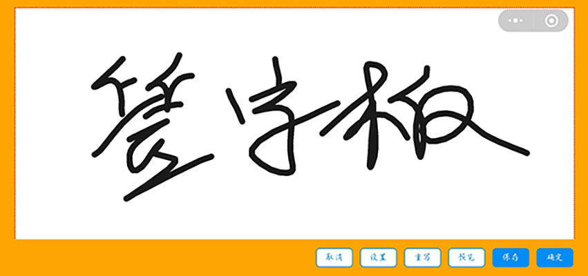
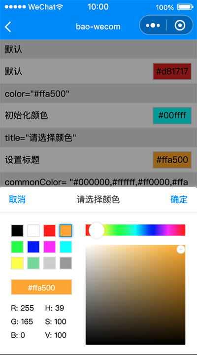
## 案例图片
## 使用方法
### 1. 安装组件
```
npm install --save bao-wecom
```
### 2. 颜色选择器使用
**在页面的 json 配置文件中添加 bao-wecom-color-picker 自定义组件的配置**
```json
{
"usingComponents": {
"bao-wecom-color-picker": "bao-wecom/colorPicker/index"
}
}
```
**WXML 文件中引用 bao-wecom-color-picker**
```xml
```
**bao-wecom-color-picker 的属性介绍如下:**
| 字段名 | 类型 | 必填 | 描述 |
| --------------------- | ------- | ---- | ----------------------------------------- |
| show | Boolean | 是 | 控制颜色选择器是否显示 |
| color | String | 否 | 设置颜色选择器的颜色,默认为#ff0000 ,仅支持rgb、hex格式 |
| commonColor | String | 否 | 设置常用颜色值,默认为"#000000,#ffffff,#ff0000,#ffa500,#00ff00,#0000ff,#ff00ff,#00ffff,#ffff00,#70db93,#cccccc,#999999" ,仅支持hex格式,最多12个 |
| comfirmText | String | 否 | 设置确定按钮的文字,默认为确定 |
| cancelText | String | 否 | 设置取消按钮的文字,默认为取消 |
| title | String | 否 | 设置标题,默认为请选择 |
**bao-wecom-color-picker 的事件介绍如下:**
| 事件名 | 描述 |
| --------------------- | ----------------------------------------- |
| confirm | 点击确定时触发,返回值{hex: 16进制色值, rgb: rgb色值, hsv: hsv色值} |
| cancel | 点击取消时触发 |
### 3. 签字板使用
**在页面的 json 配置文件中添加 bao-wecom-signature 自定义组件的配置**
```json
{
"usingComponents": {
"bao-wecom-signature": "bao-wecom/signature/index"
},
"pageOrientation": "landscape",//横屏
"navigationStyle": "custom" //自定义头
}
```
**WXML 文件中引用 bao-wecom-signature**
```xml
```
**bao-wecom-signature 的属性介绍如下:**
| 字段名 | 类型 | 必填 | 描述 |
| --------------------- | ------- | ---- | ----------------------------------------- |
| title | String | 否 | 签字版标题 |
| color | String | 否 | 设置笔画线条的颜色,默认为#1A1A1A ,hex格式 |
| boardColor | String | 否 | 设置画板的颜色,默认为#ffffff ,hex格式 |
| backgroundColor | String | 否 | 设置背景的颜色,默认为#ffa500 ,hex格式 |
| size | Number | 否 | 设置笔画线条的粗细,默认为8 |
| fileType | String | 否 | 设置导出图片的格式,默认为png |
| quality | Number | 否 | 生成图片的质量,目前仅对 jpg 有效。取值范围为 (0, 1],不在范围内时当作 1.0 处理。 |
| buttonList | Array | 否 | 设置显示的按钮,默认为["cancel", "setting", "reset", "preview", "save", "confirm"],cancel:取消按钮,setting:设置按钮,reset:重写按钮,preview:预览按钮,save:保存按钮,confirm:确认按钮。 |
**bao-wecom-signature 的事件介绍如下:**
| 事件名 | 描述 |
| --------------------- | --------------------------------------------------------------------------- |
| confirm | 点击确定时触发,返回值{ path: 图片本地路径, width: 宽度, height: 高度 } |
| cancel | 点击取消时触发 |
### 4. 环形进度条
**在页面的 json 配置文件中添加 bao-wecom-circle 自定义组件的配置**
```json
{
"usingComponents": {
"bao-wecom-circle": "bao-wecom/circle/index"
}
}
```
**WXML 文件中引用 bao-wecom-circle**
```xml
```
**bao-wecom-circle 的属性介绍如下:**
| 字段名 | 类型 | 必填 | 描述 |
| --------------------- | ------- | ---- | ----------------------------------------- |
| value | number | 是 | 目标进度 |
| start | string | 否 | 轨道起点,top:起点为圆的上部,bottom:起点为圆的下部,left:起点为圆的左侧,right:起点为圆的右侧;默认top |
| end | string | 否 | 轨道终点,top:终点为圆的上部,bottom:终点为圆的下部,left:终点为圆的左侧,right:终点为圆的右侧;默认top ,如果起点和终点相同,则轨道是一个圆|
| color | string、object | 否 | 进度条颜色,传入对象格式可以定义渐变色,例如:{ '0%': '#ffd01e', '100%': '#ee0a24' }, 默认 #1989fa |
| size | number | 否 | 圆环直径,默认为 90 px |
| layerColor | string | 否 | 轨道颜色,默认为 #ffffff |
| fill | string | 否 | 填充颜色 |
| speed | number | 否 | 动画速度(单位为 value/s),默认50 |
| text | string | 否 | 填充文字,有值则插槽不生效 |
| strokeWidth | number | 否 | 进度条宽度,默认4 |
| clockwise | boolean | 否 | 是否逆时针旋转,默认为false |
### 5. 骨架屏
**在页面的 json 配置文件中添加 bao-wecom-circle 自定义组件的配置**
```json
{
"usingComponents": {
"bao-wecom-skeleton": "bao-wecom/skeleton/index"
}
}
```
**WXML 文件中引用 bao-wecom-skeleton**
```xml
```
**bao-wecom-skeleton 的属性介绍如下:**
| 字段名 | 类型 | 必填 | 描述 |
| --------------------- | ------- | ---- | ----------------------------------------- |
| listNum | number | 否 | 列表数量,默认1 |
| rowNum | number | 否 | 内容行数,默认3 |
| title | boolean | 否 | 显示标题,默认false |
| avatar | boolean | 否 | 显示头像,默认false |
| avatarSrc | string | 否 | 自定义头像链接 |
| avatarSize | string | 否 | 头像大小,默认32px |
| avatarShape | string | 否 | 头像形状,round:圆形;square:方形;默认round |
| loading | boolean | 否 | 骨架屏加载状态,默认为true |
| animate | boolean | 否 | 是否显示呼吸动画,默认true |
| titleWidth | string | 否 | 标题宽度,默认40% |