# vue3-compare-image
**Repository Path**: jackfinal/vue3-compare-image
## Basic Information
- **Project Name**: vue3-compare-image
- **Description**: No description available
- **Primary Language**: Unknown
- **License**: MIT
- **Default Branch**: main
- **Homepage**: None
- **GVP Project**: No
## Statistics
- **Stars**: 0
- **Forks**: 0
- **Created**: 2025-07-25
- **Last Updated**: 2025-07-25
## Categories & Tags
**Categories**: Uncategorized
**Tags**: None
## README
# vue3-compare-image
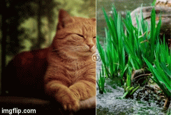
A Vue 3 component to compare and slide between two images, supports vertical and horizontal modes, and Keyboard for accessibility.
> NOTE: This project is a fork of [vue-compare-image](https://github.com/junkboy0315/vue-compare-image) with Vue 3 support and with all functionalities of [react-compare-image](https://github.com/junkboy0315/react-compare-image) plus Keyboard navigation for accessibility.
## Features
- [Documentation](https://vue3-compare-image.vercel.app)
- Simple
- Accessibility
- Fully Typescript
- Responsive (fit to the parent width)
- Size difference between two images handled correctly. Element size determined by following two factors:
- width of the parent
- right image's aspect ratio
- Horizontal & Vertical comparison
- Keyboard navigation
## How to use
In the shell:
```bash
yarn add vue3-compare-image
// or
npm install --save vue3-compare-image
```
Globally:
```js
import VueCompareImage from 'vue3-compare-image'
const app = createApp(App)
app.use(VueCompareImage)
app.mount('#app')
```
If Installed globaly, reference type in tsconfig or .d.ts file to get props autocompletion
eg in .d.ts
```ts
///
```
In your component file:
```js
import { VueCompareImage } from 'vue3-compare-image'
export default {
name: 'app',
components: { VueCompareImage },
}
```
```xml
;
```
## Props
| Prop (\* required) | type | default | description |
| ------------------------ | ----------------------- | :---------: | --------------------------------------------------------------------------------------------------------------------- |
| leftImage \* | string | `null` | left image's url |
| rightImage \* | string | `null` | right image's url |
| vertical | boolean | `false` | Compare images vertically or horizontally |
| keyboard | boolean | `true` | Allow Keyboard navigation for accessibility |
| keyboardStep | number | `0.01` | By what percentage should the slider move on keyboard press. between `0` and `1` |
| aspectRatio | `'taller'` or `'wider'` | `'taller'` | Which to choose if the aspect ratios of the images are different |
| handle | element | `null` | Custom handle element. Just pass and empty `` if you want to remove the handle. |
| handleSize | number (px) | `40` | diameter of slider handle (by pixel) |
| hover | boolean | `false` | Whether to slide at hover |
| slideOnClick | boolean | `true` | Whether to slide on click and drag or just drag. |
| leftImageAlt | string | `''` | alt props for left image |
| leftImageCss | object | `{}` | Additional css for left image |
| leftImageLabel | string | `null` | Label for the image (e.g. `before`) |
| onSliderPositionChange | function | `null` | Callback function called each time the slider changes. The position (0 to 1) of the slider is passed as arg |
| rightImageAlt | string | `''` | alt props for right image |
| rightImageCss | object | `{}` | Additional css for right image |
| rightImageLabel | string | `null` | Label for the image (e.g. `after`) |
| skeleton | element | `null` | Element displayed while image is loading |
| sliderLineColor | string | `'#ffffff'` | line color of slider |
| sliderLineWidth | number (px) | `2` | line width of slider (by pixel). set `0` to hide slider line. |
| sliderPositionPercentage | number (float) | `0.5` | Default slider line position (from 0 to 1) |
## Events
| Name | Description |
| ------------- | :-----------: |
| slideStart | When sliding has starts |
| slideEnd | When sliding ends |
| isSliding | `true` when sliding |
| allImageLoad | `true` when all images are loaded |