# plyr
**Repository Path**: legendqi/plyr
## Basic Information
- **Project Name**: plyr
- **Description**: plyr播放器代码,方便下载,从github同步实在太慢
- **Primary Language**: Unknown
- **License**: MIT
- **Default Branch**: master
- **Homepage**: None
- **GVP Project**: No
## Statistics
- **Stars**: 8
- **Forks**: 3
- **Created**: 2020-04-04
- **Last Updated**: 2025-06-18
## Categories & Tags
**Categories**: Uncategorized
**Tags**: None
## README
| 🎉 | [Plyr is merging into Vidstack](https://github.com/sampotts/plyr/issues/2408) | 🎉 |
| :-: | :---------------------------------------------------------------------------: | :-- |
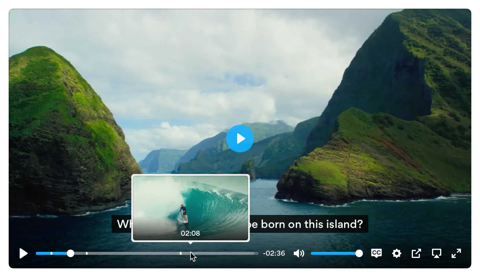
Plyr is a simple, lightweight, accessible and customizable HTML5, YouTube and Vimeo media player that supports [_modern_](#browser-support) browsers.
[Checkout the demo](https://plyr.io) - [Donate](#donate) - [Slack](https://bit.ly/plyr--chat)
[](https://badge.fury.io/js/plyr) [](https://gitpod.io/#https://github.com/sampotts/plyr) [](https://opencollective.com/plyr)
[](https://plyr.io)
# Features
- 📼 **HTML Video & Audio, YouTube & Vimeo** - support for the major formats
- 💪 **Accessible** - full support for VTT captions and screen readers
- 🔧 **[Customizable](#html)** - make the player look how you want with the markup you want
- 😎 **Clean HTML** - uses the _right_ elements. `` for volume and `
` tag and then in your JS create a new instance of Plyr as below.
```html
```
See [initialising](#initializing) for more information on advanced setups.
You can use our CDN (provided by [Cloudflare](https://www.cloudflare.com/)) for the JavaScript. There's 2 versions; one with and one without [polyfills](#polyfills). My recommendation would be to manage polyfills separately as part of your application but to make life easier you can use the polyfilled build.
```html
```
...or...
```html
```
## CSS
Include the `plyr.css` stylesheet into your ``.
```html
```
If you want to use our CDN (provided by [Cloudflare](https://www.cloudflare.com/)) for the default CSS, you can use the following:
```html
```
## SVG Sprite
The SVG sprite is loaded automatically from our CDN (provided by [Cloudflare](https://www.cloudflare.com/)). To change this, see the [options](#options) below. For
reference, the CDN hosted SVG sprite can be found at `https://cdn.plyr.io/3.7.8/plyr.svg`.
### Self hosting
If you don't want to create a build system to include Plyr as an npm module, you can use the pre-built files. You have a few options:
- Download the files from the CDN links above, they're already minified.
- Download the files from [unpkg](https://unpkg.com/browse/plyr/dist/) or similar services.
- Build the project yourself using `npm i && npm run build`, which installs the dependencies and spits out a build to `dist`.
# Ads
Plyr has partnered up with [vi.ai](https://vi.ai/publisher-video-monetization/?aid=plyrio) to offer monetization options for your videos. Getting setup is easy:
- [Sign up for a vi.ai account](https://vi.ai/publisher-video-monetization/?aid=plyrio)
- Grab your publisher ID from the code snippet
- Enable ads in the [config options](#options) and enter your publisher ID
Any questions regarding the ads can be sent straight to vi.ai and any issues with rendering raised through GitHub issues.
If you do not wish to use Vi, you can set your own `ads.tagUrl` [option](#options).
# Advanced
## Customizing the CSS
If you want to change any design tokens used for the rendering of the player, you can do so using [CSS Custom Properties](https://developer.mozilla.org/en-US/docs/Web/CSS/Using_CSS_custom_properties).
Here's a list of the properties and what they are used for:
| Name | Description | Default / Fallback |
| ---------------------------------------------- | ------------------------------------------------------------------------------------------------------- | --------------------------------------------------------------------- |
| `--plyr-color-main` | The primary UI color. |  `#00b3ff` |
| `--plyr-video-background` | The background color of video and poster wrappers for using alpha channel videos and poster images. | `rgba(0, 0, 0, 1)` |
| `--plyr-focus-visible-color` | The color used for the focus styles when an element is `:focus-visible` (keyboard focused). | `--plyr-color-main` |
| `--plyr-badge-background` | The background color for badges in the menu. |  `#4a5464` |
| `--plyr-badge-text-color` | The text color for badges. |  `#ffffff` |
| `--plyr-badge-border-radius` | The border radius used for badges. | `2px` |
| `--plyr-captions-background` | The color for the background of captions. | `rgba(0, 0, 0, 0.8)` |
| `--plyr-captions-text-color` | The color used for the captions text. |  `#ffffff` |
| `--plyr-control-icon-size` | The size of the icons used in the controls. | `18px` |
| `--plyr-control-spacing` | The space between controls (sometimes used in a multiple - e.g. `10px / 2 = 5px`). | `10px` |
| `--plyr-control-padding` | The padding inside controls. | `--plyr-control-spacing * 0.7` (`7px`) |
| `--plyr-control-radius` | The border radius used on controls. | `3px` |
| `--plyr-control-toggle-checked-background` | The background color used for checked menu items. | `--plyr-color-main` |
| `--plyr-video-controls-background` | The background for the video controls. | `linear-gradient(rgba(0, 0, 0, 0), rgba(0, 0, 0, 0.75))` |
| `--plyr-video-control-color` | The text/icon color for video controls. |  `#ffffff` |
| `--plyr-video-control-color-hover` | The text/icon color used when video controls are `:hover`, `:focus` and `:focus-visible` (equivalent). |  `#ffffff` |
| `--plyr-video-control-background-hover` | The background color used when video controls are `:hover`, `:focus` and `:focus-visible` (equivalent). | `--plyr-color-main` |
| `--plyr-audio-controls-background` | The background for the audio controls. |  `#ffffff` |
| `--plyr-audio-control-color` | The text/icon color for audio controls. |  `#4a5464` |
| `--plyr-audio-control-color-hover` | The text/icon color used when audio controls are `:hover`, `:focus` and `:focus-visible` (equivalent). |  `#ffffff` |
| `--plyr-audio-control-background-hover` | The background color used when video controls are `:hover`, `:focus` and `:focus-visible` (equivalent). | `--plyr-color-main` |
| `--plyr-menu-background` | The background color for menus. | `rgba(255, 255, 255, 0.9)` |
| `--plyr-menu-color` | The text/icon color for menu items. |  `#4a5464` |
| `--plyr-menu-shadow` | The shadow used on menus. | `0 1px 2px rgba(0, 0, 0, 0.15)` |
| `--plyr-menu-radius` | The border radius on the menu. | `4px` |
| `--plyr-menu-arrow-size` | The size of the arrow on the bottom of the menu. | `6px` |
| `--plyr-menu-item-arrow-color` | The color of the arrows in the menu. |  `#728197` |
| `--plyr-menu-item-arrow-size` | The size of the arrows in the menu. | `4px` |
| `--plyr-menu-border-color` | The border color for the bottom of the back button in the top of the sub menu pages. |  `#dcdfe5` |
| `--plyr-menu-border-shadow-color` | The shadow below the border of the back button in the top of the sub menu pages. |  `#ffffff` |
| `--plyr-progress-loading-size` | The size of the stripes in the loading state in the scrubber. | `25px` |
| `--plyr-progress-loading-background` | The background color on the loading state in the scrubber. | `rgba(35, 40, 47, 0.6)` |
| `--plyr-video-progress-buffered-background` | The fill color for the buffer indication in the scrubber for video. | `rgba(255, 255, 255, 0.25)` |
| `--plyr-audio-progress-buffered-background` | The fill color for the buffer indication in the scrubber for audio. | `rgba(193, 200, 209, 0.6)` |
| `--plyr-range-thumb-height` | The height of the scrubber handle/thumb. | `13px` |
| `--plyr-range-thumb-background` | The background of the scrubber handle/thumb. |  `#ffffff` |
| `--plyr-range-thumb-shadow` | The shadow of the scrubber handle/thumb. | `0 1px 1px rgba(215, 26, 18, 0.15), 0 0 0 1px rgba(215, 26, 18, 0.2)` |
| `--plyr-range-thumb-active-shadow-width` | The width of the shadow when the scrubber handle/thumb is `:active` (pressed). | `3px` |
| `--plyr-range-track-height` | The height of the scrubber/progress track. | `5px` |
| `--plyr-range-fill-background` | The fill color of the scrubber/progress. | `--plyr-color-main` |
| `--plyr-video-range-track-background` | The background of the scrubber/progress. | `--plyr-video-progress-buffered-background` |
| `--plyr-video-range-thumb-active-shadow-color` | The color of the shadow when the video scrubber handle/thumb is `:active` (pressed). | `rgba(255, 255, 255, 0.5)` |
| `--plyr-audio-range-track-background` | The background of the scrubber/progress. | `--plyr-video-progress-buffered-background` |
| `--plyr-audio-range-thumb-active-shadow-color` | The color of the shadow when the audio scrubber handle/thumb is `:active` (pressed). | `rgba(215, 26, 18, 0.1)` |
| `--plyr-tooltip-background` | The background color for tooltips. | `rgba(255, 255, 255, 0.9)` |
| `--plyr-tooltip-color` | The text color for tooltips. |  `#4a5464` |
| `--plyr-tooltip-padding` | The padding for tooltips. | `calc(var(--plyr-control-spacing) / 2))` |
| `--plyr-tooltip-arrow-size` | The size of the arrow under tooltips. | `4px` |
| `--plyr-tooltip-radius` | The border radius on tooltips. | `3px` |
| `--plyr-tooltip-shadow` | The shadow on tooltips. | `0 1px 2px rgba(0, 0, 0, 0.15)` |
| `--plyr-font-family` | The font family used in the player. | |
| `--plyr-font-size-base` | The base font size. Mainly used for captions. | `15px` |
| `--plyr-font-size-small` | The smaller font size. Mainly used for captions. | `13px` |
| `--plyr-font-size-large` | The larger font size. Mainly used for captions. | `18px` |
| `--plyr-font-size-xlarge` | The even larger font size. Mainly used for captions. | `21px` |
| `--plyr-font-size-time` | The font size for the time. | `--plyr-font-size-small` |
| `--plyr-font-size-menu` | The font size used in the menu. | `--plyr-font-size-small` |
| `--plyr-font-size-badge` | The font size used for badges. | `9px` |
| `--plyr-font-weight-regular` | The regular font weight. | `400` |
| `--plyr-font-weight-bold` | The bold font weight. | `600` |
| `--plyr-line-height` | The line height used within the player. | `1.7` |
| `--plyr-font-smoothing` | Whether to enable font antialiasing within the player. | `false` |
You can set them in your CSS for all players:
```css
:root {
--plyr-color-main: #1ac266;
}
```
...or for a specific class name:
```css
.player {
--plyr-color-main: #1ac266;
}
```
...or in your HTML:
```html
```
### Sass
You can use `plyr.scss` file included in `/src/sass` as part of your build and change variables to suit your design. The Sass requires you to
use [autoprefixer](https://www.npmjs.com/package/gulp-autoprefixer) (you should be already!) as all declarations use the W3C definitions.
The HTML markup uses the BEM methodology with `plyr` as the block, e.g. `.plyr__controls`. You can change the class hooks in the options to match any custom CSS
you write. Check out the JavaScript source for more on this.
## SVG
The icons used in the Plyr controls are loaded in an SVG sprite. The sprite is automatically loaded from our CDN by default. If you already have an icon build
system in place, you can include the source plyr icons (see `/src/sprite` for source icons).
### Using the `iconUrl` option
You can however specify your own `iconUrl` option and Plyr will determine if the url is absolute and requires loading by AJAX/CORS due to current browser
limitations or if it's a relative path, just use the path directly.
If you're using the `` tag on your site, you may need to use something like this: [svgfixer.js](https://gist.github.com/leonderijke/c5cf7c5b2e424c0061d2)
More info on SVG sprites here: [http://css-tricks.com/svg-sprites-use-better-icon-fonts/](http://css-tricks.com/svg-sprites-use-better-icon-fonts/) and the AJAX
technique here: [http://css-tricks.com/ajaxing-svg-sprite/](http://css-tricks.com/ajaxing-svg-sprite/)
## Cross Origin (CORS)
You'll notice the `crossorigin` attribute on the example `