# PinEntryView
**Repository Path**: mirrors_Modificator/PinEntryView
## Basic Information
- **Project Name**: PinEntryView
- **Description**: A pin entry view widget for Android.
- **Primary Language**: Unknown
- **License**: Not specified
- **Default Branch**: master
- **Homepage**: None
- **GVP Project**: No
## Statistics
- **Stars**: 0
- **Forks**: 0
- **Created**: 2020-09-25
- **Last Updated**: 2026-03-08
## Categories & Tags
**Categories**: Uncategorized
**Tags**: None
## README
PinEntryView
============
## About
A PIN entry view widget for Android with support for Android 5 Material Theme features via the
AppCompat v7 support library.
 Uses a hidden `EditText` to handle input, hence behaves much in the same was as an `EditText` on the
screen and supports similar features.
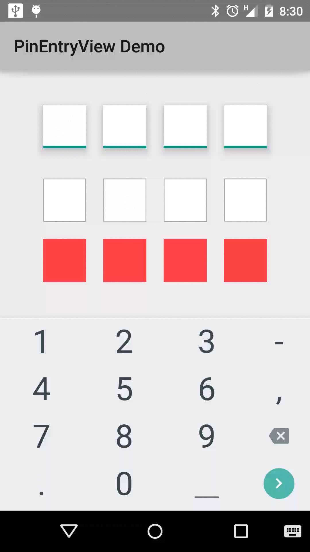
## Demo
The demo app running the latest release build is also available on Google Play:
Uses a hidden `EditText` to handle input, hence behaves much in the same was as an `EditText` on the
screen and supports similar features.
## Demo
The demo app running the latest release build is also available on Google Play:
 ## Change log
* 1.0.6 - Added `pinInputType` attribute to allow changing the input type, fixed #7
* 1.0.5 - Added `setText` and `clearText` methods, updated build to API 22
* 1.0.4 - Changed attribute name `accentColor` to `pinAccentColor` to avoid conflicts with other
libraries
* 1.0.3 - Fixed #2, gravity of digits now correctly displayed
* 1.0.2 - Add support for elevation on the digits in Lollipop
* 1.0.1 - Minor fixes
* 1.0.0 - Initial release
## Download
### Gradle
Add the following to your `build.gradle`:
compile 'me.philio:pinentryview:1.0.6'
## Styling
### Attributes
* `numDigits` - The number of digits in the PIN, default 4.
* `digitWidth` - The width of the digit view, default 50dp.
* `digitHeight` - The heigh of the digit view, default 50dp.
* `digitSpacing` - The distance between the digit views, default 20dp.
* `digitBackground` - A resource to use for the digit views, supports drawables or colours and can
be used with a custom selector as an alternative to using the built in accent support (by setting
the `accentColor` as transparent). Defaults to `android:windowBackground` from the current theme.
* `digitTextSize` - The size of the text in the digit view, default 15sp.
* `digitTextColor` - The colour of the text in the digit view, defaults to `android:textColorPrimary`
from the current theme.
* `digitElevation` - Set the elevation of the digit views, API 21+ only, default 0dp.
* `mask` - A character to use as a mask for the entered PIN value, can be set to an empty string to
show typed numbers, default *.
* `pinAccentColor` - The colour of the accent to use to highlight the view when it's in focus, defaults
to `android:colorAccent` from the current theme.
* `accentWidth` - The width of the accent highlight, default 3dp.
* `accentType` - Defines the behaviour of the accent, default none, options:
* `none` - disabled
* `all` - highlights each separate digit view
* `character` - highlights a single digit view to represent the position of the cursor
* `accentRequiresFocus` - show accent only when focused, default true
* `pinInputType` - Set the input type, default number, options:
* `text` - full keyboard, any available character allowed
* `number` - numeric keyboard, only numbers allowed
## License
Copyright 2014-2015 Phil Bayfield
Licensed under the Apache License, Version 2.0 (the "License");
you may not use this file except in compliance with the License.
You may obtain a copy of the License at
http://www.apache.org/licenses/LICENSE-2.0
Unless required by applicable law or agreed to in writing, software
distributed under the License is distributed on an "AS IS" BASIS,
WITHOUT WARRANTIES OR CONDITIONS OF ANY KIND, either express or implied.
See the License for the specific language governing permissions and
limitations under the License.
## Change log
* 1.0.6 - Added `pinInputType` attribute to allow changing the input type, fixed #7
* 1.0.5 - Added `setText` and `clearText` methods, updated build to API 22
* 1.0.4 - Changed attribute name `accentColor` to `pinAccentColor` to avoid conflicts with other
libraries
* 1.0.3 - Fixed #2, gravity of digits now correctly displayed
* 1.0.2 - Add support for elevation on the digits in Lollipop
* 1.0.1 - Minor fixes
* 1.0.0 - Initial release
## Download
### Gradle
Add the following to your `build.gradle`:
compile 'me.philio:pinentryview:1.0.6'
## Styling
### Attributes
* `numDigits` - The number of digits in the PIN, default 4.
* `digitWidth` - The width of the digit view, default 50dp.
* `digitHeight` - The heigh of the digit view, default 50dp.
* `digitSpacing` - The distance between the digit views, default 20dp.
* `digitBackground` - A resource to use for the digit views, supports drawables or colours and can
be used with a custom selector as an alternative to using the built in accent support (by setting
the `accentColor` as transparent). Defaults to `android:windowBackground` from the current theme.
* `digitTextSize` - The size of the text in the digit view, default 15sp.
* `digitTextColor` - The colour of the text in the digit view, defaults to `android:textColorPrimary`
from the current theme.
* `digitElevation` - Set the elevation of the digit views, API 21+ only, default 0dp.
* `mask` - A character to use as a mask for the entered PIN value, can be set to an empty string to
show typed numbers, default *.
* `pinAccentColor` - The colour of the accent to use to highlight the view when it's in focus, defaults
to `android:colorAccent` from the current theme.
* `accentWidth` - The width of the accent highlight, default 3dp.
* `accentType` - Defines the behaviour of the accent, default none, options:
* `none` - disabled
* `all` - highlights each separate digit view
* `character` - highlights a single digit view to represent the position of the cursor
* `accentRequiresFocus` - show accent only when focused, default true
* `pinInputType` - Set the input type, default number, options:
* `text` - full keyboard, any available character allowed
* `number` - numeric keyboard, only numbers allowed
## License
Copyright 2014-2015 Phil Bayfield
Licensed under the Apache License, Version 2.0 (the "License");
you may not use this file except in compliance with the License.
You may obtain a copy of the License at
http://www.apache.org/licenses/LICENSE-2.0
Unless required by applicable law or agreed to in writing, software
distributed under the License is distributed on an "AS IS" BASIS,
WITHOUT WARRANTIES OR CONDITIONS OF ANY KIND, either express or implied.
See the License for the specific language governing permissions and
limitations under the License.