` in a browser.
Import:
```js
import {Box} from 'ink';
```
##### Dimensions
###### width
Type: `number`, `string`
Width of the element in spaces. You can also set it in percent, which will calculate the width based on the width of parent element.
```jsx
X //=> 'X '
```
```jsx
X
Y
//=> 'X Y'
```
###### height
Type: `number`, `string`
Height of the element in lines (rows). You can also set it in percent, which will calculate the height based on the height of parent element.
```jsx
X //=> 'X\n\n\n'
```
```jsx
X
Y
//=> 'X\n\n\nY\n\n'
```
###### minWidth
Type: `number`
Sets a minimum width of the element. Percentages aren't supported yet, see https://github.com/facebook/yoga/issues/872.
###### minHeight
Type: `number`
Sets a minimum height of the element. Percentages aren't supported yet, see https://github.com/facebook/yoga/issues/872.
##### Wrapping
###### textWrap
Type: `string`
Values: `wrap` `truncate` `truncate-start` `truncate-middle` `truncate-end`
This property tells Ink to wrap or truncate text content of `
` if its width is larger than container. If `wrap` is passed, Ink will wrap text and split it into multiple lines. If `truncate-*` is passed, Ink will truncate text instead, which will result in one line of text with the rest cut off.
*Note:* Ink doesn't wrap text by default.
```jsx
Hello World
//=> 'Hello\nWorld'
// `truncate` is an alias to `truncate-end`
Hello World
//=> 'Hello…'
Hello World
//=> 'He…ld'
Hello World
//=> '…World'
```
##### Padding
###### paddingTop
Type: `number`
Default: `0`
###### paddingBottom
Type: `number`
Default: `0`
###### paddingLeft
Type: `number`
Default: `0`
###### paddingRight
Type: `number`
Default: `0`
###### paddingX
Type: `number`
Default: `0`
###### paddingY
Type: `number`
Default: `0`
###### padding
Type: `number`
Default: `0`
```jsx
Top
Bottom
Left
Right
Left and right
Top and bottom
Top, bottom, left and right
```
##### Margin
###### marginTop
Type: `number`
Default: `0`
###### marginBottom
Type: `number`
Default: `0`
###### marginLeft
Type: `number`
Default: `0`
###### marginRight
Type: `number`
Default: `0`
###### marginX
Type: `number`
Default: `0`
###### marginY
Type: `number`
Default: `0`
###### margin
Type: `number`
Default: `0`
```jsx
Top
Bottom
Left
Right
Left and right
Top and bottom
Top, bottom, left and right
```
##### Flex
###### flexGrow
Type: `number`
Default: `0`
See [flex-grow](https://css-tricks.com/almanac/properties/f/flex-grow/).
```jsx
Label:
Fills all remaining space
```
###### flexShrink
Type: `number`
Default: `1`
See [flex-shrink](https://css-tricks.com/almanac/properties/f/flex-shrink/).
```jsx
Will be 1/4
Will be 3/4
```
###### flexBasis
Type: `number`, `string`
See [flex-basis](https://css-tricks.com/almanac/properties/f/flex-basis/).
```jsx
X
Y
//=> 'X Y'
```
```jsx
X
Y
//=> 'X Y'
```
###### flexDirection
Type: `string`
Allowed values: `row`, `row-reverse`, `column` and `column-reverse`
See [flex-direction](https://css-tricks.com/almanac/properties/f/flex-direction/).
```jsx
X
Y
// X Y
X
Y
// Y X
X
Y
// X
// Y
X
Y
// Y
// X
```
###### alignItems
Type: `string`
Allowed values: `flex-start`, `center` and `flex-end`
See [align-items](https://css-tricks.com/almanac/properties/f/align-items/).
```jsx
X
{`A\nB\nC`}
// X A
// B
// C
X
{`A\nB\nC`}
// A
// X B
// C
X
{`A\nB\nC`}
// A
// B
// X C
```
###### justifyContent
Type: `string`
Allowed values: `flex-start`, `center`, `flex-end`, `space-between` and `space-around`.
See [justify-content](https://css-tricks.com/almanac/properties/f/justify-content/).
```jsx
X
// [X ]
X
// [ X ]
X
// [ X]
X
Y
// [X Y]
X
Y
// [ X Y ]
```
#### ``
The `` component is a simple wrapper around [the `chalk` API](https://github.com/chalk/chalk#api).
It supports all of the chalk's methods as `props`.
Import:
```js
import {Color} from 'ink';
```
Usage:
```jsx
Hello!
Hey there
I'm blue
```
#### ``
This component can change the style of the text, make it bold, underline, italic or strikethrough.
Import:
```js
import {Text} from 'ink';
```
##### bold
Type: `boolean`
Default: `false`
##### italic
Type: `boolean`
Default: `false`
##### underline
Type: `boolean`
Default: `false`
##### strikethrough
Type: `boolean`
Default: `false`
Usage:
```jsx
I am bold
I am italic
I am underline
I am strikethrough
```
#### ``
`` component allows permanently rendering output to stdout and preserving it across renders.
Components passed to `` as children will be written to stdout only once and will never be rerendered.
`` output comes first, before any other output from your components, no matter where it is in the tree.
In order for this mechanism to work properly, at most one `` component must be present in your node tree and components that were rendered must never update their output. Ink will detect new children appended to `` and render them to stdout.
**Note:** `` accepts only an array of children and each of them must have a unique key.
Example use case for this component is Jest's output:
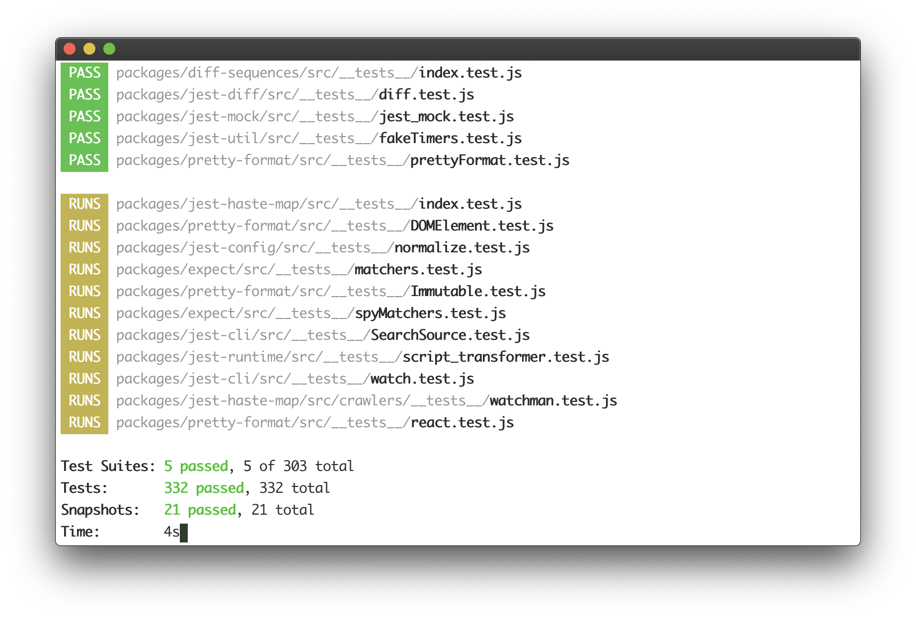
Jest continuously writes the list of completed tests to the output, while updating test results at the bottom of the output in real-time. Here's how this user interface could be implemented with Ink:
```jsx
<>
{tests.map(test => (
))}
```
See [examples/jest](examples/jest/jest.js) for a basic implementation of Jest's UI.
#### ``
`` is a [React context](https://reactjs.org/docs/context.html#reactcreatecontext), which exposes a method to manually exit the app (unmount).
Import:
```js
import {AppContext} from 'ink';
```
##### exit
Type: `Function`
Exit (unmount) the whole Ink app.
Usage:
```jsx
{({ exit }) => (
{/* Calling `onExit()` from within will unmount the app */}
)}
```
If `exit` is called with an Error, `waitUntilExit` will reject with that error.
#### ``
`` is a [React context](https://reactjs.org/docs/context.html#reactcreatecontext), which exposes input stream.
Import:
```js
import {StdinContext} from 'ink';
```
##### stdin
Type: `stream.Readable`
Default: `process.stdin`
Stdin stream passed to `render()` in `options.stdin` or `process.stdin` by default.
Useful if your app needs to handle user input.
Usage:
```jsx
{({ stdin }) => (
)}
```
##### isRawModeSupported
Type: `boolean`
A boolean flag determining if the current `stdin` supports `setRawMode`.
A component using `setRawMode` might want to use `isRawModeSupported` to nicely fall back in environments where raw mode is not supported.
Usage:
```jsx
{({ isRawModeSupported, setRawMode, stdin }) => (
isRawModeSupported ? :
)}
```
##### setRawMode
Type: `function`
See [`setRawMode`](https://nodejs.org/api/tty.html#tty_readstream_setrawmode_mode).
Ink exposes this function via own `` to be able to handle Ctrl+C, that's why you should use Ink's `setRawMode` instead of `process.stdin.setRawMode`. Ink also enables `keypress` events via [`readline.emitKeypressEvents()`](https://nodejs.org/api/readline.html#readline_readline_emitkeypressevents_stream_interface) when raw mode is enabled.
**Warning:** This function will throw unless the current `stdin` supports `setRawMode`. Use [`isRawModeSupported`](#israwmodesupported) to detect `setRawMode` support.
Usage:
```jsx
{({ setRawMode }) => (
)}
```
#### ``
`` is a [React context](https://reactjs.org/docs/context.html#reactcreatecontext), which exposes stdout stream, where Ink renders your app.
Import:
```js
import {StdoutContext} from 'ink';
```
##### stdout
Type: `stream.Writable`
Default: `process.stdout`
Usage:
```jsx
{({ stdout }) => (
)}
```
## Hooks
### useInput
This hook is used for handling user input.
It's a more convienient alternative to using `StdinContext` and listening to `data` events.
The callback you pass to `useInput` is called for each character when user enters any input.
However, if user pastes text and it's more than one character, the callback will be called only once and the whole string will be passed as `input`.
You can find a full example of using `useInput` at [examples/useinput](examples/useinput/useinput.js).
```jsx
import {useInput} from 'ink';
const UserInput = () => {
useInput((input, key) => {
if (input === 'q') {
// Exit program
}
if (key.leftArrow) {
// Left arrow key pressed
}
});
return …
};
```
The handler function that you pass to `useInput` receives two arguments:
#### input
Type: `string`
The input that the program received.
#### key
Type: `object`
Handy information about a key that was pressed.
##### key.leftArrow
##### key.rightArrow
##### key.upArrow
##### key.downArrow
Type: `boolean`
Default: `false`
If an arrow key was pressed, the corresponding property will be `true`.
For example, if user presses left arrow key, `key.leftArrow` equals `true`.
##### key.return
Type: `boolean`
Default: `false`
Return (Enter) key was pressed.
##### key.ctrl
Type: `boolean`
Default: `false`
Ctrl key was pressed.
##### key.shift
Type: `boolean`
Default: `false`
Shift key was pressed.
##### key.meta
Type: `boolean`
Default: `false`
[Meta key](https://en.wikipedia.org/wiki/Meta_key) was pressed.
### useApp
`useApp` is a React hook, which exposes props of [`AppContext`](#appcontext).
```js
import {useApp} from 'ink';
const MyApp = () => {
const {exit} = useApp();
};
```
It's equivalent to consuming `AppContext` props via `AppContext.Consumer`:
```jsx
{({exit}) => {
// …
}}
```
### useStdin
`useStdin` is a React hook, which exposes props of [`StdinContext`](#stdincontext).
Similar to `useApp`, it's equivalent to consuming `StdinContext` directly.
### useStdout
`useStdout` is a React hook, which exposes props of [`StdoutContext`](#stdoutcontext).
Similar to `useApp`, it's equivalent to consuming `StdoutContext` directly.
## Useful Components
- [ink-text-input](https://github.com/vadimdemedes/ink-text-input) - Text input.
- [ink-spinner](https://github.com/vadimdemedes/ink-spinner) - Spinner.
- [ink-select-input](https://github.com/vadimdemedes/ink-select-input) - Select (dropdown) input.
- [ink-link](https://github.com/sindresorhus/ink-link) - Link component.
- [ink-box](https://github.com/sindresorhus/ink-box) - Styled box component.
- [ink-gradient](https://github.com/sindresorhus/ink-gradient) - Gradient color component.
- [ink-big-text](https://github.com/sindresorhus/ink-big-text) - Awesome text component.
- [ink-image](https://github.com/kevva/ink-image) - Display images inside the terminal.
- [ink-tab](https://github.com/jdeniau/ink-tab) - Tab component.
- [ink-color-pipe](https://github.com/LitoMore/ink-color-pipe) - Create color text with simpler style strings in Ink.
- [ink-multi-select](https://github.com/karaggeorge/ink-multi-select) - Select one or more values from a list
- [ink-divider](https://github.com/JureSotosek/ink-divider) - A divider component.
- [ink-progress-bar](https://github.com/brigand/ink-progress-bar) - Configurable component for rendering progress bars.
- [ink-table](https://github.com/maticzav/ink-table) - Table component.
### Incompatible components
These are components that haven't migrated to Ink 2 yet:
- [ink-console](https://github.com/ForbesLindesay/ink-console) - Render output from `console[method]` calls in a scrollable panel.
- [ink-confirm-input](https://github.com/kevva/ink-confirm-input) - Yes/No confirmation input.
- [ink-checkbox-list](https://github.com/MaxMEllon/ink-checkbox-list) - Checkbox.
- [ink-quicksearch](https://github.com/aicioara/ink-quicksearch) - Select Component with fast quicksearch-like navigation
- [ink-autocomplete](https://github.com/maticzav/ink-autocomplete) - Autocomplete.
- [ink-broadcast](https://github.com/jimmed/ink-broadcast) - Implementation of react-broadcast for Ink.
- [ink-router](https://github.com/jimmed/ink-router) - Implementation of react-router for Ink.
- [ink-select](https://github.com/karaggeorge/ink-select) - Select component.
- [ink-scrollbar](https://github.com/karaggeorge/ink-scrollbar) - Scrollbar component.
- [ink-text-animation](https://github.com/yardnsm/ink-text-animation) - Text animation component.
- [ink-figlet](https://github.com/KimotoYanke/ink-figlet) - Large text component with Figlet fonts.
## Testing
Ink components are simple to test with [ink-testing-library](https://github.com/vadimdemedes/ink-testing-library).
Here's a simple example that checks how component is rendered:
```jsx
import React from 'react';
import {Text} from 'ink';
import {render} from 'ink-testing-library';
const Test = () => Hello World;
const {lastFrame} = render();
lastFrame() === 'Hello World'; //=> true
```
Visit [ink-testing-library](https://github.com/vadimdemedes/ink-testing-library) for more examples and full documentation.
## Experimental Mode
Ink has experimental mode, which includes stable new features behind a flag.
They're exposed behind a flag, because I want to be extra sure that it doesn't introduce regressions before shipping this new code for everyone and making it a default.
Instead of shipping it under `next` tag or something similar, Ink ships it as part of a regular release.
It can be enabled simply by passing `experimental` parameter to `render()` function:
```jsx
render(, {experimental: true});
```
Feel free to use experimental mode in development and I would appreciate if you reported any regressions you might see.
### More efficient reconciler and renderer
Experimental mode enables a new reconciler and renderer, which should significantly improve the rendering performance of your Ink apps.
Ink rebuilds the entire layout and output on every update, which can be taxing if there's a high frequency of updates.
Experimental mode ensures only necessary parts of the layout are updated and limits the number of renders to 60 frames per second.
### Automatic handling of oversized output
Unfortunately, terminals can't rerender output that is taller than terminal window.
So if your app output has a height of 60 rows, but user resized terminal window to 50 rows, first 10 rows won't be rerendered, because they're out of viewport.
Experimental mode adopts the same workaround that Jest does, it erases the entire terminal content if output is taller than terminal window. It comes with tradeoffs though:
- Output can become janky, since erasing terminal is not a "cheap" operation.
- Entire scrollback history in that terminal session will be lost.
It is, however, the only way known now to handle this.
## Maintainers
- [Vadim Demedes](https://github.com/vadimdemedes)
- [Sindre Sorhus](https://github.com/sindresorhus)
 You can also check it out live on [repl.it sandbox](https://ink-counter-demo.vadimdemedes.repl.run/).
Feel free to play around with the code and fork this repl at [https://repl.it/@vadimdemedes/ink-counter-demo](https://repl.it/@vadimdemedes/ink-counter-demo).
## Who's Using Ink?
- [Gatsby](https://www.gatsbyjs.org) - Gatsby is a modern web framework for blazing fast websites.
- [Parcel](https://parceljs.org) - Blazing fast, zero configuration web application bundler.
- [tap](https://node-tap.org) - A Test-Anything-Protocol library for JavaScript.
- [Typewriter](https://github.com/segmentio/typewriter) - Generates strongly-typed [Segment](https://segment.com) analytics clients from arbitrary JSON Schema.
- [Prisma](https://www.prisma.io) - The unified data layer for modern applications.
- [Wallace](https://www.projectwallace.com) - Pretty CSS analytics on the CLI.
- [tink](https://github.com/npm/tink) - Next-generation runtime and package manager.
- [Splash](https://github.com/Shopify/polaris-react/tree/master/scripts/splash) - Observe the splash zone of a change across the Shopify's [Polaris](https://polaris.shopify.com) component library.
- [emoj](https://github.com/sindresorhus/emoj) - Find relevant emoji on the command-line.
- [emma](https://github.com/maticzav/emma-cli) - Terminal assistant to find and install npm packages.
- [sindresorhus](https://github.com/sindresorhus/sindresorhus) - The Sindre Sorhus CLI.
- [swiff](https://github.com/simple-integrated-marketing/swiff) - Multi-environment command line tools for time-saving web developers.
- [share](https://github.com/marionebl/share-cli) - Quickly share files from your command line.
- [Kubelive](https://github.com/ameerthehacker/kubelive) - CLI for Kubernetes to provide live data about the cluster and its resources.
- [changelog-view](https://github.com/jdeniau/changelog-view) - Tool view changelog in console.
- [gomoku-terminal](https://github.com/acrazing/gomoku-terminal) - Play online Gomoku in the terminal.
- [cfpush](https://github.com/mamachanko/cfpush) - An interactive Cloud Foundry tutorial in your terminal.
- [startd](https://github.com/mgrip/startd) - Turn your React component into a web app from the command-line.
## Contents
- [Getting Started](#getting-started)
- [Examples](#examples)
- [API](#api)
- [Building Layouts](#building-layouts)
- [Built-in Components](#built-in-components)
- [Hooks](#hooks)
- [Useful Components](#useful-components)
- [Testing](#testing)
- [Experimental mode](#experimental-mode)
## Getting Started
Ink's goal is to provide the same component-based UI building experience that React provides, but for command-line apps. It uses [yoga-layout](https://github.com/facebook/yoga) to allow Flexbox layouts in the terminal. If you are already familiar with React, you already know Ink.
The key difference you have to remember is that the rendering result isn't a DOM, but a string, which Ink writes to the output.
To get started with Ink quickly, use [create-ink-app](https://github.com/vadimdemedes/create-ink-app) to quickly scaffold a new Ink-based CLI. Alternatively, here's how to configure Babel to work with Ink. To ensure all examples work and you can begin your adventure, make sure to set up Babel with a React preset. After [installing Babel](https://babeljs.io/docs/en/usage), configure it in `package.json`:
```json
{
"babel": {
"presets": [
"@babel/preset-react",
[
"@babel/preset-env",
{
"targets": {
"node": true
}
}
]
]
}
}
```
Don't forget to import `React` into every file that contains JSX:
```jsx
import React from 'react';
import {render, Box} from 'ink';
const Demo = () => (
You can also check it out live on [repl.it sandbox](https://ink-counter-demo.vadimdemedes.repl.run/).
Feel free to play around with the code and fork this repl at [https://repl.it/@vadimdemedes/ink-counter-demo](https://repl.it/@vadimdemedes/ink-counter-demo).
## Who's Using Ink?
- [Gatsby](https://www.gatsbyjs.org) - Gatsby is a modern web framework for blazing fast websites.
- [Parcel](https://parceljs.org) - Blazing fast, zero configuration web application bundler.
- [tap](https://node-tap.org) - A Test-Anything-Protocol library for JavaScript.
- [Typewriter](https://github.com/segmentio/typewriter) - Generates strongly-typed [Segment](https://segment.com) analytics clients from arbitrary JSON Schema.
- [Prisma](https://www.prisma.io) - The unified data layer for modern applications.
- [Wallace](https://www.projectwallace.com) - Pretty CSS analytics on the CLI.
- [tink](https://github.com/npm/tink) - Next-generation runtime and package manager.
- [Splash](https://github.com/Shopify/polaris-react/tree/master/scripts/splash) - Observe the splash zone of a change across the Shopify's [Polaris](https://polaris.shopify.com) component library.
- [emoj](https://github.com/sindresorhus/emoj) - Find relevant emoji on the command-line.
- [emma](https://github.com/maticzav/emma-cli) - Terminal assistant to find and install npm packages.
- [sindresorhus](https://github.com/sindresorhus/sindresorhus) - The Sindre Sorhus CLI.
- [swiff](https://github.com/simple-integrated-marketing/swiff) - Multi-environment command line tools for time-saving web developers.
- [share](https://github.com/marionebl/share-cli) - Quickly share files from your command line.
- [Kubelive](https://github.com/ameerthehacker/kubelive) - CLI for Kubernetes to provide live data about the cluster and its resources.
- [changelog-view](https://github.com/jdeniau/changelog-view) - Tool view changelog in console.
- [gomoku-terminal](https://github.com/acrazing/gomoku-terminal) - Play online Gomoku in the terminal.
- [cfpush](https://github.com/mamachanko/cfpush) - An interactive Cloud Foundry tutorial in your terminal.
- [startd](https://github.com/mgrip/startd) - Turn your React component into a web app from the command-line.
## Contents
- [Getting Started](#getting-started)
- [Examples](#examples)
- [API](#api)
- [Building Layouts](#building-layouts)
- [Built-in Components](#built-in-components)
- [Hooks](#hooks)
- [Useful Components](#useful-components)
- [Testing](#testing)
- [Experimental mode](#experimental-mode)
## Getting Started
Ink's goal is to provide the same component-based UI building experience that React provides, but for command-line apps. It uses [yoga-layout](https://github.com/facebook/yoga) to allow Flexbox layouts in the terminal. If you are already familiar with React, you already know Ink.
The key difference you have to remember is that the rendering result isn't a DOM, but a string, which Ink writes to the output.
To get started with Ink quickly, use [create-ink-app](https://github.com/vadimdemedes/create-ink-app) to quickly scaffold a new Ink-based CLI. Alternatively, here's how to configure Babel to work with Ink. To ensure all examples work and you can begin your adventure, make sure to set up Babel with a React preset. After [installing Babel](https://babeljs.io/docs/en/usage), configure it in `package.json`:
```json
{
"babel": {
"presets": [
"@babel/preset-react",
[
"@babel/preset-env",
{
"targets": {
"node": true
}
}
]
]
}
}
```
Don't forget to import `React` into every file that contains JSX:
```jsx
import React from 'react';
import {render, Box} from 'ink';
const Demo = () => (