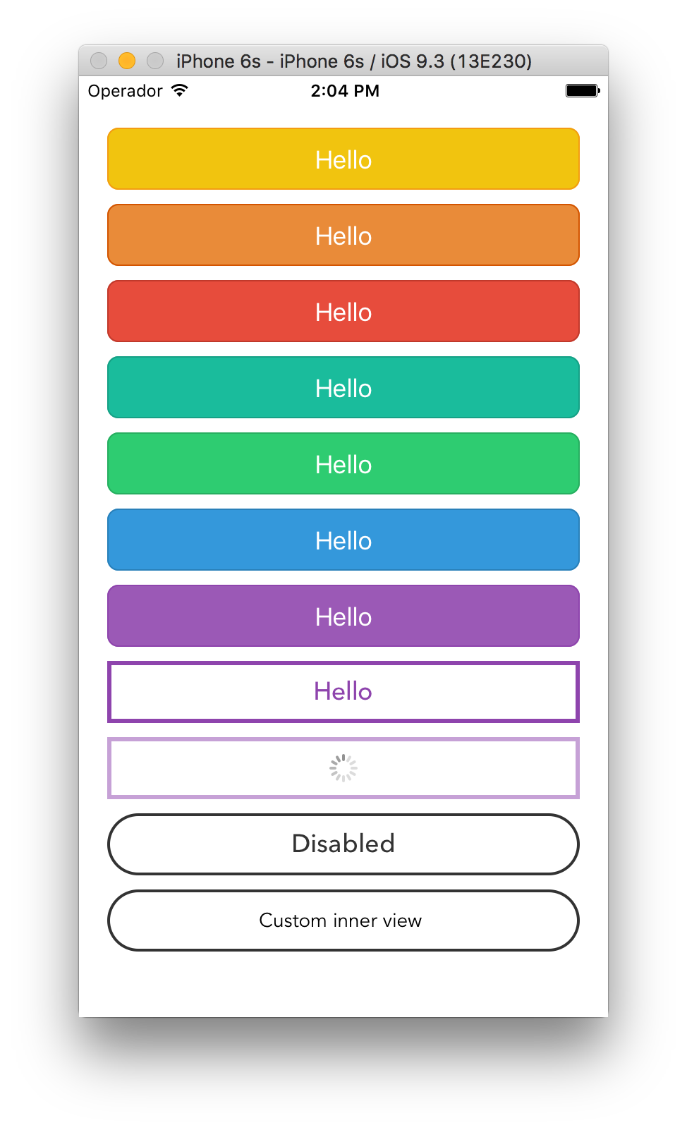
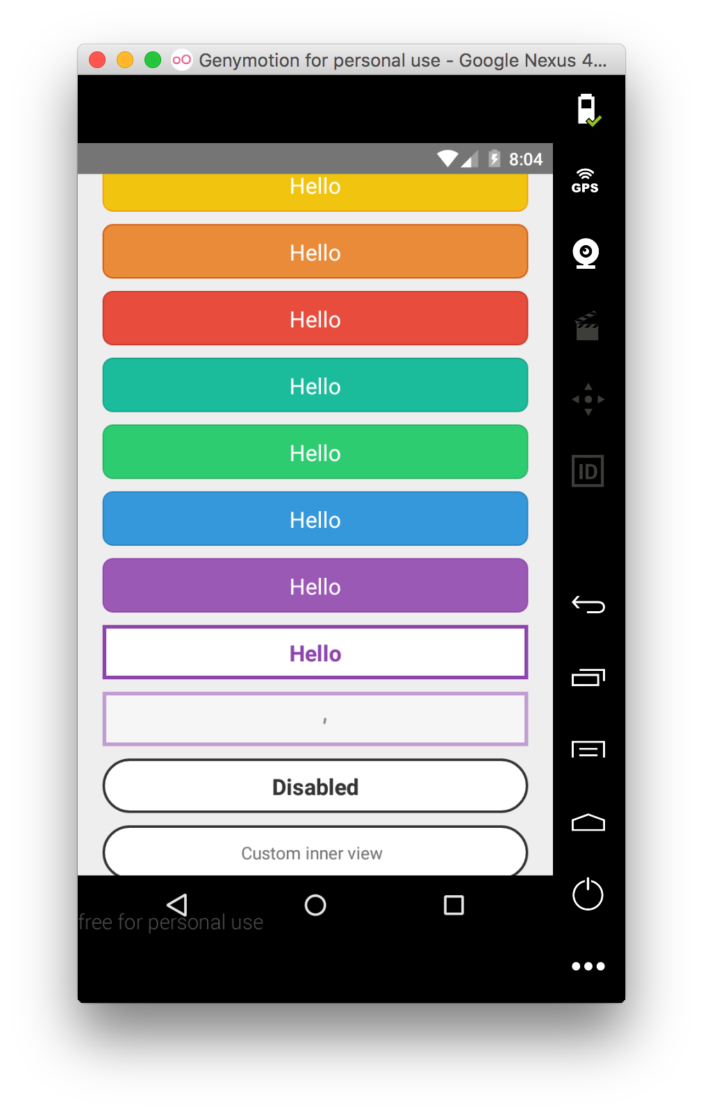
Renders a ``TouchableOpacity`` under iOS and a ``TouchableNativeFeedback`` under Android.
## Install
``apsl-react-native-button`` needs React Native 0.16 or higher.
Install the package:
```bash
$ npm i apsl-react-native-button --save
```
Import the ``Button`` component:
```javascript
import Button from 'apsl-react-native-button'
```
## Usage
Provide ``TouchableWithoutFeedback``' props to the component (including ``style``),
``textStyle``'s ``StyleSheet`` to customize the inner text and a children node
to render. You can also provide the ``isLoading`` prop that will dim the button
and disable it to prevent accidental taps.
```javascript
```
## API
| Prop | Type | Description |
|------|------|-------------|
| ``onPress`` | ``func`` | Function to execute when the ``onPress`` event is triggered. |
| ``onPressIn`` | ``func`` | Function to execute when the ``onPressIn`` event is triggered. |
| ``onPressOut`` | ``func`` | Function to execute when the ``onPressOut`` event is triggered. |
| ``onLongPress`` | ``func`` | Function to execute when the ``onLongPress`` event is triggered. |
| ``textStyle`` | ``TextStylePropTypes`` | The StyleSheet to apply to the inner button text. |
| ``disabledStyle`` | ``TextStylePropTypes`` | The StyleSheet to apply when disabled. |
| ``children`` | ``string`` | The ``string`` to render as the text button. |
| ``isLoading`` | ``bool`` | Renders an inactive state dimmed button with a spinner if ``true``. |
| ``isDisabled`` | ``bool`` | Renders an inactive state dimmed button if ``true``. |
| ``activityIndicatorColor`` | ``string`` | Sets the button of the ``ActivityIndicatorIOS`` or ``ProgressBarAndroid`` in the loading state. |
| ``background`` | ``TouchableNativeFeedback.propTypes.background`` | **Android only**. The background prop of ``TouchableNativeFeedback``. |
Check the included example for more options.
## Similar projects
[James Ide](https://github.com/ide/)'s ``react-native-button`` https://github.com/ide/react-native-button/
## License
MIT.