# giu
**Repository Path**: mirrors_guigrpa/giu
## Basic Information
- **Project Name**: giu
- **Description**: A collection of React components and utilities
- **Primary Language**: Unknown
- **License**: MIT
- **Default Branch**: master
- **Homepage**: None
- **GVP Project**: No
## Statistics
- **Stars**: 1
- **Forks**: 0
- **Created**: 2020-11-23
- **Last Updated**: 2026-04-19
## Categories & Tags
**Categories**: Uncategorized
**Tags**: None
## README
# Giu [](https://www.npmjs.com/package/giu)
An opinionated Swiss-army knife for building React application GUIs.
Online demos: [an extremely compact one](http://guigrpa.github.io/giu/compact/) ([Material Design Lite version here](http://guigrpa.github.io/giu/material/)) and [an interactive version of this documentation](http://guigrpa.github.io/giu).
## Why?
- Improvements over native HTML inputs: (optional) [state delegation](#inputs), [comprehensive validation](#input-validation), [native JS types and nullability](#input-value-types).
- Support for **Server-Side Rendering**.
- Support for **i18n**: error messages, date inputs, etc.
- Love for detail:
+ [Stackable modals](#modals) with autofocus, default buttons, etc.
+ Sticky/retainable [notifications](#notifications)
+ [Keyboard shortcuts](#select) (cmd/ctrl-J, shift-up...) for options in selects and drop-down menus
+ Keyboard navigation for (almost) everything
+ Automatic scroll-into-view when inputs, even custom ones, are focused
+ Smart positioning of floating pickers (date and color inputs, drop-down menus, validation errors, etc.)
+ Ultra-customisable [date/time inputs](#dateinput)
+ Textarea with auto-resize
+ Uniform, lightweight styles that can easily be overriden via CSS
* An extremely flexible [data table](#datatable) component
+ ... and a gorgeous [analog time picker](#dateinput)!
- Simple theme settings: overall style (default vs. Material Design Lite)...
- Easy creation of [hint screens](#hint-screens) with dynamically-positioned labels and arrows
- Lots of [helper functions](#helpers)
## Installation
Giu is intended to be bundled, e.g. with [*webpack*](https://webpack.github.io/). The examples under *packages/giu-examples/pages* are bundled with [Next.js](https://github.com/zeit/next.js/) and support SSR. Install it like this:
```
$ npm install --save-dev giu
```
Make sure you also install the required `peerDependencies` ([*react*](https://github.com/facebook/react)). Optionally, you may want to add:
* [*moment*](https://github.com/moment/moment) — if you are going to use the DateInput component
* [*material-design-lite*](https://github.com/google/material-design-lite) — if you are going to use the `mdl` theme (see example bundling for Webpack under *packages/giu-examples/pages/material.js*)
You may also want to **add fonts to your bundle** (no longer included in Giu starting with v0.15). For example, the Hints component uses *Gloria Hallelujah* by default -- make sure you load it from Google Fonts, bundle it via something like [typeface-gloria-hallelujah](https://www.npmjs.com/package/typeface-gloria-hallelujah) (if you use Webpack), or just configure the Hints component with a different font. The same applies to *Font Awesome* (default icon font), *Roboto* and *Material Icons* (for the `mdl` theme).
Once you've installed Giu, just `import { WhateverComponentYouNeed, maybeAlsoFunctions } from 'giu'`. The details on what is available can be found below. Note that many Giu components (including all inputs) require that you **include `` at (or near) the root level of your React tree**. No props are required. If you forget it, you'll see a warning in the console and those components will not work correctly. Other components you might want to add (if you use them): ``, ``, ``. More about them below.
## Inputs
Giu provides a wide variety of inputs and several useful abstractions over native HTML native elements: state delegation (optional), comprehensive validation, JS types and nullability.
You'll understand the benefits it brings with an example. Let's say you want to build a form that allows users to modify certain parameters of their registration profile, e.g. their age. With native HTML inputs, you'd use something like this:
```html
this.setState({ age: Number(age) })}
/>
```
It seems simple, right? But in reality you are handling a lot of stuff yourself:
* You must keep track of the original `age` value in the profile (let's assume it was received as `this.props.age`), as well as the modified user value (`this.state.age`).
* You must provide an `onChange` handler and keep your state up to date.
* You must convert back and forth between the input's `string` value and your `number` attribute.
* You must validate input contents before submitting the form.
You *could* use Giu in a similar way:
```html
this.setState({ age })}
/>
```
This approach follows *The React Way™*, but we're already seeing a first benefit: the `onChange` handler will be called (in addition to the native event) with the *converted* input value: either a number or `null`; no need to do the conversion ourselves.
But we can further improve on this:
```html
// alternatively: { this.refAge = c; }} ... />
```
What's happened here? We only pass the original age as `value`, but we delegate keeping track of the value entered by the user. We also drop the `onChange` handler and add some `validators` (see [details below](#input-validation)). When the time comes to submit the form, we can do:
```js
onClickSubmit() {
this.refs.age.validateAndGetValue().then(age => { ... })
}
```
The promise returned by `validateAndGetValue()` will either resolve with the current value or reject if validation fails.
### Input value types
Most HTML inputs can only hold strings. Giu inputs provide you with JS types and allow `null` values by default (include the `required` flag to change that):
| Components | JS type |
| --- | --- |
| TextInput, PasswordInput, Textarea | *string* |
| NumberInput, RangeInput | *number* |
| Checkbox | *boolean* |
| DateInput | *Date* (see full range of date/time possibilities below) |
| Select, RadioGroup | *any* (depends on the values specified in the `items` prop, see below) |
| ColorInput | *string* (e.g. `rgba(173, 163, 120, 0.62)`) |
| FileInput | *File* |
### Input validation
#### Predefined validators
Some validators are enabled by default:
```html
// Shows an error if the provided value is an invalid date.
// Will NOT complain if left blank; by default, Giu inputs can be left blank.
```
Validation occurs automatically when the input loses focus (i.e. on `blur`). You can also trigger it imperatively by calling `validateAndGetValue()` (see [Imperative API](#imperative-api)).
Enabling additional validators is easy:
```html
// Shows an error if left blank ('is required')
// OR if the format is not valid ('must be a valid date...').
// Shows an error only if a value is specified but it's not valid.
```
Here is the list of predefined validators:
```js
// Generic
isRequired() // same as the 'required' attribute, but allowing customisation
isEqualTo(password, 'password')
isOneOf(['rabbit', 'cow', 'eagle'])
// Strings
hasAtLeastChars(5)
hasAtMostChars(20)
hasLengthWithinRange(5, 20)
isEmail()
isUrl()
matchesPattern(/[-+]?[0-9]*\.?[0-9]+/)
// Numbers
isNumber()
isGreaterThanOrEqual(0) // or: isGte(0)
isLowerThanOrEqual(1000) // or: isLte(1000)
isWithinRange(0, 1000)
// Dates and times
isDate()
```
As we saw above, some of these validators are automatically enabled for certain components, e.g. `isDate()` in DateInputs and `isNumber()` in NumberInputs. However, you can include them in your `validators` list for customisation (e.g. i18n), as you'll see next.
#### Custom validators
Customise a predefined validator by passing it an additional argument upon instantiation. This argument can be a string or a function returning the desired error message (e.g. for i18n) based on the following arguments:
* Default error message
* Current (internal) input value
* Extra context, including the validator arguments (e.g. the `min` and `max` values for `isWithinRange`) and additional information (e.g. the expected format `fmt` for date/time values).
Some examples:
```html
// Override the message for the `isEmail` validator
// Override the message for the `required` validator
// Specify a function to further customise/translate your message
import i18n from 'mady'; // a translation function
i18n("'{VALUE}' is not a valid email address", { VALUE })),
]} />
// The error message function may use the extra context parameter:
`follow this format: ${fmt}`),
]} />
i18n('must be >= {MIN}', { MIN: min })),
]} />
```
You can also create your own validators, which can be synchronous (returning an error message) or asynchronous (returning a promise of an error message) and should have this signature:
* **value** *any?*: the current internal value of the input component
* **props** *object*: the input component's props (including default props)
* **context** *object?*: additional validator context provided by certain components. For example, `DateInput` injects the `moment` object via context
* **Returns** *Promise(string?)|string?*: error message
A couple of examples:
```html
// A custom sync validator
val.toLowerCase() === 'unicorn' ? undefined : 'must be a \'unicorn\''
]} />
// A custom async validator
new Promise((resolve, reject) =>
setTimeout(() =>
val.toLowerCase() === 'unicorn'
? resolve()
: resolve('checked the database; must be a \'unicorn\'')
, 1000)
),
]} />
```
### Imperative API
Giu generally follows *The React Way™*. In some particular cases, however, you may need or prefer a more imperative style:
1. Validate and fetch an input value before submitting a form
2. Move focus to an input, or away from it
3. Set an input's value (without affecting the original, reference value in the `value` prop) or revert the input state to the `value` prop
You have already seen how to accomplish task 1, via a direct component call. Assuming you keep a `ref` to the input component:
```js
async onClickSubmit() {
const age = await this.refAge.validateAndGetValue();
// ...
}
```
Tasks 2 and 3 above are also managed imperatively:
```js
// Focus/blur on an input
this.refAge.focus();
this.refAge.blur();
// Set the input's value (without touching the original value in props)
this.refAge.setValue(23);
// Revert the input's value
this.refAge.revert();
```
### Common input props
* Basic (see also the [introduction to inputs](#inputs)):
* **value** *any?*: either the original value to be modified by the user, or the current input value (if you want to manage state yourself). See also the list of [input value types](#input-value-types)
* **onChange** *function?*: include it if you want to manage state yourself, or if you just want to be informed about user changes
* **onFocus** *function?*
* **onBlur** *function?*
* **disabled** *boolean?*: prevents the input from being interacted with; also affects styles
* Validation-related (see also [input validation](#input-validation)):
* **required** *boolean?*: synonym for the `isRequired()` validator
* **validators** *array(object|function)?*: objects are used for predefined validators, whereas functions are used for custom ones
* **noErrors** *boolean?*: ignore validation altogether
* Float-related (for all inputs with floating pickers, e.g. Select, DateInput, ColorInput):
* **floatPosition** *string(`above`|`below`)?*: if unspecified, a suitable position is selected algorithmically
* **floatAlign** *string(`left`|`right`)? = `left`*: if unspecified, a suitable position is selected algorithmically
* Error-float-related:
* **errorPosition** *string(`above`|`below`)?*: if unspecified, Giu chooses `below` except if `floatPosition` is specified (it then chooses the opposite position)
* **errorAlign** *string(`left`|`right`)? = `left`*
### TextInput, PasswordInput, NumberInput, RangeInput, Textarea
Props:
```js
type PublicProps = {
...$Exact, // common to all inputs (check the docs!)
className?: string,
id?: string,
disabled?: boolean,
skipTheme?: boolean,
vertical?: boolean, // only for RangeInput
// all others are passed through to the `input` unchanged
};
```
### Checkbox
Props:
```js
type PublicProps = {
...$Exact, // common to all inputs (check the docs!)
className?: string,
id: string,
label?: React.Node, // React components to be included in the checkbox's `label` element
disabled?: boolean,
skipTheme?: boolean,
};
```
### DateInput
Shown below are some examples of DateInput, one of Giu's most versatile components: date/time/date-time modes, with or without drop-down pickers, inline pickers, digital/analogue time picker, disabled style... Not shown: keyboard navigation, clipboard events.
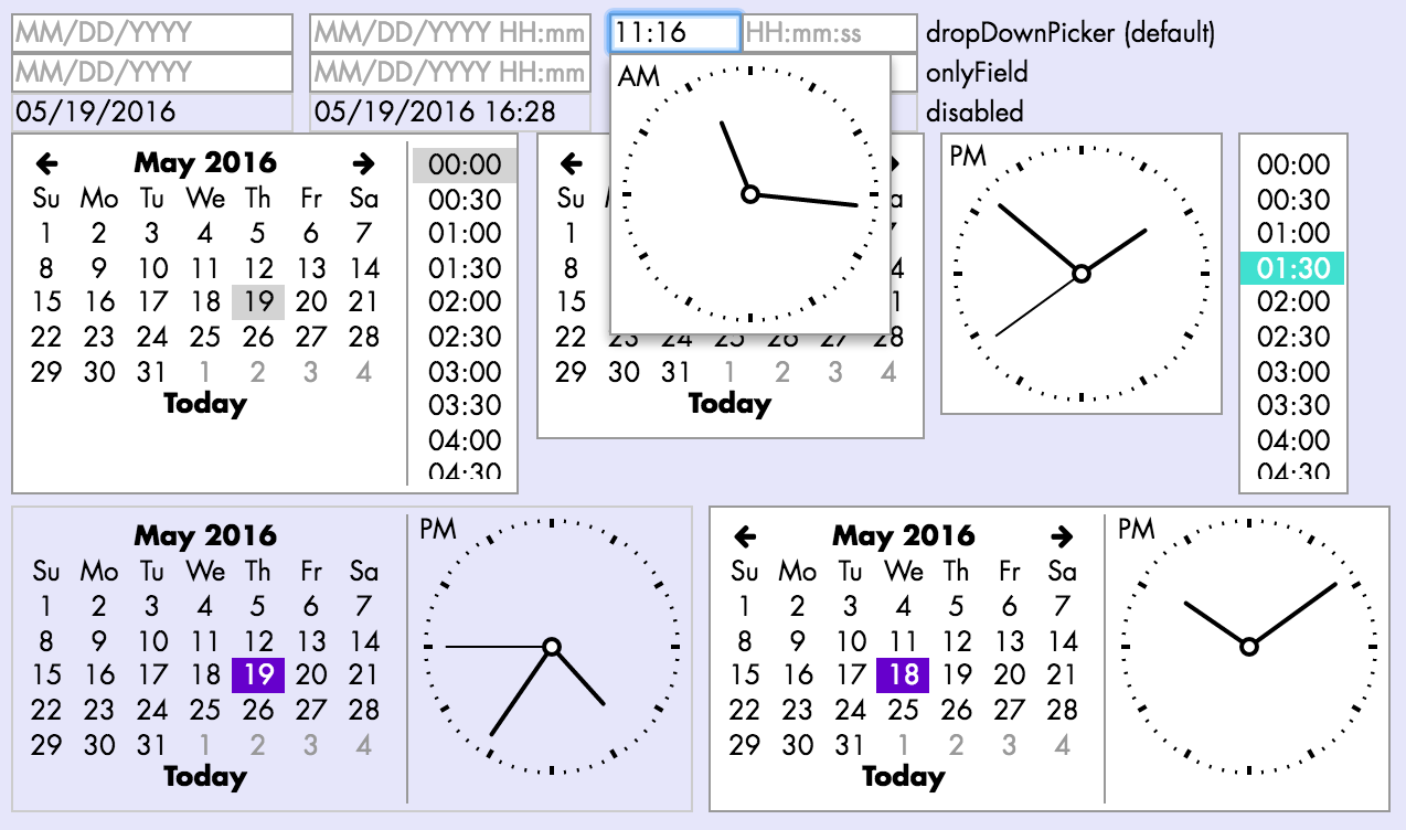
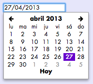
If you use [*moment*](https://github.com/moment/moment), your date picker and date/time formats will be automatically translated when you choose a different locale, e.g. `moment.locale('es')`:
Props:
```js
type PublicProps = {
...$Exact, // common to all inputs (check the docs!)
className?: string,
id?: string,
type?: PickerType, // see below (default: 'dropDownPicker')
// Whether Giu should check for iOS in order to simplify certain components
// (e.g. do not use analogue time picker) -- default: true
checkIos?: boolean,
disabled?: boolean,
placeholder?: string, // when unspecified, the expected date/time format will be used
date?: boolean, // whether the date is part of the value (default: true)
time?: boolean, // whether the time is part of the value (default: false)
// Whether the time picker should be analogue (traditional clock)
// or digital (list) (default: true)
analogTime?: boolean, // (default: true [in iOS: false])
seconds?: boolean, // whether seconds should be included in the time value (default: false)
// UTC mode; by default, it is `true` *unless* `date` and `time` are both `true`.
// In other words, local time is only used by default if both `date` and `time` are enabled
utc?: boolean, // (default: !(date && time))
todayName?: string, // label for the *Today* button (default: 'Today')
// Current language (used just for force-render).
// Use it to inform Giu that you have changed `moment`'s language.
lang?: string,
floatPosition?: FloatPosition,
floatAlign?: FloatAlign,
skipTheme?: boolean,
};
type PickerType = 'native' | 'onlyField' | 'inlinePicker' | 'dropDownPicker';
```
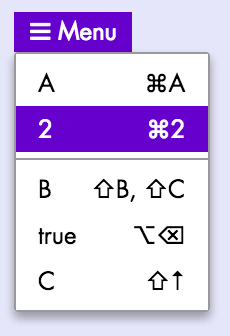
### Select
Shown below are some examples of Select and its features: `native` and custom (`inlinePicker`|`dropDownPicker`) versions, keyboard shortcuts, disabled style. Not shown: keyboard navigation, clipboard events, automatic scrolling.

*Recommendation: use `dropDownPicker` for performance, especially if you have hundreds/thousands of Selects with many options: `native` Selects attach all of their `option` subelements to the page, whereas custom Selects only do that when the dropdown is shown.*
Props:
```js
export type SelectProps = {
// Both SelectCustom and SelectNative
// ----------------------------------
className?: string,
id?: string,
type: SelectPickerType, // see below (default: 'native')
// Items with the following attributes:
// - **value** *any*: any value that can be converted to JSON. Values should be unique
// - **label** *string*: descriptive string that will be shown to the user
// - **keys** *array(string)?*: keyboard shortcuts for this option, e.g.
// `mod+a` (= `cmd+a` in OS X, `ctrl+a` in Windows), `alt+backspace`, `shift+up`...
// **Only supported in non-native Selects**
items: Array,
lang?: string, // current language (used just for force-render).
// Apart from its use for [validation](#input-validation),
// enabling this flag disables the addition of a `null` option to the `items` list
required?: boolean,
disabled?: boolean,
// SelectCustom only
// -----------------
children?: any,
onClickItem?: Function,
onCloseFloat?: Function,
floatPosition?: FloatPosition,
floatAlign?: FloatAlign,
// When enabled, two different visual styles are applied
// to an item depending on whether it is just *hovered* or also *selected*. If disabled,
// a single style is used to highlight the selected or the hovered item
twoStageStyle?: boolean,
};
export type SelectPickerType = 'native' | 'inlinePicker' | 'dropDownPicker';
```
You can also include a separator between `items` by including the special
`LIST_SEPARATOR` item (**only in non-native Selects**):
```js
import { Select, LIST_SEPARATOR } from 'giu';
```
### RadioGroup
Props:
```js
type PublicProps = {
...$Exact, // common to all inputs (check the docs!)
className?: string,
id: string, // mandatory!
items: Array,
lang?: string, // current language (used just for force-render)
disabled?: boolean,
};
type RadioChoice = {
value: any, // any value that can be converted to JSON. Values should be unique
// React elements that will be shown as a label for the corresponding radio button
label?: any | ((lang: ?string) => any),
labelExtra?: any, // React elements that will be shown below the main label
};
```
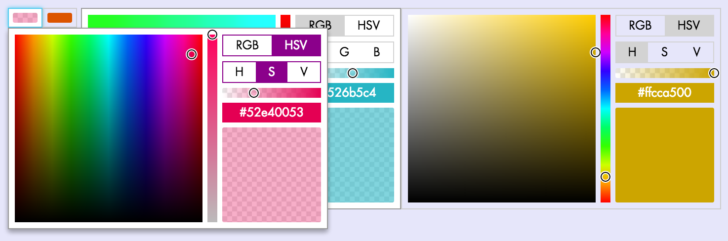
### ColorInput
Shown below are some examples of ColorInput and its features: inline and drop-down versions, RGB and HSV pickers, transparency slider, disabled style. Not shown: clipboard events.
Props:
```js
type PublicProps = {
...$Exact, // common to all inputs (check the docs!)
className?: string,
id?: string,
disabled?: boolean,
// Whether the complete color picker should be inlined or appear as a dropdown when clicked
inlinePicker?: boolean,
onCloseFloat?: () => any,
floatPosition?: FloatPosition,
floatAlign?: FloatAlign,
};
```
### FileInput
Props:
```js
type PublicProps = {
...$Exact, // common to all inputs (check the docs!)
className?: string,
id?: string,
children?: any, // React elements that will be shown inside the button(default: `Choose file…`)
disabled?: boolean,
skipTheme?: boolean,
};
```
## DataTable
A full-featured table supporting filtering, single/multiple selection,
pagination, infinite scrolling, sorting, drag and drop, clipboard events,
localStorage, etc.
Following Giu's philosophy, DataTable allows you to choose whether you
want to control individual features yourself, or you're OK with the
default behaviour. In many cases, you can set initial props (e.g.
`sortBy`, `sortDescending`, `selectedIds`, `manuallyOrderedIds`)
and then leave Giu the gruntwork of managing all the state. In order
to indicate this, just don't modify any of those props yourself.
Alternatively, if you want to manage state yourself, use the provided
callbacks (`onChangeSort`, `onChangeSelection`, `onChangeManualOrder`)
and update your props accordingly.
DataTable improves performance by only rendering the rows that are
visible. Rows can have uniform and well-known heights
(at the simplest end of the spectrum), uniform but unknown,
and also dynamic: different for every row, and even changing
in time (as a result of passed-down props or their own intrinsic state).
```js
type PublicProps = {
// Basic
// -----
className?: string,
id?: string,
itemsById?: Object, // Rows, keyed by id (default: {})
cols: Array, // Column configuration objects
lang?: string, // Used to force-refresh when language changes
// Set of rows to be shown (before filtering)
// ------------------------------------------
shownIds?: Array, // Row ids to be shown (default: [], no rows)
onChangeShownIds?: (shownIds: Array) => any,
alwaysRenderIds?: Array, // Render these rows even when not visible (e.g. editing)
commonCellProps?: Object, // Passed to all column `render` functions
// Filtering
// ---------
filterValue?: string, // (default: '')
neverFilterIds?: Array, // shown no matter what
// Sorting
// -------
headerClickForSorting?: boolean, // (default: true)
onChangeSort?: (options: {
sortBy: ?string,
sortDescending: boolean,
}) => any,
sortBy?: ?string, // Column, identified by `attr`
sortDescending?: boolean,
customPositions?: { [id: string]: ?string }, // if position is null, it will be sent to the top
// Manual sorting
allowManualSorting?: boolean, // Add manual sort column (default: true)
disableDragging?: boolean, // Keep the sort column (if any), but disable it (temporarily)
manuallyOrderedIds?: Array,
onChangeManualOrder?: (
manuallyOrderedIds: ?Array,
context: {
draggedId?: string, // ID of the row that has been dragged
}
) => any,
manualSortColLabel?: string | (() => string), // Custom column label (default: 'Sort manually')
// Selection
// ---------
selectedIds?: Array,
allowSelect?: boolean,
multipleSelection?: boolean,
onChangeSelection?: (selectedIds: Array) => any,
onClipboardAction?: (ev: SyntheticClipboardEvent<*>, json: string) => any,
onRowDoubleClick?: (ev: SyntheticMouseEvent<*>, id: string) => any,
// Fetching
// --------
// Set fetchMoreItems if you want DataTable to notify you when the last row is rendered
// (note: disabled when the filterValue prop is not empty)
fetchMoreItems?: (lastRowId: string) => any, // Called when the last row is rendered
fetching?: boolean, // When set, the FetchRowComponent will be shown
FetchRowComponent?: ComponentType,
// LocalStorage
// ------------
// Set collectionName if you want DataTable to persist some user prefs to localStorage:
// sort criteria, manual order, selection...
collectionName?: string,
// Miscellaneous
// -------------
emptyIndicator?: any,
// Styles
// ------
height?: number, // Body height (default: 200); set to -1 for 'whatever height is needed to show all rows'
width?: number, // (default: default div block behaviour)
rowHeight?: number, // Auto-calculated if unspecified
getRowClassNames?: ({ item: any, id: string }) => Array,
uniformRowHeight?: boolean, // Are rows of the same height (even if unknown a priori)? (default: false)
showHeader?: boolean, // (default: true)
animated?: boolean,
// For VirtualScroller specifically
estimatedMinRowHeight?: number,
numRowsInitialRender?: number,
maxRowsToRenderInOneGo?: number,
};
```
**Column definitions:**
```js
export type DataTableColumn = {
attr: string, // column identifier, also used to get rawValues by default
className?: string, // custom classes to be added to the giu-data-table-cells
// Label
// -----
// As a function, it will be called with the `commonCellProps`,
// if defined, or otherwise with the `lang` property)
label?: string | ((commonCellPropsOrLang: any) => string),
labelLevel?: number, // useful for very narrow cols (default: 0)
// Values
// ------
// Each cell has a "reference value", obtained through the `rawValue`
// callback (if present) or the column's `attr` property.
// The reference value is used for filtering, sorting, and copy events,
// unless the corresponding callbacks are set.
rawValue?: (item: Object) => any,
filterValue?: (item: Object) => any,
sortValue?: (item: Object) => any,
// Rendering
// ---------
// By default, the reference value is rendered. Customize this by
// specifying a `render` function.
render?: (item: Object) => ReactElement,
// Functionalities
// ---------------
sortable?: boolean, // (default: true)
sortableDescending?: boolean, // (default: true)
filterable?: boolean, // (default: true)
// Appearance
// ----------
hidden?: boolean,
};
```
## DropDownMenu
Props:
```js
type Props = {
className?: string,
id?: string,
// Items: similar to the Select component but including an `onClick` callback
items: Array,
// Other props
lang?: string, // current language (used just for force-render)
children?: any, // React elements that will be shown as the menu's title
onClickItem?: (
ev: SyntheticMouseEvent<*>, // `click` event
val: any // the item's `value` (as specified in the `items` prop)
) => any,
floatPosition?: FloatPosition,
floatAlign?: FloatAlign,
};
```
## Modals
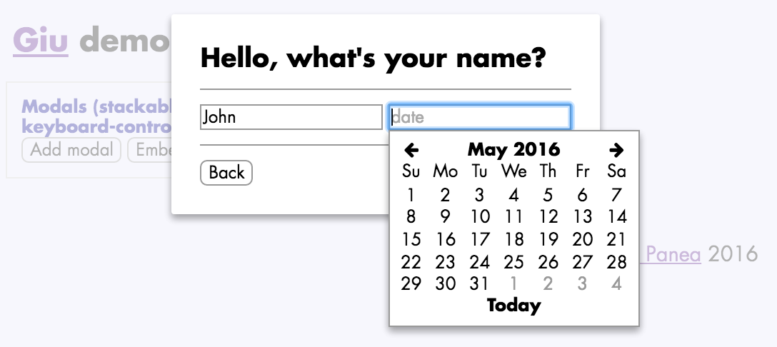
**Include the `` component at (or near)
the root level of your React tree**. No props are required.
**Note on iOS usage**: on iOS, don't use Modals with embedded
inputs (TextInput, DateInput and so on).
Due to [these bugs](https://dzone.com/articles/issues-position-fixed),
when the user focuses on the embedded input, the whole page scrolls to the top.
Here's an example on how you would open and close a modal:
```js
import { modalPush, modalPop, Button } from 'giu';
class ModalExample extends React.Component {
render() {
return
}
deleteItem() {
const children = 'Are you sure you want to delete this item?';
const deleteItem = () => { alert('deleted!'); modalPop(); }
const buttons = [
{ label: 'Close', onClick: modalPop, defaultButton: true },
{ label: 'Delete', onClick: deleteItem },
];
modalPush({ children, buttons, onEsc: modalPop });
}
}
```
API reference:
* **modalPush()**: creates a modal and pushes it on top of the stack:
- **pars** *ModalPars* (see Modal section)
* **modalPop()**: removes the modal currently at the top of the stack
**ModalPars and ModalButton definitions:**
```js
export type ModalPars = {|
className?: string,
id?: string,
title?: string, // modal title displayed to the user
children?: any, // body of the modal
buttons?: Array, // button objects (see below)
// called when the backdrop
// (semi-transparent layer highlighting the modal in fron of other
// page contents) is clicked
onClickBackdrop?: (ev: SyntheticMouseEvent<*>) => any,
onEsc?: (ev: SyntheticKeyboardEvent<*>) => any, // called when ESC is pressed
// merge with the modal's `div` style, e.g. to
// fix a modal width or background color
style?: Object,
|};
export type ModalButton = {|
left?: boolean, // align button left instead of right (default: false)
label?: any, // button text or other contents
disabled?: boolean,
plain?: boolean,
defaultButton?: boolean, // will be highlighted and automatically selected when RETURN is pressed
onClick?: (ev: SyntheticEvent<*>) => any, // `click` handler for the button
accent?: boolean, // accent style (use it with MDL theme)
|};
```
## Notifications
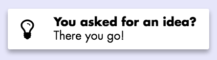
**Include the `` component at (or near)
the root level of your React tree**. No props are required.
Here's an example on how you would create a notification:
```js
import { notify, Button } from 'giu';
const NotifExample = () =>
;
```
API reference:
* **notify()**: creates a notification:
- **pars** *NotificationPars*: notification parameters (see below):
- **Returns** *string*: notification ID
* **notifRetain()**: marks a notification as retained
(it will not be automatically deleted, even if it's `sticky`):
- **id** *string*: ID of the notification to be marked as retained
* **notifDelete()**: deletes a notification:
- **id** *string*: ID of the notification to be deleted
**`NotificationPars` definition:**
```js
export type NotificationType = 'info' | 'success' | 'warn' | 'error';
export type NotificationPars = {|
id?: string,
sticky?: boolean, // never delete this notification
timeOut?: number, // time [ms] after which it's deleted [default: 4000]
type?: NotificationType, // default: `info`
icon?: string, // default: `exclamation`
iconFamily?: string,
iconSpin?: boolean,
title?: string, // highlighted text at the top of the notification
msg?: string, // notification text
onClick?: (ev: SyntheticEvent<*>) => any, // `click` handler
noStylePosition?: boolean,
noStyleShadow?: boolean,
|};
```
## Hint screens
Hint screens give tips on how to use your application, through
a combination of labels (icons, images, text) and dynamically-positioned
arrows. You can show hint screens, for example, when the user reaches a
certain part of your application or performs an action for the first time.
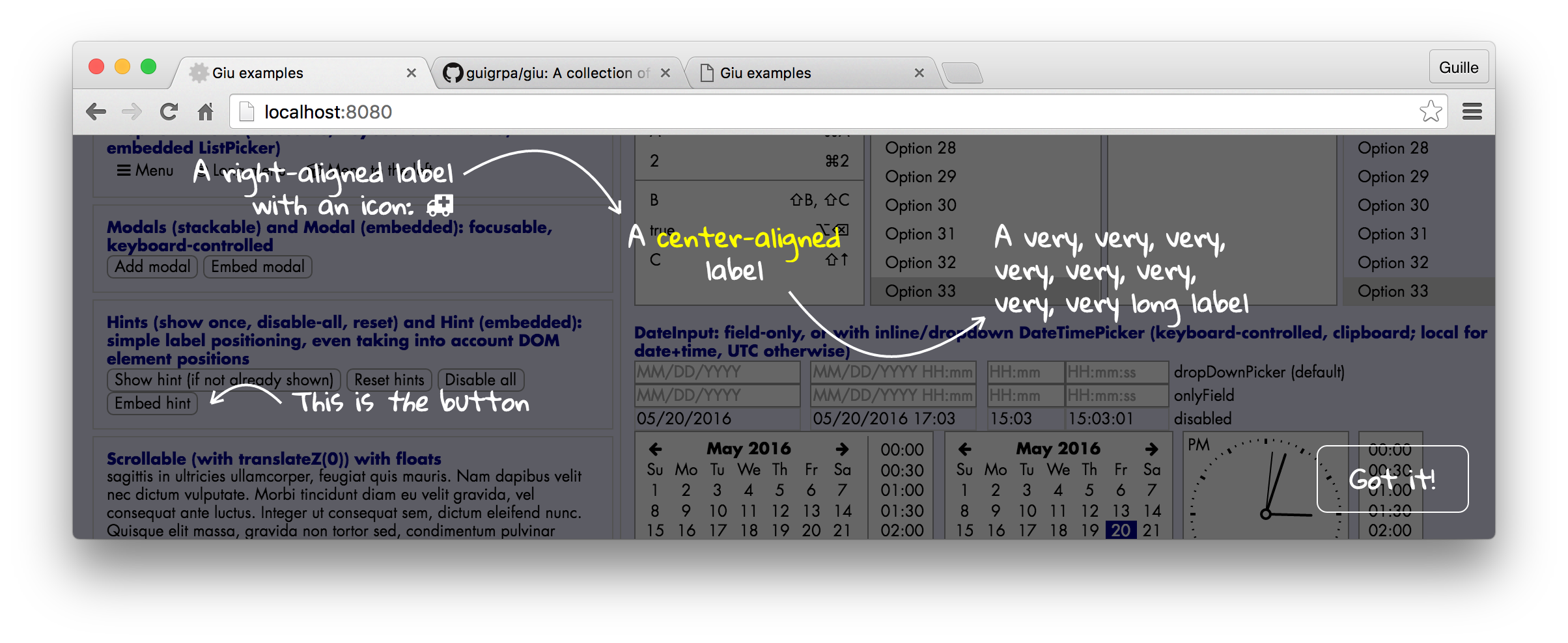
**Include the `` component at (or near)
the root level of your React tree**. No props are required.
Here's an example on how you would define a hint screen and show it
afterwards:
```js
import { hintShow, Button } from 'giu';
class HintExample extends React.Component {
componentDidMount() {
hintDefine('hintExample', {
elements: [
{
type: 'LABEL', x: 200, y: 50,
children: A label with an icon ,
},
{ type: 'ARROW', from: { x: 200, y: 50 }, to: { x: 50, y: 50 }, counterclockwise: true }
],
});
}
render() {
}
}
```
The first time you click on the button, the hint screen will appear.
After that, the `hintExample` screen will be disabled (unless `hintReset()`
is called or the `force` argument of `hintShow()` is used, see below).
The list of disabled hint screens is stored in LocalStorage.
API reference:
* **hintDefine()**: defines a hint screen:
- **id** *string*: ID of the hint to be created
- **pars** *HintScreenPars* (see below)
* **hintDisableAll()**: disables all hints
* **hintReset()**: clears the list of disabled hints
* **hintShow()**: shows a hint
- **id** *string*: ID of the hint to be shown
- **force?** *boolean*: if not enabled, the hint will only be shown if
hints are enabled (no previous call to `hintDisableAll()` and it has not
already been shown)
* **hintHide()**: hides the currently shown hint, if any
**`HintScreenPars`, `HintLabelPars` and `HintArrowPars` definitions:**
```js
export type HintScreenPars = {|
elements?: ElementsWrapper,
closeLabel?: string, // label of the close button (default: 'Got it!')
|};
type ElementsWrapper = Array | (() => Array);
type Element = HintArrowPars | HintLabelPars;
```
```js
export type HintLabelPars = {|
type: 'LABEL',
className?: string,
id?: string,
x: number,
y: number,
align?: AlignType, // (default: 'left')
children?: any, // React elements that comprise the label
|};
type AlignType = 'left' | 'right' | 'center';
```
```js
export type HintArrowPars = {
type: 'ARROW',
className?: string,
id?: string,
from: Point2, // coordinates, e.g. `{ x: 5, y: 10 }`
to: Point2, // coordinates
curveFactor?: number,
arrowSize?: number,
arrowAngle?: number,
counterclockwise?: boolean,
};
```
## Tiny little things
### Button
An inconspicuous-looking button-in-a-`span`. Props:
```js
type PublicProps = {
className?: string,
id?: string,
plain?: boolean, // removes most button styles
children?: any, // button contents (can include `Icon` components, etc.)
onClick?: (ev: SyntheticMouseEvent<*>) => any,
onMouseDown?: (ev: SyntheticMouseEvent<*>) => any,
disabled?: boolean,
skipTheme?: boolean,
// Additional props with `mdl` theme
colored?: boolean,
primary?: boolean,
accent?: boolean,
fab?: boolean,
};
```
### Icon and Spinner
A wrapper for Font Awesome icons. Props:
```js
type PublicProps = {
className?: string,
id?: string,
icon: string | [string, string], // e.g. `ambulance`, `cogs`...
family?: string, // e.g. `fas`, `far`
size?: 'lg' | '2x' | '3x' | '4x' | '5x',
fixedWidth?: boolean,
spin?: boolean,
pulse?: boolean,
onClick?: (ev: SyntheticMouseEvent<*>) => any,
disabled?: boolean,
skipTheme?: boolean,
style?: Object, // use sparsely (CSS should cover you in most cases!)
};
```
`Spinner` is a convenient shortcut for an `Icon` that, well, spins.
### LargeMessage
A simple `div` showing a centered message with a large font size.
Ideal for *No matches found*, *Choose one of the options above*,
that kind of thing. Props:
```js
type Props = {
children?: any, // contents to be shown
};
```
### Progress
A wrapper for the native HTML `progress` element (with 100% width).
```js
type PublicProps = {
className?: string,
id?: string,
value: any,
};
```
## Helpers
You can find here a wide variety of helper functions, from the very simple (`cancelEvent()`, `flexContainer()`) to the relatively complex (`scrollIntoView()`). This is just an opinionated collection of hopefully useful bits and pieces for building React components.
### DOM node visibility helpers
**isVisible()**
Determines whether the provided node is *fully* visible
in the browser window.
* **node** *?Node*: DOM node; if unspecified, the function returns `false`
* **bcr?** *ClientRect*: bounding client rectangle for `node`; if not specified,
`getBoundingClientRect()` will be called on `node`
* **Returns** *boolean*
**scrollIntoView()**
Scrolls the node's ancestors as needed in order to make a node fully visible
in the browser window (or at least most of it, if it is too large).
Implemented as a recursive algorithm that is first run
vertically and then horizontally.
* **node** *?Node*: DOM node
* **options?** *object = {}*: the following options are allowed:
- **topAncestor?** *?Node*: stop the recursive algorithm at this
ancestor (otherwise stops at the root level or when a `Modal`
ancestor is reached)
### Style helpers
**flexContainer()**
Provides an inline style object for a Flex container.
* **flexDirection** *('row' | 'column') = 'row'*
* **style?** *Object*: custom style (merged with the Flex style)
* **Returns** *Object*: Flex container style
**flexItem()**
Provides an inline style object for a Flex item.
* **flex** *string|number*: value for the CSS `flex`/`-webkit-flex` attribute
* **style?** *Object*: custom style (merged with the Flex style)
* **Returns** *Object*: Flex item style
**isDark() / isLight()**
Determines whether the provided color is perceived as dark or light.
Can be used to decide whether text on this background color should be light
or dark, respectively, for good readability.
* **color** *string|Object*: parameter describing the color (anything that
can be processed by [tinycolor](https://github.com/bgrins/TinyColor))
* **Returns** *boolean*: whether the color is dark (light)
**darken() / lighten()**
Darkens or lightens a given color by a given percentage.
* **color** *string|Object*: parameter describing the color (anything that
can be processed by [tinycolor](https://github.com/bgrins/TinyColor))
* **percentage?** *number = 10*: percentage by which the color will be modified
* **Returns** *string*: hex string for the new color, e.g. `#ffaadd`
**addStylesToPage()**
Creates a new `