# react-native-dialog
**Repository Path**: mirrors_jitsi/react-native-dialog
## Basic Information
- **Project Name**: react-native-dialog
- **Description**: Pure JavaScript React-Native dialog
- **Primary Language**: Unknown
- **License**: MIT
- **Default Branch**: master
- **Homepage**: None
- **GVP Project**: No
## Statistics
- **Stars**: 0
- **Forks**: 0
- **Created**: 2022-06-21
- **Last Updated**: 2025-12-27
## Categories & Tags
**Categories**: Uncategorized
**Tags**: None
## README
# react-native-dialog
[](https://badge.fury.io/js/react-native-dialog)
A flexible pure JavaScript React-Native dialog that follows closely the native UI guidelines.
## Features
- Support for iOS and Android (JavaScript API)
- A flexible declarative API
- Follows closely the UI of native dialogs/alerts
- Can be used both as an alert and as an input prompt
- Can be injected with any component
- Supports light/dark mode
## Demo
## Setup
Install the library using npm or yarn:
```bash
# Using npm:
$ npm install react-native-dialog
# Using yarn:
$ yarn add react-native-dialog
```
## Usage
React-native-dialog exposes a set of components that can be used to build the UI of the dialog:
- **Dialog.Container**: This component is the root component of the dialog and all the other components should be nested inside it.
- **Dialog.Title**: A `Text` component styled as a native dialog title.
- **Dialog.Description**: A `Text` component styled as a native dialog description.
- **Dialog.Button**: A component styled as a native dialog button.
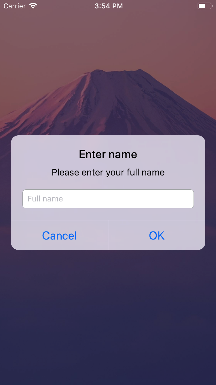
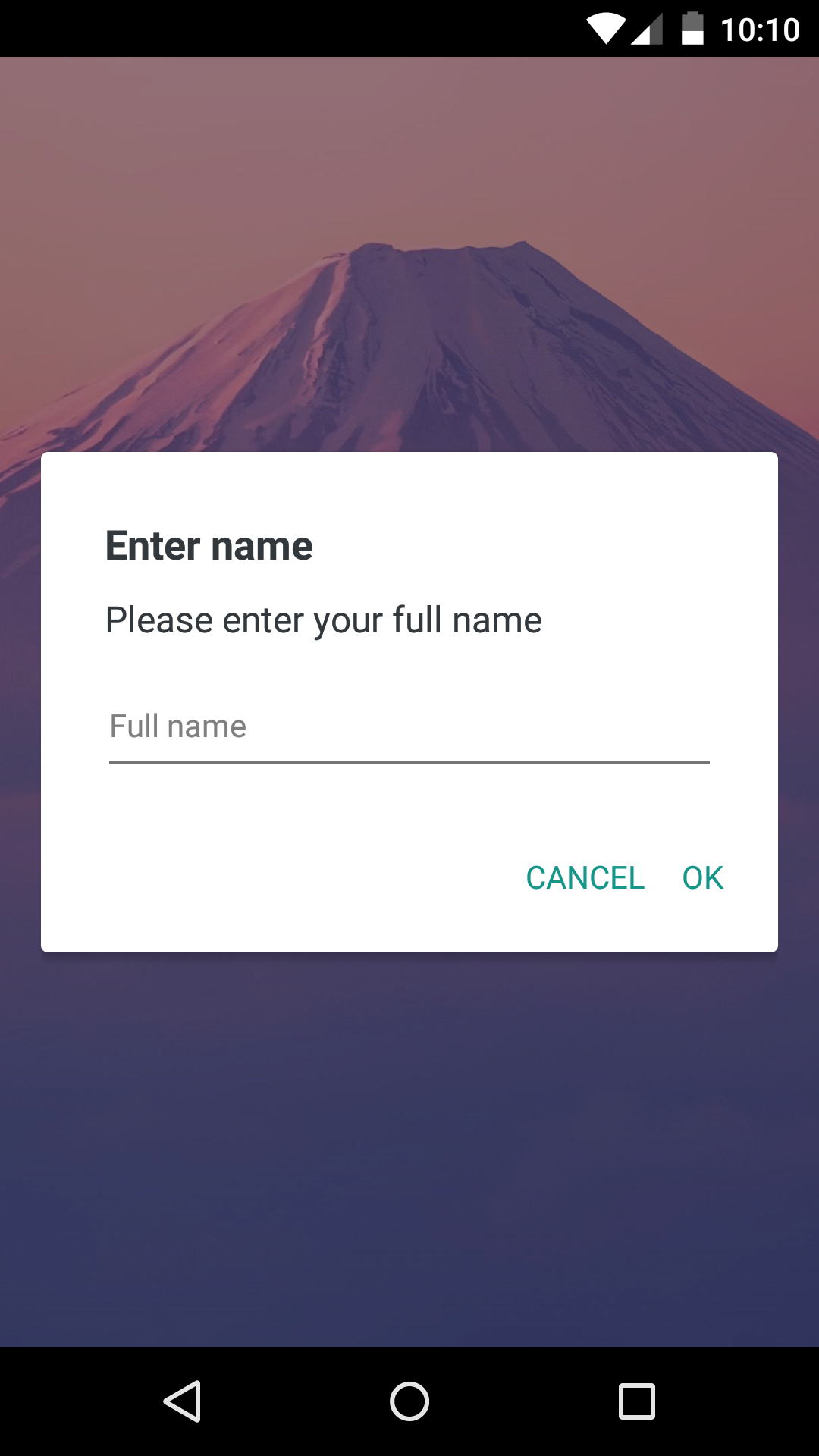
- **Dialog.Input**: A `TextInput` component styled as a native dialog input.
- **Dialog.CodeInput**: A `TextInput` component styled as one time code input.
- **Dialog.Switch**: A native `Switch` component with an optional label.
1. Import react-native-dialog:
```javascript
import Dialog from "react-native-dialog";
```
2. Create a dialog and nest its content inside of it:
```javascript
return (
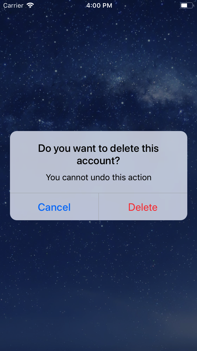
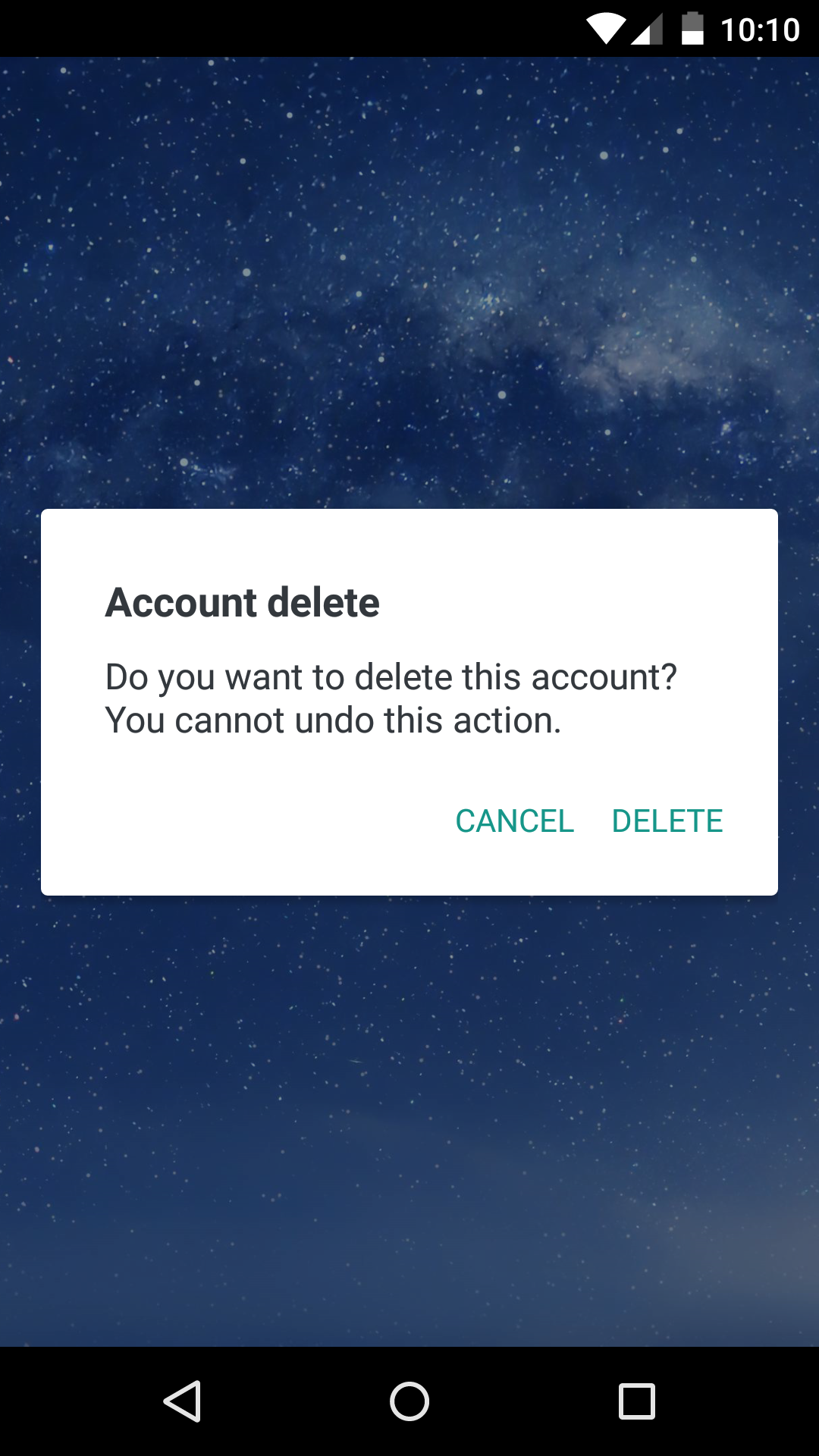
Account delete
Do you want to delete this account? You cannot undo this action.
);
```
3. Then simply show it by setting the `visible` prop to true:
```javascript
return (
Account delete
Do you want to delete this account? You cannot undo this action.
);
```
The `visible` prop is the only prop you'll really need to make the dialog work: you should control this prop value by saving it in your state and setting it to `true` or `false` when needed.
## A complete example
The following example consists in a component (`DialogTester`) with a button and a dialog.
The dialog is controlled by the `dialogVisible` state variable and it is initially hidden since its value is `false`.
Pressing the button sets `dialogVisible` to true, making the dialog visible.
Inside the dialog there are two buttons that, when pressed, set `dialogVisible` to false, hiding the dialog.
```javascript
import React, { useState } from "react";
import { Button, StyleSheet, View } from "react-native";
import Dialog from "react-native-dialog";
export default function App() {
const [visible, setVisible] = useState(false);
const showDialog = () => {
setVisible(true);
};
const handleCancel = () => {
setVisible(false);
};
const handleDelete = () => {
// The user has pressed the "Delete" button, so here you can do your own logic.
// ...Your logic
setVisible(false);
};
return (
Account delete
Do you want to delete this account? You cannot undo this action.
);
}
const styles = StyleSheet.create({
container: {
flex: 1,
backgroundColor: "#fff",
alignItems: "center",
justifyContent: "center",
},
});
```
## Available props
### Dialog.Button props
| Name | Type | Default | Description |
| -------- | ------ | -------------------------------------- | --------------------------------------- |
| label | string | **REQUIRED** | The label text |
| color | string | `#007ff9` on iOS, `#169689` on Android | The label color |
| bold | bool | false | Show the label with a bold font weight? |
| disabled | bool | false | Disable the button? |
| onPress | func | **REQUIRED** | Called when the button is pressed |
### Dialog.Description props
| Name | Type | Default | Description |
| -------- | ------ | ------------ | -------------------- |
| children | string | **REQUIRED** | The description text |
### Dialog.Container props
| Name | Type | Default | Description |
| ---------------------- | ------ | ------------- | --------------------------------------------------------------------------------------------------- |
| blurComponentIOS | node | A low-opacity | The blur component used in iOS |
| visible | bool | **REQUIRED** | Show the dialog? |
| children | node | **REQUIRED** | The dialog content |
| contentStyle | any | undefined | Extra style applied to the dialog content |
| headerStyle | any | undefined | Extra style applied to the dialog header |
| footerStyle | any | undefined | Extra style applied to the dialog footer |
| buttonSeparatorStyle | any | undefined | Extra style applied to the dialog button separator |
| onBackdropPress | func | undefined | Callback invoked when the backdrop is pressed |
| onRequestClose | func | undefined | Callback invoked when the hardware back button on Android or the menu button on Apple TV is pressed |
| keyboardVerticalOffset | number | undefined | keyboardVerticalOffset for iOS |
| verticalButtons | bool | false | Renders button vertically |
| useNativeDriver | bool | false | Defines if animations should use native driver |
### Dialog.Input props
| Name | Type | Default | Description |
| ------------ | ------ | --------- | ------------------------------------------- |
| label | string | undefined | The input floating label |
| wrapperStyle | any | undefined | The style applied to the input wrapper View |
| textInputRef | ref | undefined | Ref to the input |
`Dialog.Input` also accepts all the React-Native's `TextInput` component props.
### Dialog.CodeInput props
| Name | Type | Default | Description |
| --------------------------- | ------ | --------- | ------------------------------------------------------------ |
| wrapperStyle | any | undefined | The style applied to the input wrapper View |
| digitContainerStyle | any | undefined | The style applied to the digit container View |
| digitContainerFocusedStyle | any | undefined | The style applied to the digit container View when in focus |
| digitStyle | any | undefined | The style applied to the digit text |
| codeLength | number | 4 | The total number of digits |
| onCodeChange | func | undefined | Called when the input changed |
`Dialog.CodeInput` also accepts all the React-Native's `TextInput` component props.
### Dialog.Title props
| Name | Type | Default | Description |
| -------- | ------ | ------------ | -------------- |
| children | string | **REQUIRED** | The title text |
`Dialog.Title` also accepts all the React-Native's `Text` component props.
### Dialog.Switch props
| Name | Type | Default | Description |
| ----- | ------ | --------- | --------------------------- |
| label | string | undefined | The switch description text |
`Dialog.Switch` also accepts all the React-Native's `Switch` component props.
## Frequently Asked Questions
### How can I use a custom blur component as the dialog background on iOS?
To achieve a look even closer to the native iOS dialog you can provide your own component in the `blurComponentIOS` prop of a `Dialog.Container` and it will be injected in the dialog to be used as a background.
The `blurComponentIOS` can be useful for example if you want to apply a native blur effect to the dialog.
Here is an example using `react-native-blur`:
```javascript
const blurComponentIOS = (
);
return (
Account delete
Do you want to delete this account? You cannot undo this action.
);
```
### How can I add a 'tap outside dialog' callback?
`react-native-dialog` uses [a thin abstraction on top of the React-Native's modal component](./src/Modal.tsx). Any properties you add to `Dialog.Container` are mapped through to the modal.
The modal has an `onBackdropPress` property that can be used to register clicks on the backdrop.
Below is an example of how you can close the dialog by tapping outside.
```javascript
const [visible, setVisible] = useState(true);
const handleCancel = () => {
setVisible(false);
};
return (
Title
);
```
## Acknowledgments
Thanks to the user [@honaf](https://github.com/honaf) who has kindly offered the `react-native-dialog` namespace.
Also thanks to the user [@leecade](https://github.com/leecade) who offered the namespace `react-native-alert` (which has not been used since "Dialog" seems to suit better this component) and to [@tyxou](https://github.com/tyxou) for the entire codebase refactoring to hooks.