 ### System includes:
Registration, Login, Dashboard, Email Password, Logout
Account Update, Edit User Profile
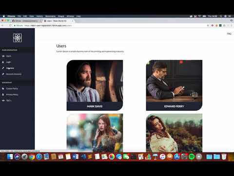
Browse Users, Public Profile Pages
Cookie Policy, Privacy Policy, T&C’s, FAQ
404 (Not Found)
The User Registration System is Fully Responsive out the box and you can Restrict Access to any page!
### Tech Stack:
* NodeJS
* React
* Server-side Rendered
* Apollo Client
* GraphQL
* MongoDB
* JSON Web Tokens
* Webpack
* SASS
### Top Features:
* Bcrypt password encryption/verification
* CKEditor - WYSIWYG editor
* File Upload – Profile Images
* Nodemailer – Custom mail server used to send password reset emails
* Custom ‘Password Reset’ Template (Built with MJML Framework)
* Multiple Layouts – Create unlimited layouts for pages/routes
* Toastr - Simple javascript toast notifications
* 100% FREE & Open Source
### Screenshot
### System includes:
Registration, Login, Dashboard, Email Password, Logout
Account Update, Edit User Profile
Browse Users, Public Profile Pages
Cookie Policy, Privacy Policy, T&C’s, FAQ
404 (Not Found)
The User Registration System is Fully Responsive out the box and you can Restrict Access to any page!
### Tech Stack:
* NodeJS
* React
* Server-side Rendered
* Apollo Client
* GraphQL
* MongoDB
* JSON Web Tokens
* Webpack
* SASS
### Top Features:
* Bcrypt password encryption/verification
* CKEditor - WYSIWYG editor
* File Upload – Profile Images
* Nodemailer – Custom mail server used to send password reset emails
* Custom ‘Password Reset’ Template (Built with MJML Framework)
* Multiple Layouts – Create unlimited layouts for pages/routes
* Toastr - Simple javascript toast notifications
* 100% FREE & Open Source
### Screenshot

Lorem Ipsum is simply dummy text of the printing and typesetting… ``` ## Styles We are using SCSS (CSS pre-processor/bracketed version of SASS) to enable us to write cleaner and more reusable css code. Our main 'styles.scss' is compiled upon each save, once the project has been started from your terminal/cmd. Whilst the resulting 'styles.css' is the only 'css' called from within the project, the 'scss' version simply contains imports to the partial files created within folders. ## CSS In order to ensure the integrity of the project and long-term maintainability, we recommend the following rules: - Media queries should be written/maintained within '_responsive.scss'. - REM CSS measurement units: We are using rem's to style our app. Whilst you should not use any other measurement unit, it is correct to use ‘px’ for certain properties. For example, you should still use 'px' for setting a border or the width of a media query to ensure more accurate break points. The root font size is set to '10px'. This means the calculation required to implement rem’s is simple: (target font size / 10 OR 18 / 10 = 1.8rem). #### 'config.js' Please utilize our configuration partial file wherever possible. This contains global variables for generic/brand colours, keyframes, mixins and more! For consistency please reference these instead of redefining where possible (or add to this file). ## 12 Col Grid Boiler template We are using a 12 Column Grid that works as follows: The grid has 12 columns Each columns width is a % value that can be calculated using the following: ``` Target Columns (Example '6') Minus Number of Total Columns (12) Times 100 = 50% ``` Example HTML mark-up for a 2-column layout: ```