# css-star-rating
**Repository Path**: mirrors_mhs/css-star-rating
## Basic Information
- **Project Name**: css-star-rating
- **Description**: Css Star Rating is a css only star rating lib based on best practice UX/UI methodes. It is written in scss and fully customizable.
- **Primary Language**: Unknown
- **License**: MIT
- **Default Branch**: master
- **Homepage**: None
- **GVP Project**: No
## Statistics
- **Stars**: 0
- **Forks**: 0
- **Created**: 2020-12-18
- **Last Updated**: 2025-09-06
## Categories & Tags
**Categories**: Uncategorized
**Tags**: None
## README
# Css Star Rating ⭐⭐⭐⭐⭐
#### ⭐ Css Star Rating is a pure css star rating plugin based on best practice UX/UI methods. ⭐


[](https://www.npmjs.com/package/css-star-rating)
[](https://github.com/BioPhoton/css-star-rating)
[](https://travis-ci.org/BioPhoton/css-star-rating)
[](https://www.npmjs.com/package/css-star-rating)
[](http://packagequality.com/#?package=css-star-rating)
Css Star Rating is written in scss and fully customizable over variables.
Easily compose your own rating component over a rich set of css modifiers for any kind of UI state.
## Demo
Demos in the **[KSS style guide](https://biophoton.github.io/css-star-rating/)**
## Features
- [x] **Written in scss**
- [x] **Customizable over variables**
- [x] **Flexbox layout**
- [x] **SVG icons**
- [x] **Icon fonts like fontawesome, ionicon...**
- [x] **Display rating over css class**
- [x] **Different Numbers of stars**
- [x] **Color of stars depend on rating**
- [x] **Half stars**
- [x] **Sizes**
- [x] **Star alignments**
- [x] **Static colors**
- [x] **Disabled mode**
- [x] **Star types**
- [x] **Label**
- [x] **Label positions**
- [x] **Animations**
- [x] **Directions**
- [x] **Themes**
## Browser support
| IE | Firefox | Chrome | Safari | Opera |
|--- |--- |--- |--- |---|
| 11 | 50 | 55 | 10 | 41 |
| | | | | |
## Related Projects
| Css | Angular1 (>=1.5)| Angular (>=2) |
|--- |--- |--- |
| | | |
| [Css Star Rating](https://github.com/BioPhoton/css-star-rating) | [Angular1 Star Rating](https://github.com/BioPhoton/angular1-star-rating) | [Angular Star Rating](https://github.com/BioPhoton/angular-star-rating) |
## Demo
- [x] [KSS documentation](https://biophoton.github.io/css-star-rating/)
## Install
**Get Css Star Rating:**
- clone & build this repository
- [download as .zip](https://github.com/BioPhoton/css-star-rating/releases)
- via **[npm](https://www.npmjs.org/)**: by running `$ npm install css-star-rating` from your console
- via **[bower](https://bower.io/)**: by running `$ bower install css-star-rating` from your console
**Load library**
```html
```
**Copy asstes (optional)**
If you want to use svg as icon type copy the
```star-rating.icons.svg``` image form ```bower_components/css-star-rating/dist/images/star-rating.css``` to your roots assets folder.
**Use it**
```html
1.5
```
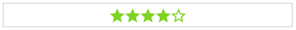
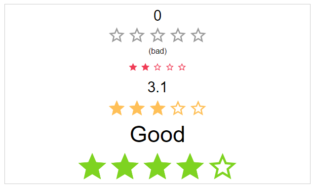
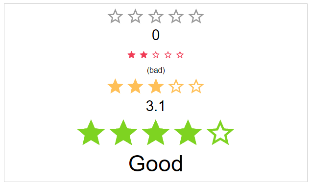
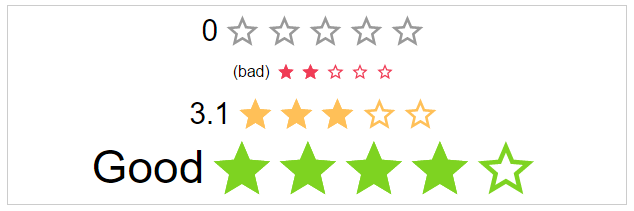
## Css Modifiers
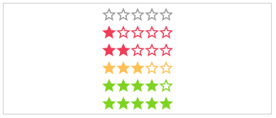
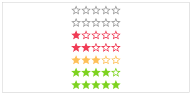
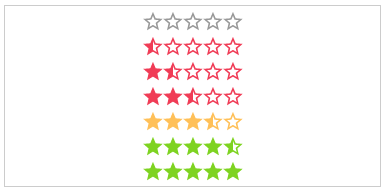
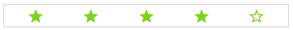
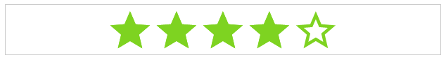
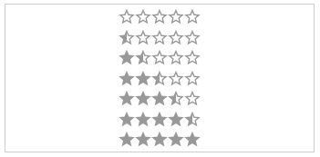
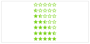
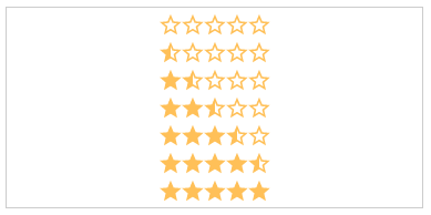
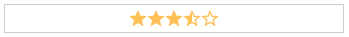
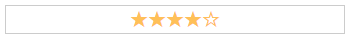
**.value-[N]**:
The actual star rating value. The color of the stars depends on the rating number
- .value-0
- .value-1
- .value-2
- .value-3
- .value-4
- .value-5
```html
...stars...
```
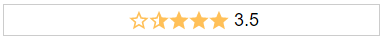
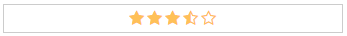
**.half**:
If set, every rating value will have a half star at the end.
- .half
```html
...stars...
```
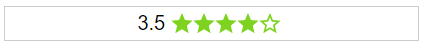
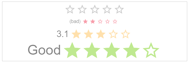
**text**:
The text next to the stars.
- (Just additional HTML)
```html
My text
...stars...
```
**.label-[VISIBILITY]**:
The position of the label.
- .label-visible
- .label-hidden
```html
3.5
...stars...
```
**.label-[POSITION]**:
The position of the label.
- .label-top
- .label-right
- .label-bottom
- .label-left
```html
Good
...stars...
```
**.space**:
If the start use the whole space or not.
```html
...stars...
```
**.[SIZE]**:
The height and width of the stars.
- .small
- .medium
- .large
```html
...stars...
```
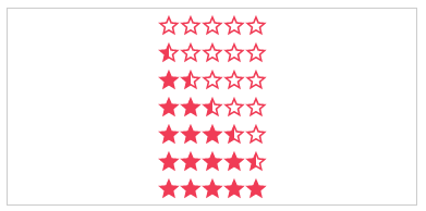
**color-[COLOR_NAME]**:
Static color of stars.
- .color-default
- .color-negative
- .color-ok
- .color-positive
```html
...stars...
```
**.disabled**:
The click callback is disabled, colors are transparent
```html
...stars...
```
**.direction-[DIRECTION]**:
The direction of the stars and label.
- .direction-rtl
- .direction-ltr
```html
...stars...
```
**.[ANIMATION_SPEED]**:
The duration of the animation in ms.
- .immediately
- .noticeable
- .slow
```html
...stars...
```
**starType**:
The type of start resource to use.
- .star-svg
- .star-icon (star character)
- .custom-icon (i.e. font-awesome)
```html
```
## Themes
As a bonus there are some themes as classes.
**theme-[NAME]**:
The type of start resource to use.
- .theme-google-places
- .theme-kununu
```html
 |
|  |
|  |
|  |
|  |
## Related Projects
| Css | Angular1 (>=1.5)| Angular (>=2) |
|--- |--- |--- |
|
|
## Related Projects
| Css | Angular1 (>=1.5)| Angular (>=2) |
|--- |--- |--- |
|  |
|  |
|  |
| [Css Star Rating](https://github.com/BioPhoton/css-star-rating) | [Angular1 Star Rating](https://github.com/BioPhoton/angular1-star-rating) | [Angular Star Rating](https://github.com/BioPhoton/angular-star-rating) |
## Demo
- [x] [KSS documentation](https://biophoton.github.io/css-star-rating/)
## Install
**Get Css Star Rating:**
- clone & build this repository
- [download as .zip](https://github.com/BioPhoton/css-star-rating/releases)
- via **[npm](https://www.npmjs.org/)**: by running `$ npm install css-star-rating` from your console
- via **[bower](https://bower.io/)**: by running `$ bower install css-star-rating` from your console
**Load library**
```html
```
**Copy asstes (optional)**
If you want to use svg as icon type copy the
```star-rating.icons.svg``` image form ```bower_components/css-star-rating/dist/images/star-rating.css``` to your roots assets folder.
**Use it**
```html
```
## Css Modifiers
**.value-[N]**:
The actual star rating value. The color of the stars depends on the rating number
- .value-0
- .value-1
- .value-2
- .value-3
- .value-4
- .value-5
```html
```
|
| [Css Star Rating](https://github.com/BioPhoton/css-star-rating) | [Angular1 Star Rating](https://github.com/BioPhoton/angular1-star-rating) | [Angular Star Rating](https://github.com/BioPhoton/angular-star-rating) |
## Demo
- [x] [KSS documentation](https://biophoton.github.io/css-star-rating/)
## Install
**Get Css Star Rating:**
- clone & build this repository
- [download as .zip](https://github.com/BioPhoton/css-star-rating/releases)
- via **[npm](https://www.npmjs.org/)**: by running `$ npm install css-star-rating` from your console
- via **[bower](https://bower.io/)**: by running `$ bower install css-star-rating` from your console
**Load library**
```html
```
**Copy asstes (optional)**
If you want to use svg as icon type copy the
```star-rating.icons.svg``` image form ```bower_components/css-star-rating/dist/images/star-rating.css``` to your roots assets folder.
**Use it**
```html
```
## Css Modifiers
**.value-[N]**:
The actual star rating value. The color of the stars depends on the rating number
- .value-0
- .value-1
- .value-2
- .value-3
- .value-4
- .value-5
```html
```
 **.half**:
If set, every rating value will have a half star at the end.
- .half
```html
```
**.half**:
If set, every rating value will have a half star at the end.
- .half
```html
```
 **text**:
The text next to the stars.
- (Just additional HTML)
```html
```
**text**:
The text next to the stars.
- (Just additional HTML)
```html
```
 **.label-[VISIBILITY]**:
The position of the label.
- .label-visible
- .label-hidden
```html
```
**.label-[VISIBILITY]**:
The position of the label.
- .label-visible
- .label-hidden
```html
```
 **.label-[POSITION]**:
The position of the label.
- .label-top
- .label-right
- .label-bottom
- .label-left
```html
```
**.label-[POSITION]**:
The position of the label.
- .label-top
- .label-right
- .label-bottom
- .label-left
```html
```

 **.space**:
If the start use the whole space or not.
```html
```
**.space**:
If the start use the whole space or not.
```html
```


 **.[SIZE]**:
The height and width of the stars.
- .small
- .medium
- .large
```html
```
**.[SIZE]**:
The height and width of the stars.
- .small
- .medium
- .large
```html
```


 **color-[COLOR_NAME]**:
Static color of stars.
- .color-default
- .color-negative
- .color-ok
- .color-positive
```html
```
**color-[COLOR_NAME]**:
Static color of stars.
- .color-default
- .color-negative
- .color-ok
- .color-positive
```html
```
 **.disabled**:
The click callback is disabled, colors are transparent
```html
```
**.disabled**:
The click callback is disabled, colors are transparent
```html
```

 **.direction-[DIRECTION]**:
The direction of the stars and label.
- .direction-rtl
- .direction-ltr
```html
```
**.direction-[DIRECTION]**:
The direction of the stars and label.
- .direction-rtl
- .direction-ltr
```html
```

 **.[ANIMATION_SPEED]**:
The duration of the animation in ms.
- .immediately
- .noticeable
- .slow
```html
```
**.[ANIMATION_SPEED]**:
The duration of the animation in ms.
- .immediately
- .noticeable
- .slow
```html
```


 **starType**:
The type of start resource to use.
- .star-svg
- .star-icon (star character)
- .custom-icon (i.e. font-awesome)
```html
```
**starType**:
The type of start resource to use.
- .star-svg
- .star-icon (star character)
- .custom-icon (i.e. font-awesome)
```html
```
 ## Themes
As a bonus there are some themes as classes.
**theme-[NAME]**:
The type of start resource to use.
- .theme-google-places
- .theme-kununu
```html
```
## Themes
As a bonus there are some themes as classes.
**theme-[NAME]**:
The type of start resource to use.
- .theme-google-places
- .theme-kununu
```html
```