# AndroidBottomBar
**Repository Path**: mirrors_skydoves/AndroidBottomBar
## Basic Information
- **Project Name**: AndroidBottomBar
- **Description**: 🍫 A lightweight bottom navigation view, fully customizable with an indicator and animations.
- **Primary Language**: Unknown
- **License**: Apache-2.0
- **Default Branch**: master
- **Homepage**: None
- **GVP Project**: No
## Statistics
- **Stars**: 0
- **Forks**: 0
- **Created**: 2022-01-07
- **Last Updated**: 2026-04-05
## Categories & Tags
**Categories**: Uncategorized
**Tags**: None
## README
AndroidBottomBar
🍫 A lightweight bottom navigation view, fully customizable with an indicator and animations.


## Including in your project
[](https://search.maven.org/search?q=g:%22com.github.skydoves%22%20AND%20a:%22androidbottombar%22)
[](https://jitpack.io/#skydoves/AndroidBottomBar)
### Gradle
Add below codes to your **root** `build.gradle` file (not your module build.gradle file).
```gradle
allprojects {
repositories {
mavenCentral()
}
}
```
And add a dependency code to your **module**'s `build.gradle` file.
```gradle
dependencies {
implementation "com.github.skydoves:androidbottombar:1.0.2"
}
```
## Usage
Add following XML namespace inside your XML layout file.
```gradle
xmlns:app="http://schemas.android.com/apk/res-auto"
```
### AndroidBottomBarView
Here is a basic example of implementing `AndroidBottomBarView`.
```gradle
```
### BottomMenuItem
We can add menu items to the `AndroidBottomBarView` using the `BottomMenuItem`, fully customizable.
```kotlin
androidBottomBar.addBottomMenuItems(mutableListOf(
BottomMenuItem(this)
.setTitle("Movie") // sets the content of the title.
.setTitleColorRes(R.color.black) // sets the color of the title using resource.
.setTitleActiveColorRes(R.color.white) // sets the color of the title when selected/active.
.setTitlePadding(6) // sets the padding of the title.
.setTitleSize(14f) // sets the size of the title.
.setTitleGravity(Gravity.CENTER) // sets gravity of the title.
.setIcon(R.drawable.ic_movie)
.setIconColorRes(R.color.md_blue_200) // sets the [Drawable] of the icon using resource.
.setIconActiveColorRes(R.color.md_blue_200) // sets the color of the icon when selected/active.
.setBadgeText("New!") // sets the content of the badge.
.setBadgeTextSize(9f) // sets the size of the badge.
.setBadgeTextColorRes(R.color.white) // sets the text color of the badge using resource.
.setBadgeColorRes(R.color.md_blue_200) // sets the color of the badge using resource.
.setBadgeAnimation(BadgeAnimation.FADE) // sets an animation of the badge.
.setBadgeDuration(450) // sets a duration of the badge.
.build(),
BottomMenuItem(this)
// .. //
```
Here is the Java way.
```java
List bottomMenuItems = new ArrayList<>();
bottomMenuItems.add(new BottomMenuItem(context)
.setTitle("Tv")
.setIcon(R.drawable.ic_tv)
.build());
// add more BottomMenuItems. //
androidBottomBarView.addBottomMenuItems(bottomMenuItems);
```
### BottomBarFlavor
`BottomBarFlavor` decides which type (icon, title) will be shown as default (if unselected).
The default flavor is icon.
```kotlin
app:bottomBar_flavor="icon"
```
| ICON | TITLE |
| :---------------: | :---------------: |
|  |
|  ### Indicator
We can customize the indicator using below attributes.
```gradle
app:bottomBar_indicator_color="@color/md_blue_200" // color of the indicator.
app:bottomBar_indicator_height="4dp" // height of the indicator.
app:bottomBar_indicator_padding="6dp" // padding of the indicator.
app:bottomBar_indicator_radius="12dp" // corner radius of the indicator.
app:bottomBar_indicator_visible="true" // visibility of the indicator.
```
### Title Composition
We can customize the title of the menu item.
```kotlin
.setTitle("Movie") // sets the content of the title.
.setTitleColorRes(R.color.black) // sets the color of the title using resource.
.setTitleActiveColorRes(R.color.white) // sets the color of the title when selected/active.
.setTitlePadding(6) // sets the padding of the title.
.setTitleSize(14f) // sets the size of the title.
.setTitleGravity(Gravity.CENTER) // sets gravity of the title.
```
#### TitleForm
TitleForm is a collection of attribute class that related to a menu title for customizing the menu item title easily.
### Indicator
We can customize the indicator using below attributes.
```gradle
app:bottomBar_indicator_color="@color/md_blue_200" // color of the indicator.
app:bottomBar_indicator_height="4dp" // height of the indicator.
app:bottomBar_indicator_padding="6dp" // padding of the indicator.
app:bottomBar_indicator_radius="12dp" // corner radius of the indicator.
app:bottomBar_indicator_visible="true" // visibility of the indicator.
```
### Title Composition
We can customize the title of the menu item.
```kotlin
.setTitle("Movie") // sets the content of the title.
.setTitleColorRes(R.color.black) // sets the color of the title using resource.
.setTitleActiveColorRes(R.color.white) // sets the color of the title when selected/active.
.setTitlePadding(6) // sets the padding of the title.
.setTitleSize(14f) // sets the size of the title.
.setTitleGravity(Gravity.CENTER) // sets gravity of the title.
```
#### TitleForm
TitleForm is a collection of attribute class that related to a menu title for customizing the menu item title easily.
Generally, we set the almost same attributes for consistency of the menu items.
We can build a common form of the title, and we can reuse on every menu item.
Then we can reduce boilerplate work from writing the same attributes on every menu item.
```kotlin
// we can create the form using kotlin dsl.
val titleForm = titleForm(this) {
setTitleColorRes(R.color.black)
setTitlePadding(6)
setTitleSize(14f)
}
androidBottomBar.addBottomMenuItems(mutableListOf(
BottomMenuItem(this)
// setTitleForm must be called before other title related methods.
.setTitleForm(titleForm)
.setTitle("Movie")
.build(),
BottomMenuItem(this)
.setTitleForm(titleForm)
.setTitle("Tv")
.build(),
// ** //
```
Here is the Java way to build the `TitleForm`.
```java
TitleForm.Builder titleForm = new TitleForm.Builder(context)
.setTitleColorRes(R.color.black)
.setTitlePadding(6)
.setTitleSize(14f);
```
### Icon Composition
We can customize the icon of the menu item.
```kotlin
.setIcon(R.drawable.ic_movie)
.setIconColorRes(R.color.md_blue_200) // sets the [Drawable] of the icon using resource.
.setIconActiveColorRes(R.color.md_blue_200) // sets the color of the icon when selected/active.
.setIconSize(24) // sets the size of the icon.
```
#### IconForm
IconForm is a collection of attribute class that related to a menu icon for customizing the menu item icon easily.
The same concept of the `TitleForm`, and we must call before other icon related methods.
```kotlin
// we can create the form using kotlin dsl.
val iconForm = iconForm(this) {
setIcon(R.drawable.ic_movie)
setIconColorRes(R.color.md_blue_200) // sets the [Drawable] of the icon using resource.
setIconSize(24) // sets the size of the icon.
}
androidBottomBar.addBottomMenuItems(mutableListOf(
BottomMenuItem(this)
.setIconForm(iconForm)
.setIcon(R.drawable.ic_star)
.build(),
// ** //
```
Here is the Java way to build the `IconForm`.
```java
IconForm.Builder iconForm = new IconForm.Builder(context)
.setIconColorRes(R.color.md_blue_100)
.setIconSize(24);
```
### Badge Composition
We can customize the badge of the menu item.
```kotlin
.setBadgeText("New!") // sets the content of the badge.
.setBadgeTextSize(9f) // sets the size of the badge.
.setBadgeTextColorRes(R.color.white) // sets the text color of the badge using resource.
.setBadgeColorRes(R.color.md_blue_200) // sets the color of the badge using resource.
.setBadgeStyle(Typeface.BOLD)// sets the [Typeface] of the badge.
.setBadgePadding(6) // sets the padding of the badge.
.setBadgeMargin(4) // sets the margin of the badge.
.setBadgeRadius(6) // sets the radius of the badge.
.setBadgeAnimation(BadgeAnimation.FADE) // sets an animation of the badge.
.setBadgeDuration(450) // sets a duration of the badge.
```
#### Show and dismiss
We can show and dismiss badges using below methods.
```kotlin
androidBottomBar.showBadge(0) // shows the badge by an index.
androidBottomBar.showBadge(0, "123") // shows the badge by an index and changes badge text.
androidBottomBar.dismissBadge(0) // dismisses the badge by an index.
```
#### BadgeForm
BadgeForm is a collection of attribute class that related to a menu badge for customizing the menu item badge easily.
The same concept of the `TitleForm`, and we must call before other badge related methods.
```kotlin
// we can create the form using kotlin dsl.
val badgeForm = badgeForm(this) {
setBadgeTextSize(9f)
setBadgePaddingLeft(6)
setBadgePaddingRight(6)
setBadgeDuration(550)
}
androidBottomBar.addBottomMenuItems(mutableListOf(
BottomMenuItem(this)
.setTitle("movie")
.setBadgeForm(badgeForm)
.setBadgeText("New!")
.setBadgeColorRes(R.color.md_blue_200)
.setBadgeAnimation(BadgeAnimation.FADE)
.build(),
BottomMenuItem(this)
.setTitle("star")
.setBadgeForm(badgeForm)
.setBadgeText("⭐⭐⭐")
.setBadgeColorRes(R.color.white)
.setBadgeTextColorRes(R.color.black)
.build(),
// ** //
```
#### BadgeAnimation
We can customize badge animations using the below method.
```gradle
.setBadgeAnimation(BadgeAnimation.FADE) // fade, scale
```
FADE | SCALE |
| :---------------: | :---------------: |
|  |
|  |
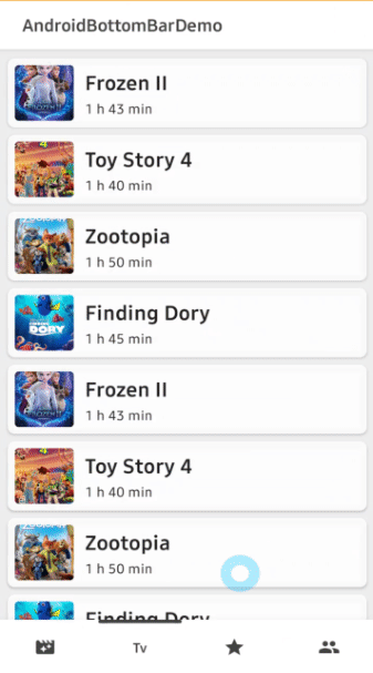
|  {
// when selected, changed viewpager's current item.
viewpager.currentItem = index
// when selected, dismiss a badge of the item.
androidBottomBar.dismissBadge(index)
}
}
```
### OnBottomMenuInitializedListener
We can listen to the menu items are initialized when they are initialized completely.<br>
If we want to show badges, bind `AndroidBottomBarView` to `ViewPager` or etc, we have to call them in this listener.
```kotlin
androidBottomBar.setOnBottomMenuInitializedListener {
// binds to a viewpager.
androidBottomBar.bindViewPager(viewpager)
// shows a badge index 0.
androidBottomBar.showBadge(index = 0)
// gets a BottomMenuItemView by index.
val menuItemView = androidBottomBar.getBottomMenuItemView(index = 0)
}
```
### bindViewPager, bindViewPager2
We can bind a `ViewPager` and `ViewPager2` to the `AndroidBottomBarView` for selecting menu items and moving an indicator<br>
automatically by scrolling of viewPager.
```kotlin
androidBottomBar.setOnBottomMenuInitializedListener {
androidBottomBar.bindViewPager(viewpager)
}
```
### BottomMenuAnimation
We can customize the selected/unselected animations of menu items and an indicator.
```kotlin
app:bottomBar_menuAnimation=) |
|  |
|  |
|  |
|