
A powerful & easy to use timeline package for Flutter! 🚀
> ***Caveat***: This package is an early stage. Not enough testing has been done to guarantee stability. Some APIs may change. # Examples Check it out on the [web](https://chulwoo.dev/timelines/) or look at the [source code](https://github.com/chulwoo-park/timelines/tree/main/example). | Timeline status | Package delivery tracking | Process timeline | | - | - | - | | [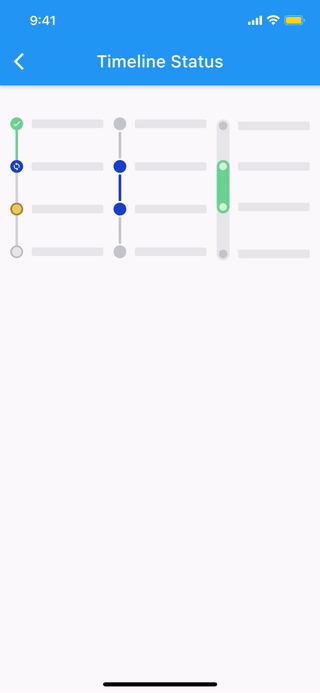](https://chulwoo.dev/timelines/#/timeline_status) | [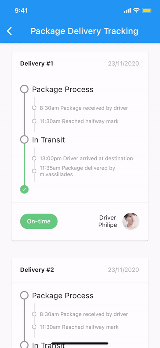](https://chulwoo.dev/timelines/#/package_delivery_tracking) | [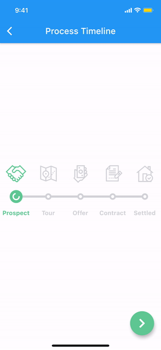](https://chulwoo.dev/timelines/#/process_timeline) |More examples
🚧 WIP 🚧
| ContainerIndicator | |
|---|---|

|
ContainerIndicator(
  child: Container(
    width: 15.0,
    height: 15.0,
    color: Colors.blue,
  ),
)
|
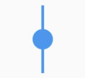
DotIndicator |

|
DotIndicator() |
OutlinedDotIndicator |

|
OutlinedDotIndicator() |
| SolidLineConnector | |
|---|---|

|
SizedBox(
  height: 20.0,
  child: SolidLineConnector(),
)
|
DashedLineConnector |

|
SizedBox(
  height: 20.0,
  child: DashedLineConnector(),
)
|
DecoratedLineConnector |

|
SizedBox(
  height: 20.0,
  child: DecoratedLineConnector(
    decoration: BoxDecoration(
      gradient: LinearGradient(
        begin: Alignment.topCenter,
        end: Alignment.bottomCenter,
        colors: [Colors.blue, Colors.lightBlueAccent[100]],
      ),
    ),
  ),
)
|
| Simple TimelineNode | |
|---|---|
|
SizedBox(
  height: 50.0,
  child: TimelineNode.simple(),
)
|
Complex TimelineNode |
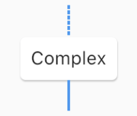
|
SizedBox(
  height: 80.0,
  child: TimelineNode(
    indicator: Card(
      margin: EdgeInsets.zero,
      child: Padding(
        padding: EdgeInsets.all(8.0),
        child: Text('Complex'),
      ),
    ),
    startConnector: DashedLineConnector(),
    endConnector: SolidLineConnector(),
  ),
)
|
| TimelineTile | |
|---|---|
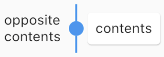
|
TimelineTile(
  oppositeContents: Padding(
    padding: const EdgeInsets.all(8.0),
    child: Text('opposite\ncontents'),
  ),
  contents: Card(
    child: Container(
      padding: EdgeInsets.all(8.0),
      child: Text('contents'),
    ),
  ),
  node: TimelineNode(
    indicator: DotIndicator(),
    startConnector: SolidLineConnector(),
    endConnector: SolidLineConnector(),
  ),
)
|
| ConnectionDirection.before | |
|---|---|
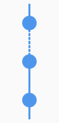
|
FixedTimeline.tileBuilder(
  builder: TimelineTileBuilder.connectedFromStyle(
    connectionDirection: ConnectionDirection.before,
    connectorStyleBuilder: (context, index) {
      return (index == 1) ? ConnectorStyle.dashedLine : ConnectorStyle.solidLine;
    },
    indicatorStyleBuilder: (context, index) => IndicatorStyle.dot,
    itemExtent: 40.0,
    itemCount: 3,
  ),
)
|
ConnectionDirection.after |
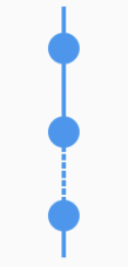
|
FixedTimeline.tileBuilder(
  builder: TimelineTileBuilder.connectedFromStyle(
    connectionDirection: ConnectionDirection.after,
    connectorStyleBuilder: (context, index) {
      return (index == 1) ? ConnectorStyle.dashedLine : ConnectorStyle.solidLine;
    },
    indicatorStyleBuilder: (context, index) => IndicatorStyle.dot,
    itemExtent: 40.0,
    itemCount: 3,
  ),
)
|
| ContentsAlign.basic | |
|---|---|
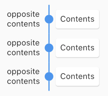
|
FixedTimeline.tileBuilder(
  builder: TimelineTileBuilder.connectedFromStyle(
    contentsAlign: ContentsAlign.basic,
    oppositeContentsBuilder: (context, index) => Padding(
      padding: const EdgeInsets.all(8.0),
      child: Text('opposite\ncontents'),
    ),
    contentsBuilder: (context, index) => Card(
      child: Padding(
        padding: const EdgeInsets.all(8.0),
        child: Text('Contents'),
      ),
    ),
    connectorStyleBuilder: (context, index) => ConnectorStyle.solidLine,
    indicatorStyleBuilder: (context, index) => IndicatorStyle.dot,
    itemCount: 3,
  ),
)
|
ContentsAlign.reverse |
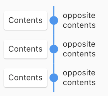
|
FixedTimeline.tileBuilder(
  builder: TimelineTileBuilder.connectedFromStyle(
    contentsAlign: ContentsAlign.reverse,
    oppositeContentsBuilder: (context, index) => Padding(
      padding: const EdgeInsets.all(8.0),
      child: Text('opposite\ncontents'),
    ),
    contentsBuilder: (context, index) => Card(
      child: Padding(
        padding: const EdgeInsets.all(8.0),
        child: Text('Contents'),
      ),
    ),
    connectorStyleBuilder: (context, index) => ConnectorStyle.solidLine,
    indicatorStyleBuilder: (context, index) => IndicatorStyle.dot,
    itemCount: 3,
  ),
)
|
ContentsAlign.alternating |
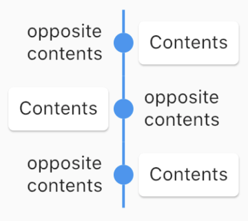
|
FixedTimeline.tileBuilder(
  builder: TimelineTileBuilder.connectedFromStyle(
    contentsAlign: ContentsAlign.alternating,
    oppositeContentsBuilder: (context, index) => Padding(
      padding: const EdgeInsets.all(8.0),
      child: Text('opposite\ncontents'),
    ),
    contentsBuilder: (context, index) => Card(
      child: Padding(
        padding: const EdgeInsets.all(8.0),
        child: Text('Contents'),
      ),
    ),
    connectorStyleBuilder: (context, index) => ConnectorStyle.solidLine,
    indicatorStyleBuilder: (context, index) => IndicatorStyle.dot,
    itemCount: 3,
  ),
)
|