# fluttertpc_keyboard_actions
**Repository Path**: openharmony-sig/fluttertpc_keyboard_actions
## Basic Information
- **Project Name**: fluttertpc_keyboard_actions
- **Description**: No description available
- **Primary Language**: Unknown
- **License**: MIT
- **Default Branch**: master
- **Homepage**: None
- **GVP Project**: No
## Statistics
- **Stars**: 0
- **Forks**: 3
- **Created**: 2024-06-25
- **Last Updated**: 2025-05-07
## Categories & Tags
**Categories**: Uncategorized
**Tags**: None
## README
# 🚨 **重要提示 | IMPORTANT**
>
> **⚠️ 此代码仓已归档。新地址请访问 [fluttertpc_keyboard_actions](https://gitcode.com/openharmony-sig/fluttertpc_keyboard_actions)。| ⚠️ This repository has been archived. For the new address, please visit [fluttertpc_keyboard_actions](https://gitcode.com/openharmony-sig/fluttertpc_keyboard_actions).**
>
---
>
# Keyboard Actions
[](https://pub.dartlang.org/packages/keyboard_actions)
Add features to the Android / iOS keyboard in a simple way.
Because the keyboard that Android / iOS offers us specifically when we are in numeric mode, does not bring the button to hide the keyboard.
This causes a lot of inconvenience for users, so this package allows adding functionality to the existing keyboard.
## Features
- Done button for the keyboard (You can customize the button).
- Move up/down between your Textfields (You can hide for set `nextFocus: false`).
- Keyboard Bar customization.
- Custom footer widget below keyboard bar
- Create your own Keyboard in an easy way
- You can use it for Android, iOS or both platforms.
- Compatible with Dialog.
Example of the custom footer:
 For more fun, use that widget as a custom keyboard with your custom input:
 Even more fun:
[Watch the video](https://thumbs.gfycat.com/NimbleGraveDarwinsfox-mobile.mp4)
## Getting started
You should ensure that you add the dependency in your flutter project.
```yaml
dependencies:
keyboard_actions: "^4.1.0"
```
You should then run `flutter packages upgrade` or update your packages in IntelliJ.
## Example Project
There is an example project in the `example` folder where you can get more information. Check it out. Otherwise, keep reading to get up and running.
## Usage
```dart
import 'package:flutter/material.dart';
import 'package:keyboard_actions/keyboard_actions.dart';
class Content extends StatefulWidget {
const Content({
Key key,
}) : super(key: key);
@override
_ContentState createState() => _ContentState();
}
class _ContentState extends State {
final FocusNode _nodeText1 = FocusNode();
final FocusNode _nodeText2 = FocusNode();
final FocusNode _nodeText3 = FocusNode();
final FocusNode _nodeText4 = FocusNode();
final FocusNode _nodeText5 = FocusNode();
final FocusNode _nodeText6 = FocusNode();
/// Creates the [KeyboardActionsConfig] to hook up the fields
/// and their focus nodes to our [FormKeyboardActions].
KeyboardActionsConfig _buildConfig(BuildContext context) {
return KeyboardActionsConfig(
keyboardActionsPlatform: KeyboardActionsPlatform.ALL,
keyboardBarColor: Colors.grey[200],
nextFocus: true,
actions: [
KeyboardActionsItem(
focusNode: _nodeText1,
),
KeyboardActionsItem(focusNode: _nodeText2, toolbarButtons: [
(node) {
return GestureDetector(
onTap: () => node.unfocus(),
child: Padding(
padding: EdgeInsets.all(8.0),
child: Icon(Icons.close),
),
);
}
]),
KeyboardActionsItem(
focusNode: _nodeText3,
onTapAction: () {
showDialog(
context: context,
builder: (context) {
return AlertDialog(
content: Text("Custom Action"),
actions: [
FlatButton(
child: Text("OK"),
onPressed: () => Navigator.of(context).pop(),
)
],
);
});
},
),
KeyboardActionsItem(
focusNode: _nodeText4,
displayCloseWidget: false,
),
KeyboardActionsItem(
focusNode: _nodeText5,
toolbarButtons: [
//button 1
(node) {
return GestureDetector(
onTap: () => node.unfocus(),
child: Container(
color: Colors.white,
padding: EdgeInsets.all(8.0),
child: Text(
"CLOSE",
style: TextStyle(color: Colors.black),
),
),
);
},
//button 2
(node) {
return GestureDetector(
onTap: () => node.unfocus(),
child: Container(
color: Colors.black,
padding: EdgeInsets.all(8.0),
child: Text(
"DONE",
style: TextStyle(color: Colors.white),
),
),
);
}
],
),
KeyboardActionsItem(
focusNode: _nodeText6,
footerBuilder: (_) => PreferredSize(
child: SizedBox(
height: 40,
child: Center(
child: Text('Custom Footer'),
)),
preferredSize: Size.fromHeight(40)),
),
],
);
}
@override
Widget build(BuildContext context) {
return KeyboardActions(
config: _buildConfig(context),
child: Center(
child: Padding(
padding: const EdgeInsets.all(15.0),
child: Column(
crossAxisAlignment: CrossAxisAlignment.stretch,
children: [
TextField(
keyboardType: TextInputType.number,
focusNode: _nodeText1,
decoration: InputDecoration(
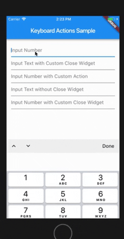
hintText: "Input Number",
),
),
TextField(
keyboardType: TextInputType.text,
focusNode: _nodeText2,
decoration: InputDecoration(
hintText: "Input Text with Custom Done Button",
),
),
TextField(
keyboardType: TextInputType.number,
focusNode: _nodeText3,
decoration: InputDecoration(
hintText: "Input Number with Custom Action",
),
),
TextField(
keyboardType: TextInputType.text,
focusNode: _nodeText4,
decoration: InputDecoration(
hintText: "Input Text without Done button",
),
),
TextField(
keyboardType: TextInputType.number,
focusNode: _nodeText5,
decoration: InputDecoration(
hintText: "Input Number with Toolbar Buttons",
),
),
TextField(
keyboardType: TextInputType.number,
focusNode: _nodeText6,
decoration: InputDecoration(
hintText: "Input Number with Custom Footer",
),
),
],
),
),
),
);
}
}
```
## Using Custom Keyboard
```dart
import 'package:flutter/material.dart';
import 'package:keyboard_actions/keyboard_actions.dart';
class Content extends StatelessWidget {
final FocusNode _nodeText7 = FocusNode();
final FocusNode _nodeText8 = FocusNode();
//This is only for custom keyboards
final custom1Notifier = ValueNotifier("0");
final custom2Notifier = ValueNotifier(Colors.blue);
/// Creates the [KeyboardActionsConfig] to hook up the fields
/// and their focus nodes to our [FormKeyboardActions].
KeyboardActionsConfig _buildConfig(BuildContext context) {
return KeyboardActionsConfig(
keyboardActionsPlatform: KeyboardActionsPlatform.ALL,
keyboardBarColor: Colors.grey[200],
nextFocus: true,
actions: [
KeyboardActionsItem(
focusNode: _nodeText7,
footerBuilder: (_) => CounterKeyboard(
notifier: custom1Notifier,
),
),
KeyboardActionsItem(
focusNode: _nodeText8,
footerBuilder: (_) => ColorPickerKeyboard(
notifier: custom2Notifier,
),
),
],
);
}
@override
Widget build(BuildContext context) {
return KeyboardActions(
config: _buildConfig(context),
child: Center(
child: Container(
padding: const EdgeInsets.all(15.0),
child: Column(
crossAxisAlignment: CrossAxisAlignment.stretch,
children: [
KeyboardCustomInput(
focusNode: _nodeText7,
height: 65,
notifier: custom1Notifier,
builder: (context, val, hasFocus) {
return Container(
alignment: Alignment.center,
color: hasFocus ? Colors.grey[300] : Colors.white,
child: Text(
val,
style:
TextStyle(fontSize: 30, fontWeight: FontWeight.bold),
),
);
},
),
KeyboardCustomInput(
focusNode: _nodeText8,
height: 65,
notifier: custom2Notifier,
builder: (context, val, hasFocus) {
return Container(
width: double.maxFinite,
color: val ?? Colors.transparent,
);
},
),
],
),
),
),
);
}
}
/// A quick example "keyboard" widget for picking a color.
class ColorPickerKeyboard extends StatelessWidget
with KeyboardCustomPanelMixin
implements PreferredSizeWidget {
final ValueNotifier notifier;
static const double _kKeyboardHeight = 200;
ColorPickerKeyboard({Key key, this.notifier}) : super(key: key);
@override
Widget build(BuildContext context) {
final double rows = 3;
final double screenWidth = MediaQuery.of(context).size.width;
final int colorsCount = Colors.primaries.length;
final int colorsPerRow = (colorsCount / rows).ceil();
final double itemWidth = screenWidth / colorsPerRow;
final double itemHeight = _kKeyboardHeight / rows;
return Container(
height: _kKeyboardHeight,
child: Wrap(
children: [
for (final color in Colors.primaries)
GestureDetector(
onTap: () {
updateValue(color);
},
child: Container(
color: color,
width: itemWidth,
height: itemHeight,
),
)
],
),
);
}
@override
Size get preferredSize => Size.fromHeight(_kKeyboardHeight);
}
/// A quick example "keyboard" widget for counter value.
class CounterKeyboard extends StatelessWidget
with KeyboardCustomPanelMixin
implements PreferredSizeWidget {
final ValueNotifier notifier;
CounterKeyboard({Key key, this.notifier}) : super(key: key);
@override
Size get preferredSize => Size.fromHeight(200);
@override
Widget build(BuildContext context) {
return Container(
height: preferredSize.height,
child: Row(
children: [
Expanded(
child: InkWell(
onTap: () {
int value = int.tryParse(notifier.value) ?? 0;
value--;
updateValue(value.toString());
},
child: FittedBox(
child: Text(
"-",
style: TextStyle(
fontWeight: FontWeight.bold,
),
),
),
),
),
Expanded(
child: InkWell(
onTap: () {
int value = int.tryParse(notifier.value) ?? 0;
value++;
updateValue(value.toString());
},
child: FittedBox(
child: Text(
"+",
style: TextStyle(
fontWeight: FontWeight.bold,
),
),
),
),
),
],
),
);
}
}
```
You can follow me on twitter [@diegoveloper](https://www.twitter.com/diegoveloper)
Even more fun:
[Watch the video](https://thumbs.gfycat.com/NimbleGraveDarwinsfox-mobile.mp4)
## Getting started
You should ensure that you add the dependency in your flutter project.
```yaml
dependencies:
keyboard_actions: "^4.1.0"
```
You should then run `flutter packages upgrade` or update your packages in IntelliJ.
## Example Project
There is an example project in the `example` folder where you can get more information. Check it out. Otherwise, keep reading to get up and running.
## Usage
```dart
import 'package:flutter/material.dart';
import 'package:keyboard_actions/keyboard_actions.dart';
class Content extends StatefulWidget {
const Content({
Key key,
}) : super(key: key);
@override
_ContentState createState() => _ContentState();
}
class _ContentState extends State {
final FocusNode _nodeText1 = FocusNode();
final FocusNode _nodeText2 = FocusNode();
final FocusNode _nodeText3 = FocusNode();
final FocusNode _nodeText4 = FocusNode();
final FocusNode _nodeText5 = FocusNode();
final FocusNode _nodeText6 = FocusNode();
/// Creates the [KeyboardActionsConfig] to hook up the fields
/// and their focus nodes to our [FormKeyboardActions].
KeyboardActionsConfig _buildConfig(BuildContext context) {
return KeyboardActionsConfig(
keyboardActionsPlatform: KeyboardActionsPlatform.ALL,
keyboardBarColor: Colors.grey[200],
nextFocus: true,
actions: [
KeyboardActionsItem(
focusNode: _nodeText1,
),
KeyboardActionsItem(focusNode: _nodeText2, toolbarButtons: [
(node) {
return GestureDetector(
onTap: () => node.unfocus(),
child: Padding(
padding: EdgeInsets.all(8.0),
child: Icon(Icons.close),
),
);
}
]),
KeyboardActionsItem(
focusNode: _nodeText3,
onTapAction: () {
showDialog(
context: context,
builder: (context) {
return AlertDialog(
content: Text("Custom Action"),
actions: [
FlatButton(
child: Text("OK"),
onPressed: () => Navigator.of(context).pop(),
)
],
);
});
},
),
KeyboardActionsItem(
focusNode: _nodeText4,
displayCloseWidget: false,
),
KeyboardActionsItem(
focusNode: _nodeText5,
toolbarButtons: [
//button 1
(node) {
return GestureDetector(
onTap: () => node.unfocus(),
child: Container(
color: Colors.white,
padding: EdgeInsets.all(8.0),
child: Text(
"CLOSE",
style: TextStyle(color: Colors.black),
),
),
);
},
//button 2
(node) {
return GestureDetector(
onTap: () => node.unfocus(),
child: Container(
color: Colors.black,
padding: EdgeInsets.all(8.0),
child: Text(
"DONE",
style: TextStyle(color: Colors.white),
),
),
);
}
],
),
KeyboardActionsItem(
focusNode: _nodeText6,
footerBuilder: (_) => PreferredSize(
child: SizedBox(
height: 40,
child: Center(
child: Text('Custom Footer'),
)),
preferredSize: Size.fromHeight(40)),
),
],
);
}
@override
Widget build(BuildContext context) {
return KeyboardActions(
config: _buildConfig(context),
child: Center(
child: Padding(
padding: const EdgeInsets.all(15.0),
child: Column(
crossAxisAlignment: CrossAxisAlignment.stretch,
children: [
TextField(
keyboardType: TextInputType.number,
focusNode: _nodeText1,
decoration: InputDecoration(
hintText: "Input Number",
),
),
TextField(
keyboardType: TextInputType.text,
focusNode: _nodeText2,
decoration: InputDecoration(
hintText: "Input Text with Custom Done Button",
),
),
TextField(
keyboardType: TextInputType.number,
focusNode: _nodeText3,
decoration: InputDecoration(
hintText: "Input Number with Custom Action",
),
),
TextField(
keyboardType: TextInputType.text,
focusNode: _nodeText4,
decoration: InputDecoration(
hintText: "Input Text without Done button",
),
),
TextField(
keyboardType: TextInputType.number,
focusNode: _nodeText5,
decoration: InputDecoration(
hintText: "Input Number with Toolbar Buttons",
),
),
TextField(
keyboardType: TextInputType.number,
focusNode: _nodeText6,
decoration: InputDecoration(
hintText: "Input Number with Custom Footer",
),
),
],
),
),
),
);
}
}
```
## Using Custom Keyboard
```dart
import 'package:flutter/material.dart';
import 'package:keyboard_actions/keyboard_actions.dart';
class Content extends StatelessWidget {
final FocusNode _nodeText7 = FocusNode();
final FocusNode _nodeText8 = FocusNode();
//This is only for custom keyboards
final custom1Notifier = ValueNotifier("0");
final custom2Notifier = ValueNotifier(Colors.blue);
/// Creates the [KeyboardActionsConfig] to hook up the fields
/// and their focus nodes to our [FormKeyboardActions].
KeyboardActionsConfig _buildConfig(BuildContext context) {
return KeyboardActionsConfig(
keyboardActionsPlatform: KeyboardActionsPlatform.ALL,
keyboardBarColor: Colors.grey[200],
nextFocus: true,
actions: [
KeyboardActionsItem(
focusNode: _nodeText7,
footerBuilder: (_) => CounterKeyboard(
notifier: custom1Notifier,
),
),
KeyboardActionsItem(
focusNode: _nodeText8,
footerBuilder: (_) => ColorPickerKeyboard(
notifier: custom2Notifier,
),
),
],
);
}
@override
Widget build(BuildContext context) {
return KeyboardActions(
config: _buildConfig(context),
child: Center(
child: Container(
padding: const EdgeInsets.all(15.0),
child: Column(
crossAxisAlignment: CrossAxisAlignment.stretch,
children: [
KeyboardCustomInput(
focusNode: _nodeText7,
height: 65,
notifier: custom1Notifier,
builder: (context, val, hasFocus) {
return Container(
alignment: Alignment.center,
color: hasFocus ? Colors.grey[300] : Colors.white,
child: Text(
val,
style:
TextStyle(fontSize: 30, fontWeight: FontWeight.bold),
),
);
},
),
KeyboardCustomInput(
focusNode: _nodeText8,
height: 65,
notifier: custom2Notifier,
builder: (context, val, hasFocus) {
return Container(
width: double.maxFinite,
color: val ?? Colors.transparent,
);
},
),
],
),
),
),
);
}
}
/// A quick example "keyboard" widget for picking a color.
class ColorPickerKeyboard extends StatelessWidget
with KeyboardCustomPanelMixin
implements PreferredSizeWidget {
final ValueNotifier notifier;
static const double _kKeyboardHeight = 200;
ColorPickerKeyboard({Key key, this.notifier}) : super(key: key);
@override
Widget build(BuildContext context) {
final double rows = 3;
final double screenWidth = MediaQuery.of(context).size.width;
final int colorsCount = Colors.primaries.length;
final int colorsPerRow = (colorsCount / rows).ceil();
final double itemWidth = screenWidth / colorsPerRow;
final double itemHeight = _kKeyboardHeight / rows;
return Container(
height: _kKeyboardHeight,
child: Wrap(
children: [
for (final color in Colors.primaries)
GestureDetector(
onTap: () {
updateValue(color);
},
child: Container(
color: color,
width: itemWidth,
height: itemHeight,
),
)
],
),
);
}
@override
Size get preferredSize => Size.fromHeight(_kKeyboardHeight);
}
/// A quick example "keyboard" widget for counter value.
class CounterKeyboard extends StatelessWidget
with KeyboardCustomPanelMixin
implements PreferredSizeWidget {
final ValueNotifier notifier;
CounterKeyboard({Key key, this.notifier}) : super(key: key);
@override
Size get preferredSize => Size.fromHeight(200);
@override
Widget build(BuildContext context) {
return Container(
height: preferredSize.height,
child: Row(
children: [
Expanded(
child: InkWell(
onTap: () {
int value = int.tryParse(notifier.value) ?? 0;
value--;
updateValue(value.toString());
},
child: FittedBox(
child: Text(
"-",
style: TextStyle(
fontWeight: FontWeight.bold,
),
),
),
),
),
Expanded(
child: InkWell(
onTap: () {
int value = int.tryParse(notifier.value) ?? 0;
value++;
updateValue(value.toString());
},
child: FittedBox(
child: Text(
"+",
style: TextStyle(
fontWeight: FontWeight.bold,
),
),
),
),
),
],
),
);
}
}
```
You can follow me on twitter [@diegoveloper](https://www.twitter.com/diegoveloper)