# react-stack-grid
**Repository Path**: pacezhong/react-stack-grid
## Basic Information
- **Project Name**: react-stack-grid
- **Description**: Pinterest like layout components for React.js
- **Primary Language**: JavaScript
- **License**: MIT
- **Default Branch**: master
- **Homepage**: None
- **GVP Project**: No
## Statistics
- **Stars**: 0
- **Forks**: 0
- **Created**: 2020-08-17
- **Last Updated**: 2020-12-19
## Categories & Tags
**Categories**: Uncategorized
**Tags**: None
## README
# react-stack-grid
[](https://travis-ci.org/tsuyoshiwada/react-stack-grid)
[](http://badge.fury.io/js/react-stack-grid)
Pinterest like layout components for React.js.
## Table of Contents
* [Live Demo](#live-demo)
* [Install](#install)
* [Quick Example](#quick-example)
* [Props](#props)
* [Instance API](#instance-api)
* [updateLayout(): void](#updatelayout-void)
* [Animations](#animations)
* [Tips](#tips)
* [Performance when using images](#performance-when-using-images)
* [When animation is unnecessary](#when-animation-is-unnecessary)
* [How to manually update layout ?](#how-to-manually-update-layout-)
* [Responsive layout](#responsive-layout)
* [Thanks](#thanks)
* [License](#license)
* [ChangeLog](#changelog)
* [Author](#author)
* [Development](#development)
* [Contribution](#contribution)
## Live Demo
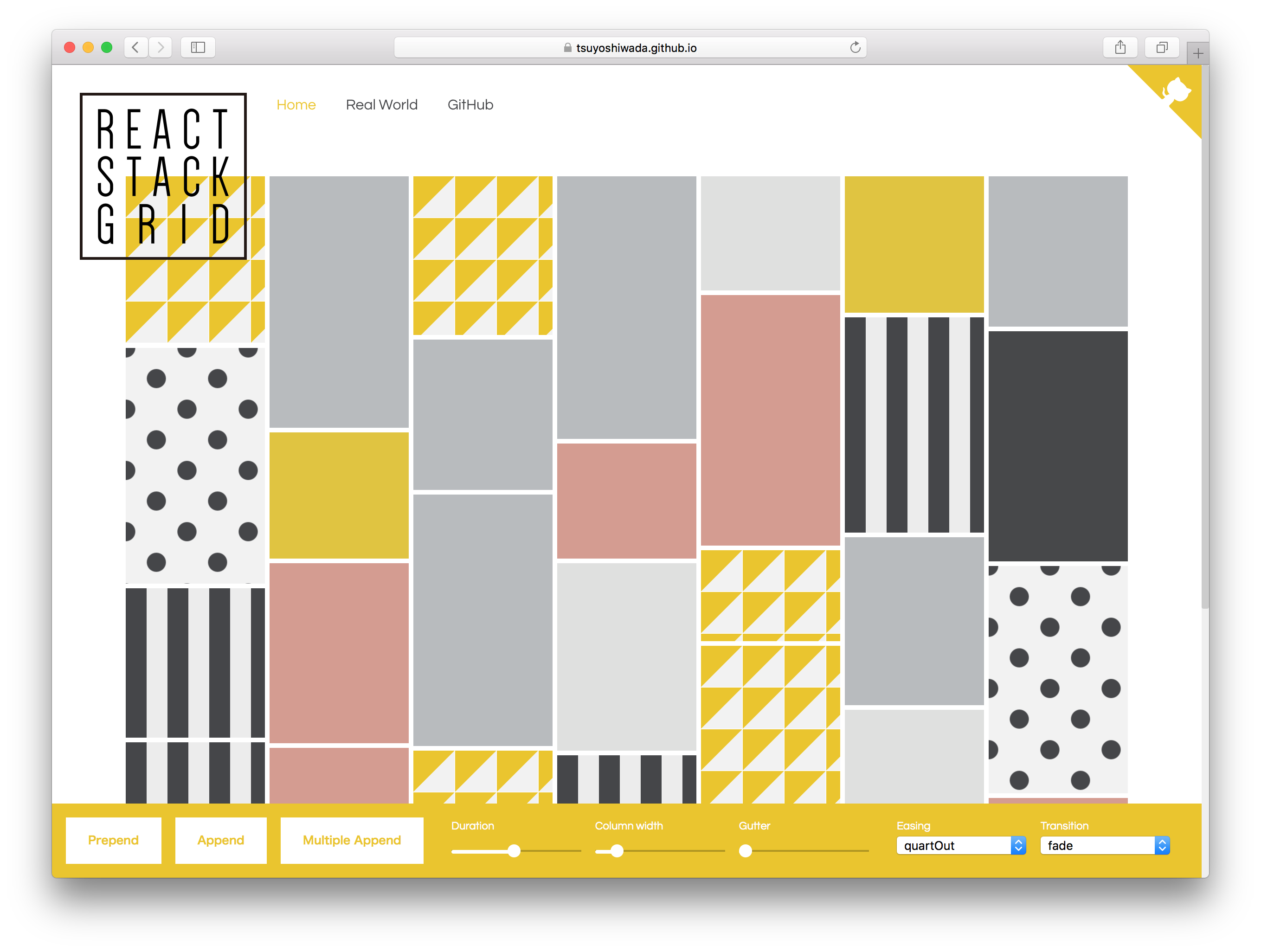
[https://tsuyoshiwada.github.io/react-stack-grid/](https://tsuyoshiwada.github.io/react-stack-grid/)
## Install
You can install the [react-stack-grid](https://www.npmjs.com/package/react-stack-grid) from [npm](https://www.npmjs.com/).
```bash
$ npm install react-stack-grid
```
## Quick Example
Following code is simplest usage.
```javascript
import React, { Component } from "react";
import StackGrid from "react-stack-grid";
class MyComponent extends Component {
render() {
return (
Item 1
Item 2
Item 3
);
}
}
```
width of parent is managed by [react-sizeme](https://github.com/ctrlplusb/react-sizeme).
## Props
You can set the following properties.
| Property | Type | Default | Description |
|:----------------------|:------------------------------------------------------------|:---------------------------------|:----------------------------------------------------------------------------------------------------------------------------------------|
| `className` | `PropTypes.string` | `undefined` | Specify `className` of component. |
| `style` | `PropTypes.object` | `{}` | Original style of component. Following styles are ignored. (`position`, `height`, `transition`) |
| `gridRef` | `PropTypes.func` | `null` | Reference the instance of StackGrid. Unlike ordinary `ref`, it accepts only functions. |
| `component` | `PropTypes.string` | `"div"` | See [ReactTransitionGroup](https://facebook.github.io/react/docs/animation.html#rendering-a-different-component) |
| `itemComponent` | `PropTypes.string` | `"span"` | Specify the component of the grid item. |
| `columnWidth` | `PropTypes.oneOfType([PropTypes.number, PropTypes.string])` | `150` | Specify column width as an number(`px`), or percentage string. (Example `"33.33%"`) |
| `gutterWidth` | `PropTypes.number` | `5` | Specify gutter width as an number. |
| `gutterHeight` | `PropTypes.number` | `5` | Specify gutter height as an number. |
| `duration` | `PropTypes.number` | `480` | Specify duration of animation in ms. |
| `easing` | `PropTypes.string` | `easings.quartOut` | Specify a css valid transition-timing-function string. It can be easily specification by using `easings`. |
| `appearDelay` | `PropTypes.number` | `30` | Specify delay of the initial animation in ms. |
| `appear` | `PropTypes.func` | `fadeUp.appear` | See Animations section. |
| `appeared` | `PropTypes.func` | `fadeUp.appear` | ... |
| `enter` | `PropTypes.func` | `fadeUp.appear` | ... |
| `entered` | `PropTypes.func` | `fadeUp.appear` | ... |
| `leaved` | `PropTypes.func` | `fadeUp.appear` | ... |
| `units` | `PropTypes.func` | `{ length: "px", angle: "deg" }` | ... |
| `monitorImagesLoaded` | `PropTypes.bool` | `false` | If set to `true`, images reading is monitored. use [imagesloaded](https://github.com/desandro/imagesloaded). |
| `vendorPrefix` | `PropTypes.bool` | `false` | If set to `true`, add a vendor prefix to styles add dynamically. |
| `userAgent` | `PropTypes.string` | `undefined` | Specify userAgent for determinig the vendor prefix. See [inline-style-prefixer](https://github.com/rofrischmann/inline-style-prefixer). |
| `enableSSR` | `PropTypes.bool` | `false` | Render component on the server side. [More info](https://github.com/ctrlplusb/react-sizeme#server-side-rendering). |
| `onLayout` | `PropTypes.func` | `null` | It is called at the timing when the layout is confirmed, or at the updated timing. (Called only by client.) |
| `horizontal` | `PropTypes.bool` | `false` | The transposed (horizontal) order of drawing elements. Retains the original order of the items. |
| `rtl` | `PropTypes.bool` | `false` | When true, items are placed right-to-left instead of the default left-to-right. Useful for RTL languages such as Arabic and Hebrew. |
## Instance API
### updateLayout(): void
Update the current layout.
## Animations
The following function must return styles related to animation.
See [ReactTransitionGroup](https://facebook.github.io/react/docs/animation.html#rendering-a-different-component) for details.
* `appear`
* `appeared`
* `enter`
* `entered`
* `leaved`
You can use extended syntax for transform's style. For example properties like `translateX` and` scale`.
See [easy-css-transform-builder](https://github.com/tsuyoshiwada/easy-css-transform-builder).
Each function is given the following arguments.
* `rect: { top: number; left: number; width: number; height: number; }`
* `containerSize: { width: number; height: number; }`
* `index: number`
It is easiest to use them because you have several presets.
* `fade`
* `fadeDown`
* `fadeUp`
* `scaleDown`
* `scaleUp`
* `flip`
* `helix`
It's an actual use example.
```javascript
import StackGrid, { transitions } from "react-stack-grid";
const { scaleDown } = transitions;
class MyComponent extends Component {
render() {
return (
...
);
}
}
```
Please try actual demonstration in [live demo](https://tsuyoshiwada.github.io/react-stack-grid/).
## Tips
### Performance when using images
When `true` is specified for `monitorImagesLoaded`, reloading occurs when the image loading is completed.
If you know the size in advance, specify `monitorImagesLoaded` as `false`.
### When animation is unnecessary
By default animation is enabled.
If it's not necessary, specify `0` for `duration` property.
```javascript
...
```
### How to manually update layout ?
If the size of an item is changed by an action such as a click event, there are cases where you want to update the layout manually.
You can manually update the layout by referring to the StackGrid instance with `gridRef` and executing the`updateLayout()` method.
```javascript
class MyComponent extends React.Component {
// When the size of the item is changed...
something = () => {
this.grid.updateLayout();
};
render() {
return (
this.grid = grid}
>
{/* items ... */}
);
}
}
```
### Responsive layout
You can get width using [react-sizeme](https://github.com/ctrlplusb/react-sizeme) and change columnWidth according to width.
This is a solution, but we can respond in other ways!
```javascript
import React, { Component } from 'react';
import sizeMe from 'react-sizeme';
import StackGrid from 'react-stack-grid';
class YourComponent extends Component {
render() {
const {
size: {
width
}
} = this.props;
return (
// Grid items...
);
}
}
export default sizeMe()(YourComponent);
```
## Thanks
* Layout inspired by [Pinterest](https://pinterest.com/).
* API inspired by [dantrain/react-stonecutter](https://github.com/dantrain/react-stonecutter).
## License
Released under the [MIT Licence](https://raw.githubusercontent.com/tsuyoshiwada/react-stack-grid/master/LICENSE)
## ChangeLog
See [CHANGELOG.md](./CHANGELOG.md)
## Author
[tsuyoshiwada](https://github.com/tsuyoshiwada)
## Development
Initialization of the project.
```bash
$ cd /your/project/dir
$ git clone https://github.com/tsuyoshiwada/react-stack-grid.git
```
Install some dependencies.
```bash
$ npm install
```
Start the development and can you see demo page (access to the `http://localhost:3000/`).
```bash
$ npm start
```
Run lint and testing.
```bash
$ npm test
```
Generates build file.
```bash
$ npm run build
```
## Contribution
Thank you for your interest in react-stack-grid.js.
Bugs, feature requests and comments are more than welcome in the [issues](https://github.com/tsuyoshiwada/react-stack-grid/issues).
**Before you open a PR:**
Be careful to follow the code style of the project. Run `npm test` after your changes and ensure you do not introduce any new errors or warnings.
All new features and changes need documentation.
Thanks!