# step-progress-indicator
**Repository Path**: sapchart/step-progress-indicator
## Basic Information
- **Project Name**: step-progress-indicator
- **Description**: No description available
- **Primary Language**: Unknown
- **License**: MIT
- **Default Branch**: master
- **Homepage**: None
- **GVP Project**: No
## Statistics
- **Stars**: 0
- **Forks**: 0
- **Created**: 2020-07-04
- **Last Updated**: 2020-12-19
## Categories & Tags
**Categories**: Uncategorized
**Tags**: None
## README
# Step Progress Indicator


Open source Flutter package, bar indicator made of a series of selected and unselected steps.
Made by Sandro Maglione, check out his personal official website [sandromaglione.com](https://www.sandromaglione.com)
**[Check out the full step_progress_indicator tutorial](http://www.sandromaglione.com/blog/2020/01/24/step-progress-indicator-flutter-package-tutorial/)**
See the full example [here](https://github.com/SandroMaglione/step-progress-indicator/tree/master/example)
Check out the official dartdoc for the package [here](https://pub.dev/documentation/step_progress_indicator/latest/step_progress_indicator/StepProgressIndicator-class.html)
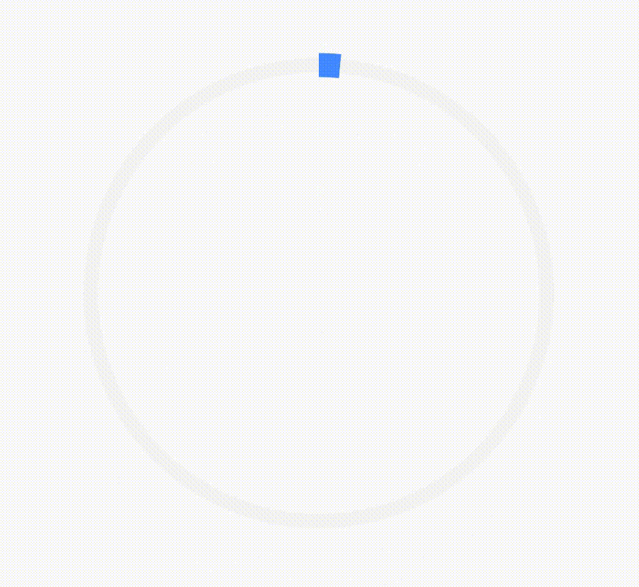
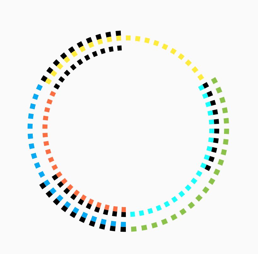
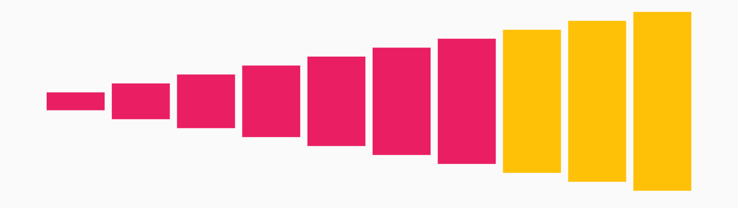
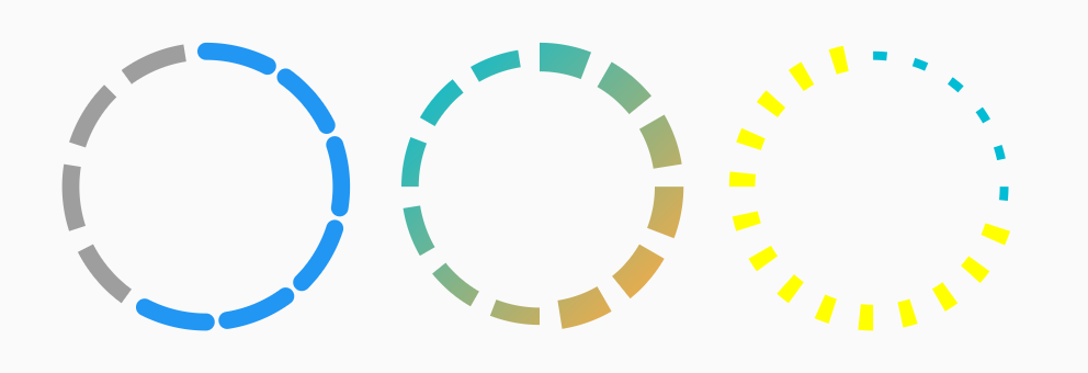
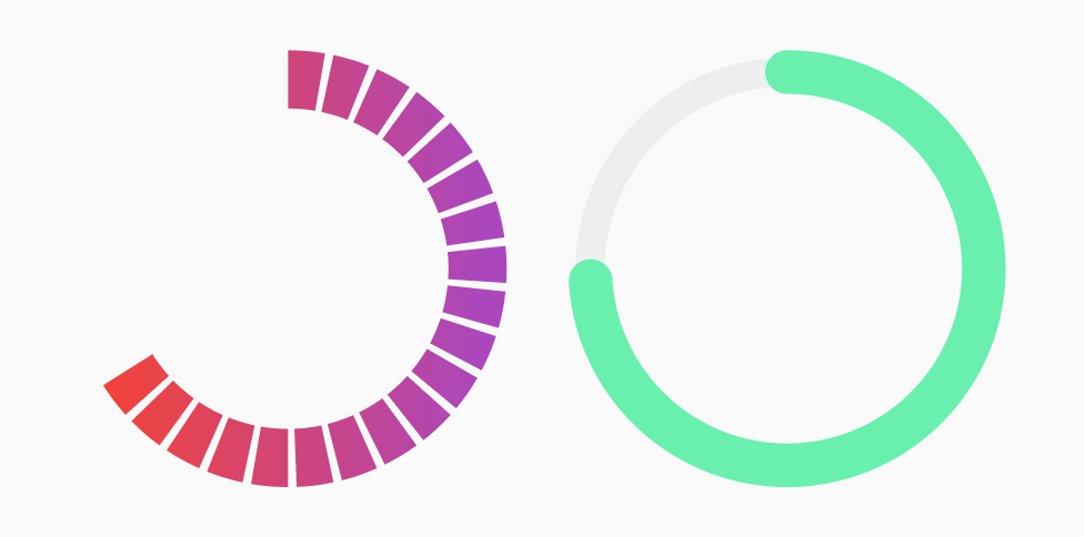
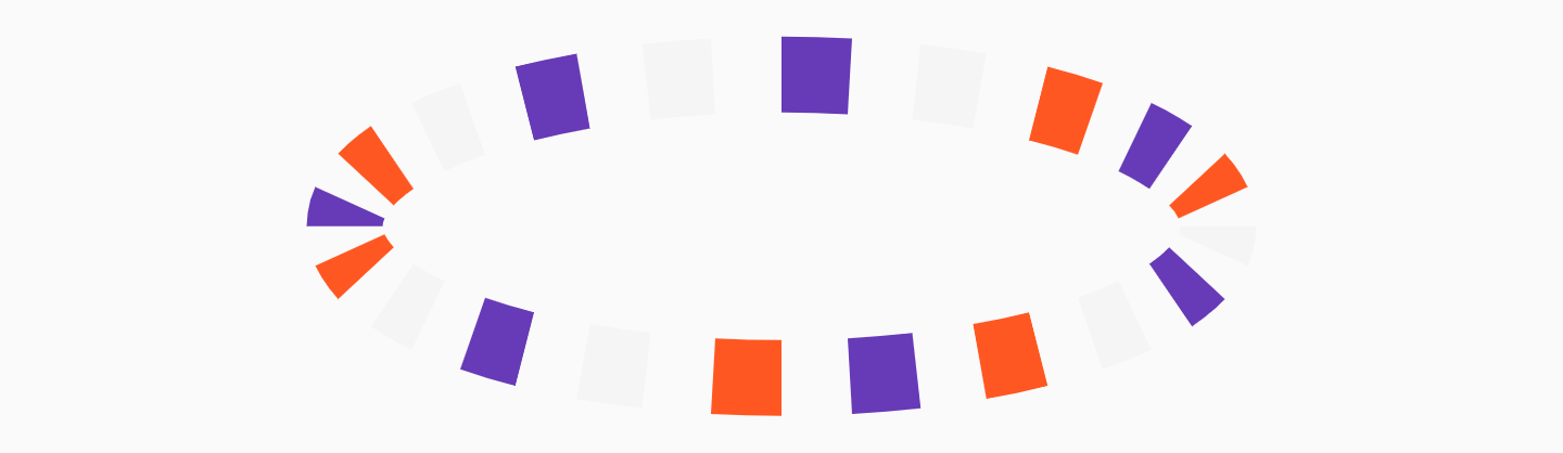
## Screenshots
Install and import the package. Then just customize its parameters.
```yaml
dependencies:
flutter:
sdk: flutter
step_progress_indicator: ^0.2.3+6
```
---
Horizontal | Vertical
:-------------------------:|:-------------------------:
 | 
Circular1 | Circular2
:-------------------------:|:-------------------------:
 | 
 | 
---
## Examples
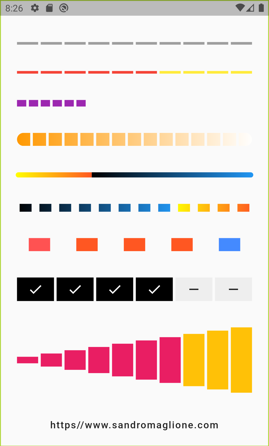
#### StepProgressIndicator - Example 1
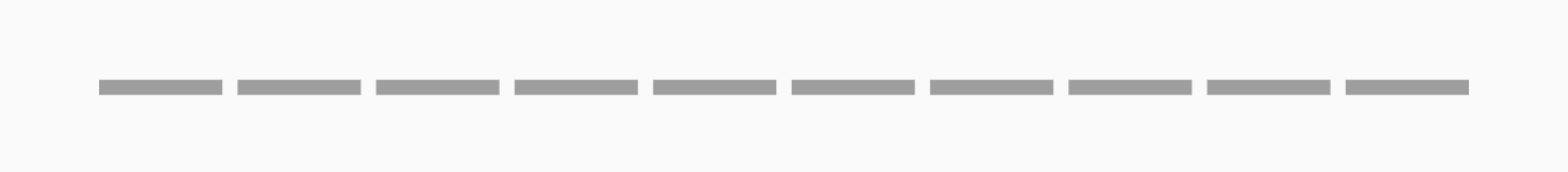
```dart
StepProgressIndicator(
totalSteps: 10,
)
```
#### StepProgressIndicator - Example 2
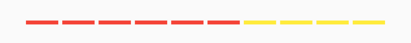
```dart
StepProgressIndicator(
totalSteps: 10,
currentStep: 6,
selectedColor: Colors.red,
unselectedColor: Colors.yellow,
)
```
#### StepProgressIndicator - Example 3

```dart
StepProgressIndicator(
totalSteps: 20,
currentStep: 6,
size: 10,
selectedColor: Colors.purple,
unselectedColor: Colors.transparent,
)
```
#### StepProgressIndicator - Example 4
```dart
StepProgressIndicator(
totalSteps: 15,
currentStep: 12,
size: 20,
selectedColor: Colors.amber,
unselectedColor: Colors.black,
roundedEdges: Radius.circular(10),
),
```
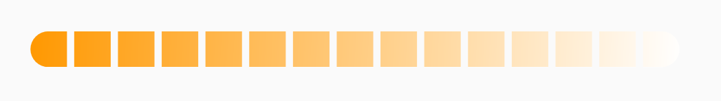
#### StepProgressIndicator - Example 5
```dart
StepProgressIndicator(
totalSteps: 100,
currentStep: 32,
size: 8,
padding: 0,
selectedColor: Colors.yellow,
unselectedColor: Colors.cyan,
roundedEdges: Radius.circular(10),
),
```
#### StepProgressIndicator - Example 6

```dart
StepProgressIndicator(
totalSteps: 12,
currentStep: 4,
padding: 6.0,
size: 12,
progressDirection: TextDirection.rtl,
selectedColor: Colors.green,
unselectedColor: Colors.black12,
)
```
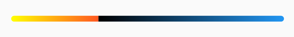
#### StepProgressIndicator - Example 7
```dart
StepProgressIndicator(
totalSteps: 5,
padding: 20.0,
size: 20,
customColor: (index) => index == 0
? Colors.redAccent
: index == 4 ? Colors.blueAccent : Colors.deepOrange,
)
```
#### StepProgressIndicator - Example 8
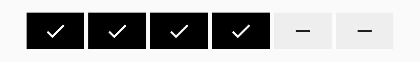
```dart
StepProgressIndicator(
totalSteps: 6,
currentStep: 4,
size: 36,
selectedColor: Colors.black,
unselectedColor: Colors.grey[200],
customStep: (index, color, _) => color == Colors.black
? Container(
color: color,
child: Icon(
Icons.check,
color: Colors.white,
),
)
: Container(
color: color,
child: Icon(
Icons.remove,
),
),
)
```
#### StepProgressIndicator - Example 9
```dart
StepProgressIndicator(
totalSteps: 10,
currentStep: 7,
selectedColor: Colors.pink,
unselectedColor: Colors.amber,
customSize: (index) => (index + 1) * 10.0,
)
```
---
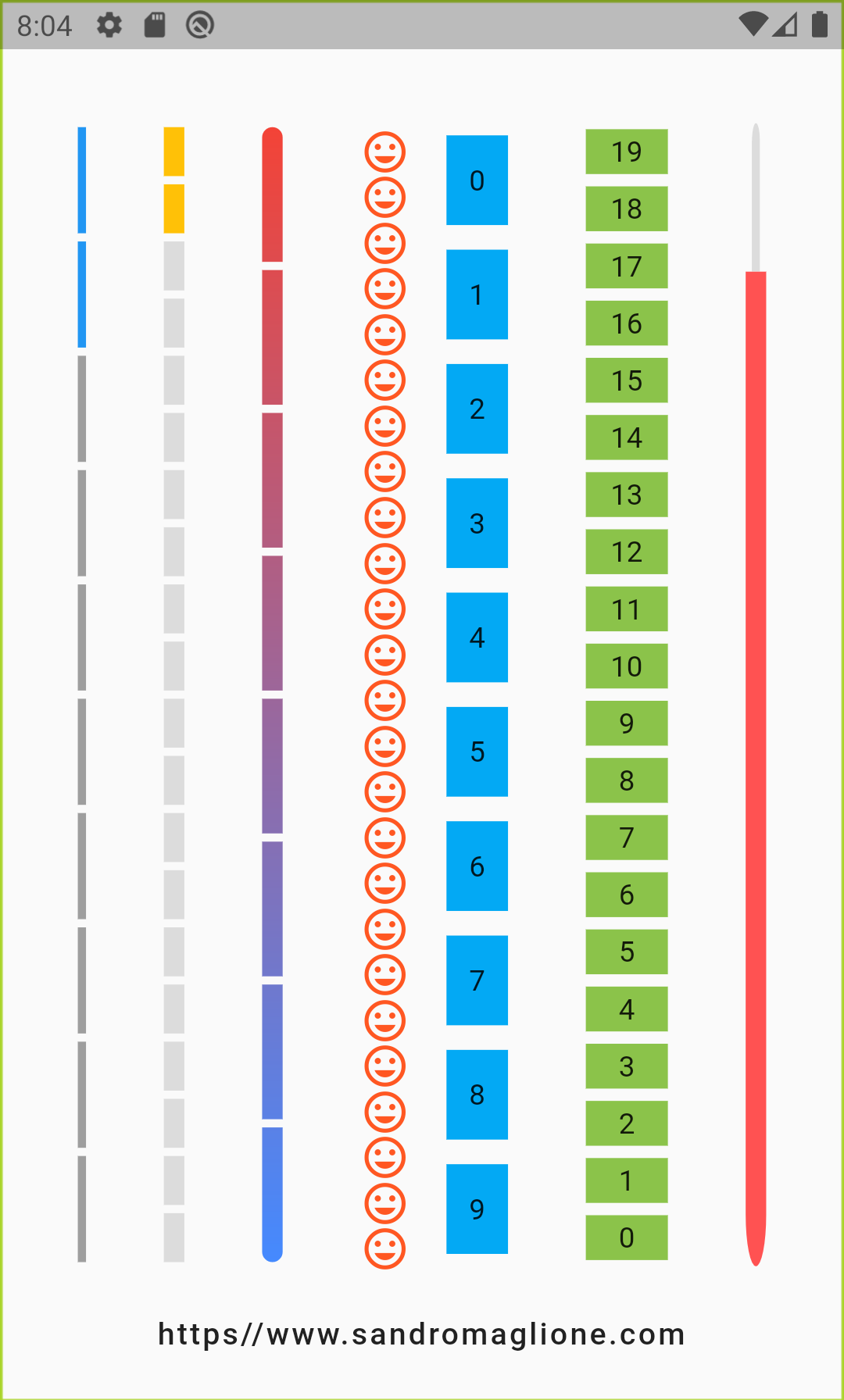
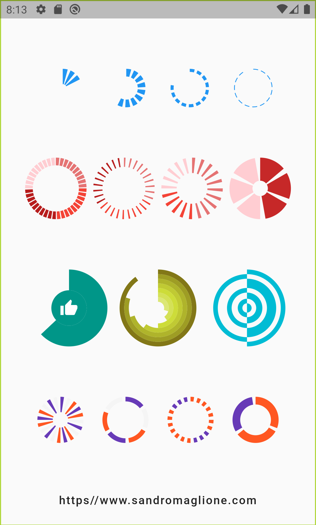
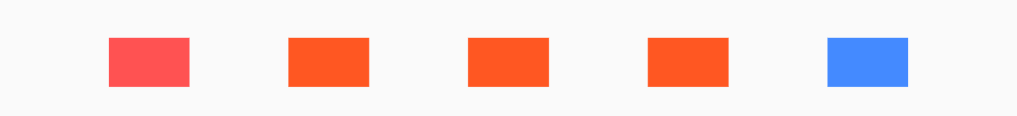
#### CircularStepProgressIndicator - Example 1
```dart
Row(
mainAxisAlignment: MainAxisAlignment.spaceEvenly,
children: [
CircularStepProgressIndicator(
totalSteps: 10,
currentStep: 6,
width: 100,
),
CircularStepProgressIndicator(
totalSteps: 12,
currentStep: 6,
selectedColor: Colors.redAccent,
unselectedColor: Colors.grey[200],
selectedStepSize: 10.0,
width: 100,
),
CircularStepProgressIndicator(
totalSteps: 20,
currentStep: 6,
padding: math.pi / 15,
selectedColor: Colors.cyan,
unselectedColor: Colors.yellowAccent,
selectedStepSize: 3.0,
unselectedStepSize: 9.0,
width: 100,
),
],
)
```
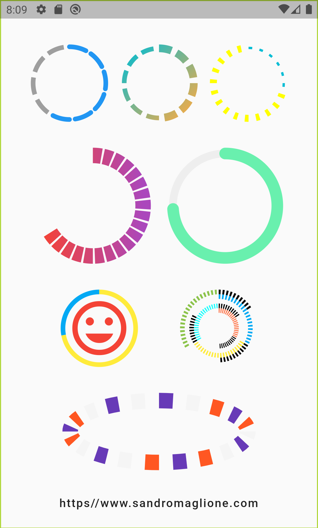
#### CircularStepProgressIndicator - Example 2
```dart
Row(
mainAxisAlignment: MainAxisAlignment.spaceEvenly,
children: [
CircularStepProgressIndicator(
totalSteps: 20,
currentStep: 12,
stepSize: 20,
selectedColor: Colors.red,
unselectedColor: Colors.purple[400],
padding: math.pi / 80,
width: 150,
height: 150,
startingAngle: -math.pi * 2 / 3,
arcSize: math.pi * 2 / 3 * 2,
),
CircularStepProgressIndicator(
totalSteps: 100,
currentStep: 74,
stepSize: 10,
selectedColor: Colors.greenAccent,
unselectedColor: Colors.grey[200],
padding: 0,
width: 150,
height: 150,
selectedStepSize: 15,
),
],
),
```
#### CircularStepProgressIndicator - Example 3

```dart
CircularStepProgressIndicator(
totalSteps: 100,
currentStep: 72,
selectedColor: Colors.yellow,
unselectedColor: Colors.lightBlue,
padding: 0,
width: 100,
child: Icon(
Icons.tag_faces,
color: Colors.red,
size: 84,
),
)
```
#### CircularStepProgressIndicator - Example 4
```dart
CircularStepProgressIndicator(
totalSteps: 20,
stepSize: 20,
customColor: (index) => index % 3 == 0
? Colors.deepPurple
: index % 2 == 0
? Colors.deepOrange
: Colors.grey[100],
width: 250,
)
```
---
## StepProgressIndicator Parameters
| Parameter | Type | Description | Default |
|-------------------|------|-------------|---------|
| **totalSteps** | `int` | Total number of step of the complete indicator. | **`@required`** |
| currentStep | `int` | Number of steps to underline, all the steps with index <= `currentStep` will have Color equal to `selectedColor`. | 0 |
| customStep`(int, Color, double)` | `Widget` | Defines a custom Widget to display at each step, given the current step index, the Color, which could be defined with `selectedColor` and `unselectedColor` or using `customColor`, and its size, which could be defined using `size`, `selectedSize`, `unselectedSize`, or `customSize`. | - |
| onTap`(int)` | `void Function()` | Defines onTap function given index of the pressed step. | - |
| customColor`(int)` | `Color` | Assign a custom Color for each step. | - |
| customSize`(int)` | `double` | Assign a custom size for each step. | - |
| selectedColor | `Color` | Color of the selected steps. | `Colors.blue` |
| unselectedColor | `Color` | Color of the unselected steps. | `Colors.grey` |
| direction | `Axis` | Defines if indicator is horizontal or vertical. | `Axis.horizontal` |
| progressDirection | `TextDirection` | Defines if steps grow from left-to-right / top-to-bottom `TextDirection.ltr` or right-to-left / bottom-to-top `TextDirection.rtl`. | `TextDirection.ltr` |
| size | `double` | Size of the indicator (height if `direction` is `Axis.horizontal`, width if `Axis.vertical`). | 4.0 |
| padding | `double` | Spacing, left-right if horizontal, top-bottom if vertical, of each step. | 2.0 |
| fallbackLength | `double` | Length of the progress indicator in case the main axis (based on `direction` attribute) has no size limit i.e. `double.infinity`. | 100.0 |
| selectedSize | `double` | Specify a custom size for selected steps. | - |
| unselectedSize | `double` | Specify a custom size for unselected steps. | - |
| roundedEdges | `Radius` | Add rounded edge corners to first and last step. | - |
---
## CircularStepProgressIndicator Parameters
| Parameter | Type | Description | Default |
|-------------------|------|-------------|---------|
| **totalSteps** | `int` | Total number of step of the complete indicator. | **`@required`** |
| currentStep | `int` | Number of steps to underline, all the steps with index <= `currentStep` will have Color equal to `selectedColor`. | 0 |
| child | `Widget` | Widget child contained inside the indicator. | - |
| selectedColor | `Color` | Color of the selected steps. | `Colors.blue` |
| unselectedColor | `Color` | Color of the unselected steps. | `Colors.grey` |
| customColor`(int)` | `Color` | Assign a custom Color for each step. | - |
| customStepSize`(int)` | `double` | Assign a custom size for each step. | - |
| selectedStepSize | `double` | Specify a custom size for selected steps. | - |
| unselectedStepSize | `double` | Specify a custom size for unselected steps. | - |
| circularDirection | `TextDirection` | Defines if steps grow clockwise (`CircularDirection.clockwise`) or counterclockwise (`CircularDirection.counterclockwise`) | `CircularDirection.clockwise` |
| stepSize | `double` | Size of the each step of the indicator. | 6.0 |
| height | `double` | Height of the indicator's container. | - |
| width | `double` | Width of the indicator's container. | - |
| padding | `double` | Spacing between each step. | `math.pi / 20` |
| startingAngle | `double` | Angle in which is placed the starting point of the indicator.| 0 |
| arcSize | `double` | Angle in radiants which represents the size of the arc used to display the indicator. | `math.pi * 2` |
| fallbackHeight | `double` | Height of the indicator's container in case the parent height has no size limit i.e. `double.infinity`. | 100.0 |
| fallbackWidth | `double` | Width of the indicator's container in case the parent width has no size limit i.e. `double.infinity`. | 100.0 |
---
## Roadmap
I am always open for suggestions and ideas for possible improvements or fixes.
Feel free to open a Pull request if you would like to contribute to the project.
If you would like to have a new feature implemented, just write a new issue.
## Versioning
- v0.2.3+6 - 20 May 2020
- v0.2.2+5 - 26 April 2020
- v0.2.1+4 - 25 February 2020
- v0.2.0+3 - 24 February 2020
- v0.1.1+2 - 24 January 2020
- v0.1.0+1 - 23 January 2020
## License
MIT License, see the [LICENSE.md](https://github.com/SandroMaglione/step-progress-indicator/blob/master/LICENSE) file for details.