# Ethereal
**Repository Path**: sofqi/Ethereal
## Basic Information
- **Project Name**: Ethereal
- **Description**: Silence theme
- **Primary Language**: CSS
- **License**: MIT
- **Default Branch**: master
- **Homepage**: None
- **GVP Project**: No
## Statistics
- **Stars**: 0
- **Forks**: 0
- **Created**: 2026-09-14
- **Last Updated**: 2026-10-09
## Categories & Tags
**Categories**: Uncategorized
**Tags**: None
## README
# Ethereal
**Keywords / 关键词**
`Obsidian theme` · `zero-override` · `official CSS variables` · `Style Settings` · `light & dark` · `per-mode accent` · `layered CSS snippets` · `ordered & unordered lists` · `callouts` · `blank lines` · `inline code` · `text selection` · `CJK web fonts` · `minimal`
Obsidian 主题 · 零覆盖 · 官方 CSS 变量 · Style Settings 面板 · 明暗双模 · 重音色分模式 · CSS 片段分层 · 有序与无序列表 · 标注 · 空白行 · 行内代码 · 选中文本 · 中文字体兜底 · 极简
[English](#english) · [中文](#中文)
A minimal, **zero-override** theme for [Obsidian](https://obsidian.md/) (formerly *Silence*). Ethereal's base layer does **not** restyle anything itself — it only re-exposes Obsidian's official CSS variables (949 variables extracted from the official 1.14.4 `app.css`) through the [Style Settings](https://github.com/mgmeyers/obsidian-style-settings) plugin, so every look stays 100% native and fully within your control. CSS snippets merged into the theme are self-contained extension layers on top of it.
极简、**零覆盖**的 [Obsidian](https://obsidian.md/) 主题(原名 *Silence*)。基础层**不修改任何原生规则**,只把 Obsidian 官方 CSS 变量(自官方 1.14.4 `app.css` 提取,共 949 个)通过 [Style Settings](https://github.com/mgmeyers/obsidian-style-settings) 插件暴露出来,因此观感 100% 原生且完全由你掌控;并入主题的 CSS 片段则作为独立扩展层叠加其上。
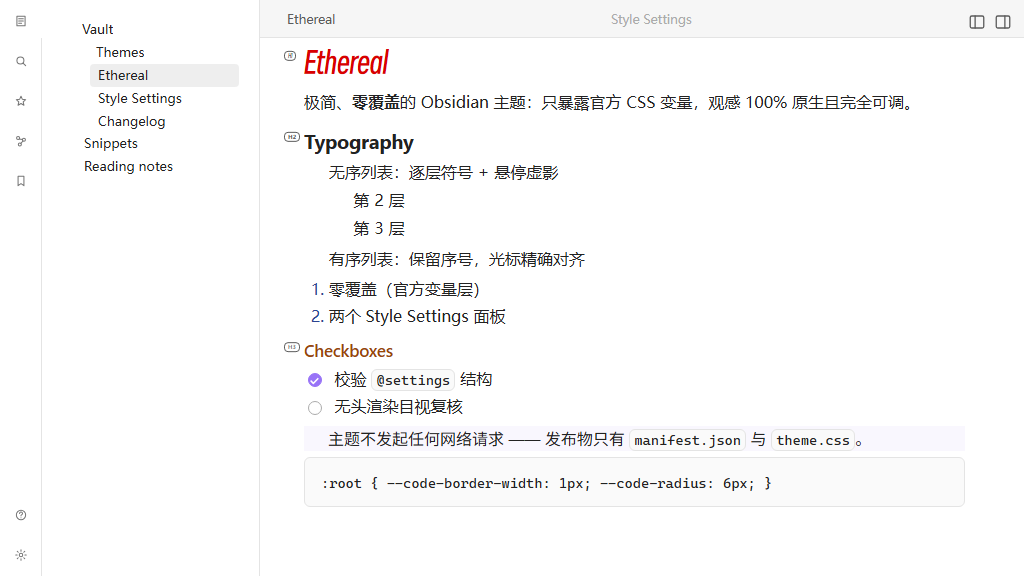
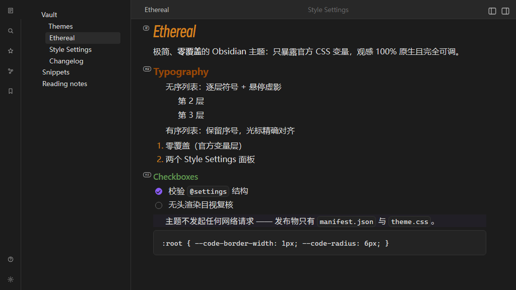
Both images are 1024×576 renders of the real app.css + theme.css in headless Chromium (the community directory recommends 512×288 — same 16:9 aspect).
两张图都是把真实 app.css + theme.css 丢进无头 Chromium 渲染出的 1024×576 图像(社区目录推荐 512×288,比例同为 16:9)。
---
## English
### Features
- **Zero overrides (official-variable layer).** The base layer contains no native-rule changes; only variable defaults are exposed, and locked where a value must not drift. A curated set of official variables gets the theme's own defaults (source: `scripts/defaults.json`), still fully overridable via Style Settings.
- **Two Style Settings panels.** 「Ethereal 定制」 is the beginner-facing panel (220 entries / 179 settings) covering everyday typography, UI and component options; 「Ethereal 官方变量」 is the advanced panel (978 entries / 886 settings) exposing the remaining official variables. Commonly used official variables live in the custom panel only — a single entry point, never duplicated.
- **Tuned defaults out of the box.** A few values ship at the theme's own settings rather than Obsidian's generic ones, so a fresh install already looks the way the theme is designed to. The ribbon is **38px** wide with `10px 0px 6px 0px` padding, and its right divider is hidden so the sidebar reads as one surface; the note-area **dot lattice starts at a 40px spacing**; and its pattern **travels with the text** (「Scroll with document」 ships on). None of these is special-cased — every one is an ordinary panel entry, one click away from being changed back. (Values already stored by Style Settings always win over a theme default, so an existing vault keeps whatever it has; the new defaults apply to settings you have never touched.)
- **Status-bar height is pinned, so it no longer jumps on startup.** Obsidian paints the bar at its official `min-height` (18px) and lets entries size it — but entries only arrive later, since community plugins register theirs after the workspace is ready. An entry carrying a 16px icon is 22px tall (3px padding + icon + 3px), so the bar used to ramp 18 → 26px, and to **34px** as soon as one entry grew taller (a teleprompter entry wraps a 24px `.clickable-icon` button; its own 3px padding makes that 30px, and `.status-bar`'s default `align-items: stretch` applies the tallest entry to every sibling). The theme now pins the geometry with two unconditional rules — `min-height: 26px` on `.status-bar` (22px entry + the theme's 2px padding) and `max-height: 22px` on `.status-bar-item`. `max-height` is a different property from `height`, so plugin CSS loading later cannot undo it (even a declared `height: 30px !important` stays clamped; only a plugin declaring its own `max-height` / `min-height` could push past). No switch: with entries capped, turning the reservation off would only differ for a bar that has no icon-bearing entry at all. Frame-by-frame CDP sampling of a real boot: official 18 / 27 / 31px versus a constant 26px here — the only remaining change is the official 18px first frame handing over to the theme ~30–200ms after the first paint.
- **Light / dark compatibility.** Dual-mode variables (shadows, input backgrounds, text selection, RGB palettes, …) are separated per mode and locked to official light-mode values in light theme. General variables are overridden on `body` and colours on `body.theme-light` / `body.theme-dark`, following Obsidian's theme guidelines.
- **Per-mode accent colours** (Blue Topaz style). The accent HSL settings are split into light/dark groups (`accent-h/s/l-light`, `accent-h/s/l-dark`), since Obsidian's `--accent-h/s/l` is otherwise shared between modes.
- **Layered CSS-snippet merges.** Beyond the official-variable layer, CSS snippets are appended at the end of `theme.css` as self-contained layers (`#region` blocks — List, Custom, Callout, Blank-line), each scoped to its own `--*` namespace, with their settings surfaced in the custom panel (or a dedicated panel), never mixing into the official panel.
- **Inline code: official variables + one hover effect.** Inline code deliberately has **no private variables** — its background, border and radius come from Obsidian's own `--code-background` / `--code-border-width` / `--code-border-color` / `--code-radius`, so there is a single source of truth instead of a second set of controls duplicating them. The theme changes two of those defaults — `--code-border-width` from the official `0px` to **`1px`**, and `--code-radius` from `var(--radius-s)` to **`6px`** — declared as real CSS defaults in the official-variable layer (`scripts/defaults.json` → `:root` / `body`), not merely as panel defaults: Style Settings never injects defaults, so a panel-only value would have no effect. (Since these are official variables, they shape fenced code blocks too.) The border colour stays `--background-modifier-border`, so it adapts to light and dark for free, and the 1px border is what makes inline code visible in dark mode at all, where `--code-background` sits very close to the page background. The single custom option is **hover darken** (「Ethereal 定制 → Typography → Text styles → Inline code」, on by default), which lays Obsidian's own `--background-modifier-hover` over the chip and switches its border to `--background-modifier-border-hover` — the same tokens the variable chips in Style Tuner's settings UI use, so the tint is exactly as strong as that reference (darkens in light mode, lightens in dark) and adapts on its own. **Click-to-copy is deliberately left out of the theme**: Obsidian themes are CSS-only and cannot write to the clipboard or raise a `Notice` — install a community plugin such as *Inline Code Copy* or *Copy Inline Code* if you want that behaviour.
- **Settings sidebar hover highlight.** Obsidian's settings sidebar is inert on hover — only the *active* tab ever gets a background, so the row under the pointer stays invisible. The switch 「Ethereal 定制 → UI → Tabs → **Settings sidebar hover highlight**」 (id `settings-nav-hover-highlight`, **on by default**) paints that row with Obsidian's own `--background-modifier-hover` the moment the pointer lands on it. It is the same token the active row uses, so hovering and being active read as one visual language, and light/dark is handled by the token itself — no per-mode declarations. The effect is deliberately the plainest possible: **background colour only, no transition and no movement**, so the feedback is instant (an earlier fade-and-slide version was dropped — a 140ms fade reads as half a beat late, and the movement was never the point). Dropping the movement also removed a real hazard: sliding the row itself would add horizontal overflow, because `.vertical-tab-header` sets `overflow-y: auto`, which makes `overflow-x` compute to `auto` as well. The single rule sits inside `@media (hover: hover)`, since `:hover` sticks on touch screens. The theme consequently still ships **no `transition` anywhere**. Turn the switch off for the native inert hover back.
- **Ordered lists mirror the unordered ones.** 「Ethereal 定制 → Typography → Ordered list」 carries the same per-level controls (number size and colour, ghost halo colour/size/offset) as 「Unordered list」, with the same defaults — except the symbol, because ordered lists **keep their numbering**. The two views allow different things, and the settings say so: reading-view numbers are the browser's native `::marker`, which honours font properties and `color` but drops `background`/`padding`/`border-radius`, so only size and colour apply there; the halo works in the edit view, where CodeMirror renders the number as a real span (drawn as a pill rather than a circle, since a number is wider than a glyph). Two global sliders tune the geometry: **horizontal adjust** shifts the number left, and **ghost horizontal inset** pulls the halo in so it hugs the digits instead of bulging into the body text. Horizontal adjust defaults to **0**, which makes the ordered-list caret line up exactly with the unordered-list one. Raising it lines the number up with the unordered-list *symbol* instead, but the caret moves with it and the gap before the body text grows by the same amount — **the two alignments are mutually exclusive**: a number is plain text, so its glyph and its caret share a single coordinate, whereas the unordered-list symbol is a pseudo-element drawn centred on the marker point and therefore always sits left of its own caret. (The unordered list's own **symbol adjust** defaults to 0 too, and moves only the symbol — it used to shift the element box, and with it the caret, which is what put the two carets 2px apart.) Both apply to lines that are being edited too — Obsidian skips inline marks that intersect the selection, so any such line has no `.list-number` span for the shift to hang off, and the number used to snap back to the un-shifted position and turn grey. The offset and the per-level size/colour are now applied to that line's marker span as well, covering the caret's line **and** every line a drag-selection covers (only the caret's line carries `.cm-active`, so the rule keys off the missing span instead). The halo is not reproduced there: it needs the real span's box, and these lines are mid-edit, where showing source is Obsidian's native behaviour.
- **Text selection.** The selection background lives in 「Ethereal 定制 → Typography → Text styles → Text selection」 and is Obsidian's own `--text-selection`, moved up from the advanced panel rather than duplicated, so it keeps following your accent colour by default and accepts any CSS colour. No corner-radius option: reading-view selections are painted by the browser and `::selection` does not accept `border-radius`, so only the edit view could be rounded.
- **H1–H6 indicator labels.** Both views print a small `H1`…`H6` chip in the left margin of every heading — reading view and live preview alike — so a heading's level is readable without counting `#`s. It ships **on** and has no panel entry: add the class `remove-heading-indicator` to `` to switch it off. The chip is an absolutely positioned `::before`, so the heading has to be its containing block — the theme gives `h1`…`h6` `position: relative` in the reading view, and the heading **line** (`.cm-line.HyperMD-header-1…6`) the same in the edit view. The edit-view half was missing until 1.6.1, and CM6's own base theme already declares `position: relative` on `.cm-scroller`: the chip's containing block therefore fell back to the **scroll container**, `bottom: 60%` resolved against the viewport height, and the chip was painted at a fixed spot about 40% down the pane instead of next to its heading — which made it invisible for every heading below the first screen. Fixed in 1.6.1.
- **Callouts, merged from the vault snippet.** `Callout.css` now ships inside the theme as the third snippet layer, and its look is the callout default: a centred title bar tinted 20% with the callout's own type colour, normal-text title and icon colours, `4px 12px` title padding, and shrink-to-fit width in both views — the edit view uses `width: fit-content`, the reading view `inline-block`, two formulas that give identical widths, and because the edit-view widget is a real block, CM6's line-height table stays consistent (the old inline-level widget hung a ~10px strut descent below itself and shifted every following line; the measurement record ships as a comment in the layer). The eleven official layout/title/content variables moved into 「Ethereal 定制 → Components → Callouts」 (◉, single entry point; the fourteen per-type colours stay in the official panel), six of them re-defaulted — `--callout-radius: 6px`, `--callout-padding: 0px`, `--callout-title-color: var(--text-normal)`, `--callout-title-padding: 4px 12px`, `--callout-title-weight: 600`, `--callout-content-padding: 0px 12px`. Eight theme-owned variables cover what the official set has no knob for: minimum width, title tint opacity (a 0–100% slider), title font stack, title alignment (centre by default; `flex-start` is the official look), icon/title gap, icon colour, plus two toggles — **full width** (off by default; on restores the official spanning geometry) and **show tip icon** (the merged snippet hides the `tip` callout's icon, written as `body:not(.callout-show-tip-icon)` so the default also holds without Style Settings). Two virtual types survive: a callout type containing `empty` loses its whole title bar, `notitle` only its title text. The theme-owned variables are declared on `body`, not `:root`, because their values reference element-scoped variables (`--callout-color` is defined per callout) and a `:root` declaration would substitute too early and silently invalidate — `body` is also where Style Settings injects, so the defaults stay overridable. If the original snippet is still enabled it loads after the theme and overrides these settings, so disable it in Appearance → CSS snippets.
- **Blank lines, merged from the vault snippet.** `Blank-line-hide.css` ships as the fourth snippet layer: in the live-preview edit view, a line holding only a line break compresses to **0.5em** (a 0–2em slider; 0 hides blank lines completely, a value near the line height approximates the native look). The **native blank lines** toggle restores the full height. Under 「Ethereal 定制 → Typography → Paragraphs」. *(The merged snippet also compressed any line sitting directly before or after a blockquote, callout or heading — even a non-blank one. That half was dropped in 1.6.1: it never actually applied to blank lines, because the blank-line rule below already wins for them with `!important`, and squashing a line of real text into a 0.5em line box only makes it overflow and overlap its neighbours. It was also the trigger of a scroll-jump bug — see [DEBUGLOG.md](DEBUGLOG.md).)*
- **Text alignment.** 「Ethereal 定制 → Typography → Paragraphs → **Text alignment**」 (id `paragraph-text-align`) picks the horizontal alignment of body text: **justify** (the default, inherited from the merged Custom snippet), left, centre or right. The snippet used to hard-code `text-align: justify`, and its selector only ever matched the edit view — `.cm-line` does not exist in the reading view, so the editor justified while reading mode silently stayed left-aligned ever since the merge. Alignment is now a variable (`--paragraph-text-align`, declared on `body` at the same value as the CSS fallback, since Style Settings never injects defaults) applied in **both** views: the edit view keeps the snippet's heading exclusion and additionally skips code-block and table rows, while the reading view targets `p` / `li` — headings, code and tables stay left-aligned on both sides, so the two views always agree. `hyphens: auto` rides along as in the snippet, so justified Latin text breaks words instead of pulling open wide gaps.
- **Highlights: theme gold restored, colour emojis supported.** The strengthened highlight (「Ethereal 定制 → Typography → Text styles → Highlights → **Highlight strengthen**」, on by default) lays a partial-height gradient bar under every ==highlight==, and since 1.14.4 that gradient follows each highlight's own colour: the six emoji-prefixed colours Obsidian just added (==🔴== 🟠 🟡 🟢 🔵 🟣 at the start of the ==marks==) render in their official palettes instead of being painted over, while a plain ==highlight== keeps the theme's gold `rgba(255, 208, 0, 0.4)`. That default had silently degraded to pure `yellow` — 1.14.4 deleted the official `--text-highlight-bg` declaration the theme relied on, and Style Settings never injects defaults — so the theme now ships the default itself: customize the colour in 「Ethereal 定制 → Essentials → Colors → **文本高亮背景色**」, and tune the six colours' depth in 「Ethereal 官方变量 → Typography → Highlights」 via `highlight-background-*` / `highlight-opacity`.
- **Note-area background: drawn patterns and an image.** 「Ethereal 定制 → UI → Background」 paints the main-area Markdown panes only (edit + reading view) — sidebars, other tab types and hover previews are untouched. Three drawn patterns — **solid** (one flat colour), **grid** (a line lattice, with its own spacing, line thickness, colour and opacity) and **dots** (a dot lattice — 40px spacing out of the box — with dot size, colour and opacity) — plus an optional **background image** with fit (cover / contain / auto / tile), position and opacity. It is painted in two layers. The **paper** layer is `.workspace-split.mod-root .workspace-leaf-content[data-type="markdown"] > .view-content`, the element that already carries the official `--background-primary`; it holds the solid colour, the image, and a page-coloured **veil** that implements image opacity (so fading the image never fades the pattern). The **pattern** layer sits on the element that actually scrolls — `.cm-editor > .cm-scroller` in the editor, `.markdown-reading-view > .markdown-preview-view` in the reading view. That placement is what makes **Scroll with document** possible (the toggle is nothing more than `background-attachment: scroll`, pinned to the pane, versus `local`, travelling with the text — and it ships **on**, so the pattern follows the text by default) and, because the pattern layer is a descendant of the paper layer, it is also what keeps the pattern *above* the image. A pair of **offset** sliders (±200px) nudges the pattern's starting position in x and y. Both patterns are drawn as **transparent-background single-pass gradients painted on the scrolling element itself** — the grid as two `linear-gradient` bands, the dots as one `radial-gradient` — so neither carries an opaque base, neither needs a `mask` or a pseudo-element, and both work with either value of `background-attachment` for free. That last point is what keeps **Scroll with document** honest: it is the only construction that satisfies all three requirements at once (sharp dots at small sizes, a coverage area that includes the inline title and excludes the scrollbar, and a background that actually follows the content). One caveat the panel states outright: **background image** is a variable only, because theme CSS cannot reach a file inside the vault (`file://` and `app://local/` are both blocked by the app, and the official docs only sanction base64 embedding) — so the panel takes any CSS image value, a base64 data URL or a remote URL, and the very same variable name (`ui-background-image`) can be filled in by a community plugin such as *CSS Resource Variables* or *Style Context* to point at a vault file. Verified by cross-correlating the pattern's pixel profile across two screenshots: scrolling 137px moves the pattern by exactly −137px (≡ 3px at a 20px spacing) with the switch on and by 0 with it off, on both panes — and the two states agree to the pixel at the top of the note, so flipping the switch never makes the pattern jump.
- **Optional CJK web-font fallback.** `snippets/ethereal-web-fonts.css` in this repo adds `@font-face` rules for the heading / internal-link fonts (`Source Han Serif SC VF`, `Source Han Sans SC VF`) and the H1 display face (`得意黑`) — `src: local(…)` first, CDN second, so an installed copy is used with **zero network requests** and a missing one is fetched as `unicode-range` subsets. It ships **separately from the theme** because Obsidian's developer policies forbid themes from loading network assets — see [Optional: CJK web fonts](#optional-cjk-web-fonts).
- **Companion plugin: Style Tuner.** The optional [obsidian-style-tuner](https://github.com/Dyse-Sofqi/obsidian-style-tuner) plugin adds a live UI for adjusting theme, plugin and snippet CSS variables from inside Obsidian, and shows each setting's variable name as a monospace, click-to-copy chip — which is what replaced the old `(--var)` title suffix. (The earlier `silence-presets` link was dead and has been removed.)
- **Pure CSS, no shipped JavaScript.** The release contains only `manifest.json` + `theme.css`. The Node scripts under `scripts/` are build-time tooling and are not part of the theme.
### Style Settings panel map
Two panels, two audiences. Settings live in exactly one of them.
**「Ethereal 定制」 — 220 entries / 179 settings.** The everyday panel. Group
titles follow the Obsidian UI language (`title` / `title.zh`).
| Group | Sub-groups |
| --- | --- |
| **Essentials** | Colors · Backgrounds · Fonts · Radiuses |
| **Typography** | Paragraphs · Headings *(Colors / Fonts / Sizes / Weights)* · Text styles *(Highlights / Bold / Italic / Inline code / Text selection)* · Links *(Wiki)* · Unordered list *(levels 1–4)* · Ordered list *(levels 1–4)* |
| **UI** | Background *(Drawn background / Grid / Dots / Background image)* · Editing · Tabs |
| **Components** | Checkboxes · Callouts |
**「Ethereal 官方变量」 — 978 entries / 886 settings.** Every remaining official
variable, grouped as in `app.css`, each title prefixed with `◉` so an official
variable is recognisable at a glance.
An official variable that has a better home in the custom panel is moved there
and removed from the official panel — a single entry point, never two. Where an
official variable is still listed but no longer reaches what its name suggests
(the three `--list-marker-*` colours, whose job the per-level list colours took
over), its description says so and points at the panel that does work.
### Installation
1. Install the [Style Settings](https://github.com/mgmeyers/obsidian-style-settings) community plugin (recommended; the theme works without it, but exposes no customization panel).
2. In Obsidian: **Settings → Appearance → Themes → Manage → Browse**, search for **Ethereal**, and install.
- Manual installation: download the latest release from GitHub (contains `manifest.json` + `theme.css`) and place both inside your vault's `.obsidian/themes/Ethereal/` folder.
### Optional: CJK web fonts
The theme itself makes **no network calls at all** — the release contains only `manifest.json` + `theme.css`, with no remote references anywhere in the CSS. Obsidian's developer policies require this for community themes, so the font fallback lives in a separate, opt-in snippet.
To use it:
1. Download [`snippets/ethereal-web-fonts.css`](snippets/ethereal-web-fonts.css) from this repo.
2. Copy it into `/.obsidian/snippets/`.
3. Enable it in **Settings → Appearance → CSS snippets**.
Once enabled, the snippet contacts:
| Host | Purpose |
| --- | --- |
| `cdn.jsdelivr.net` (primary) | `@fontsource-variable/noto-serif-sc`, `@fontsource-variable/noto-sans-sc`, `cn-fontsource-smiley-sans-oblique-regular` |
| `fastly.jsdelivr.net` (mirror) | same packages, used only if the primary fails |
- If 思源宋体 / 思源黑体 / 得意黑 are installed locally, `local()` matches and **nothing is downloaded**.
- Because the faces are `unicode-range` subsets, only the subsets containing characters actually rendered are requested (~80–104 KB each, then HTTP-cached). Requests carry no cookies or identifiers.
- No telemetry, no analytics, no accounts. Turn the snippet off and all network activity stops.
### Development
```bash
npm run validate:settings # validate both @settings blocks (structure, types, duplicate ids)
npm run gen:settings # regenerate the official-variable panel (writes to a temp path — never straight onto theme.css)
npm run gen:webfonts # regenerate the @font-face web-font region (idempotent, in-place)
```
### Compatibility
- Obsidian **1.0.0+** (panel contents are generated from the official **1.14.4** `app.css`).
### License
MIT License — see [LICENSE](LICENSE). The theme exposes Obsidian's native CSS variables; Obsidian's assets remain property of Obsidian, Inc. The optional web-font snippet references open-source fonts served by jsDelivr: 思源宋体 / 思源黑体 (SIL Open Font License 1.1) and 得意黑 Smiley Sans (SIL Open Font License 1.1).
---
## 中文
### 功能
- **零覆盖(官方变量层)**。基础层不含任何原生规则改动,只暴露变量默认值,并在「该值不应漂移」处锁定。一批官方变量采用主题自定默认值(数据源 `scripts/defaults.json`),且始终可在 Style Settings 中覆盖。
- **两个 Style Settings 面板**。「Ethereal 定制」面向日常使用(220 项 / 179 个设置),涵盖正文排版、界面与组件;「Ethereal 官方变量」为进阶面板(978 项 / 886 个设置),暴露其余官方变量。常用官方变量只出现在定制面板,单一入口、不重复。
- **开箱即用的默认值**。有几处值用的是主题自己的设定,而非 Obsidian 的通用值,因此全新安装就已经是主题设计的样子:功能区宽 **38px**、内边距 `10px 0px 6px 0px`,右侧分隔线隐藏,侧边栏读起来是完整的一块;笔记区的**点阵默认间距 40px**,且图案**随正文滚动**(「随文档滚动」默认开启)。这些都不是特例 —— 每一项都是普通的面板条目,一键即可改回去。(Style Settings 里**已保存**的值始终优先于主题默认值,所以已有库保持原样;新默认值只作用于你从未动过的设置。)
- **状态栏高度钉死,启动时不再跳变**。Obsidian 先按官方 `min-height`(18px)画状态栏,高度随后才由条目决定 —— 而条目总是后到:社区插件的条目要等 workspace 就绪才注册。带 16px 图标的条目高 22px(上下各 3px + 图标 16px),所以栏高会 18 → 26 连跳;插件条目一旦长高,还会被 `.status-bar` 默认的 `align-items: stretch` 放大到整排 —— 提词器插件的条目里包了一个 24px 的 `.clickable-icon` 按钮(上下各 4px + 16px 图标),条目自身再加 3px×2 = 30px,整条栏于是冲到 **34px**。主题现在用两条无条件规则钉死几何:`.status-bar` 的 `min-height: 26px`(22px 条目 + 主题的上下各 2px)与 `.status-bar-item` 的 `max-height: 22px`。`max-height` 与 `height` 是两个属性,插件 CSS 后加载也盖不掉它(实测连 `height: 30px !important` 都照样被夹住,只有插件自己声明 `max-height` / `min-height` 才可能顶开)。不做开关:条目封顶之后,「关掉预留」只有在整条栏连一个图标条目都没有时才看得出区别。CDP 逐帧采样真实启动:官方 18 / 27 / 31px,本主题恒为 26px —— 只剩「官方 18px 首帧在首绘后约 30–200ms 交给主题」这一帧变化。
- **明暗双模兼容**。明暗差异变量(阴影、输入框背景、文本选择、RGB 色板等)按模式分开,并在明亮主题下锁定为官方明亮值。通用变量在 `body` 上覆盖、颜色在 `body.theme-light` / `body.theme-dark` 上覆盖,遵循 Obsidian 主题规范。
- **重音色分模式**(Blue Topaz 风格)。重音 HSL 拆成明/暗两组(`accent-h/s/l-light`、`accent-h/s/l-dark`),因为 Obsidian 的 `--accent-h/s/l` 本身在明暗之间共享。
- **CSS 片段分层并入**。在官方变量层之外,CSS 片段以自包含层的形式追加在 `theme.css` 末尾(`#region` 区块 —— 无序列表、Custom、Callout、空白行),每层使用独立 `--*` 命名空间,设置收在定制面板(或独立面板),不与官方面板混在一起。
- **行内代码:只用官方变量 + 一个悬停效果**。行内代码刻意**不设私有变量** —— 底色、边框、圆角全部来自 Obsidian 官方的 `--code-background` / `--code-border-width` / `--code-border-color` / `--code-radius`,单一数据源,不再重复造一套控件。主题改动了其中两个默认值 —— `--code-border-width` 从官方 `0px` 提到 **`1px`**、`--code-radius` 从 `var(--radius-s)` 提到 **`6px`**,都写在官方变量层的 CSS 默认值里(`scripts/defaults.json` → `:root` / `body`),而不是只改面板默认值 —— Style Settings 从不注入默认值,只改面板等于无效。(这两个都是官方变量,因此围栏代码块同样受影响。)边框色沿用 `--background-modifier-border`,因此自动适配日间/夜间;这道 1px 边框也是深色模式下行内代码能被看见的关键(那里 `--code-background` 与页面底色非常接近)。唯一的自建选项是**悬停压暗**(「Ethereal 定制 → 正文排版 → 文本样式 → 行内代码」,默认开启):在底色上叠一层官方 `--background-modifier-hover`,并把边框换成 `--background-modifier-border-hover` —— 正是 Style Tuner 设置界面变量代码块用的那两个 token,强度与参照物完全一致(日间压暗、夜间提亮),且明暗自适应。**点击复制刻意不做进主题**:主题只有 CSS,无法写剪贴板、无法弹 `Notice` —— 需要该行为请安装社区插件(如 *Inline Code Copy*、*Copy Inline Code*)。
- **设置侧边栏悬停底色**。Obsidian 设置窗口的左侧栏原生对悬停毫无反应 —— 只有*当前选中*那一项会带底色,指针底下的那一行什么都不会发生。开关在「Ethereal 定制 → 界面 → 标签页与窗口 → **设置侧边栏悬停底色**」(id `settings-nav-hover-highlight`,**默认开启**):指针落到某一行的那一刻,该行即得到 Obsidian 官方的 `--background-modifier-hover` 底色。它与选中项用的是同一个 token,因此「悬停」与「选中」读起来是同一套视觉语言,明暗由 token 自己适配,不需要任何按明暗分档的声明。效果刻意做成**最朴素的形态:只有底色,没有过渡、没有位移**,反馈才能即时(第一版的「140ms 淡入 + 右移 3px」被否掉:「淡入」读起来慢半拍,而「位移」本就不是要的效果)。去掉位移还顺带消掉一个真实隐患:位移若作用在条目本身,右侧会多出横向溢出(`.vertical-tab-header` 声明了 `overflow-y: auto`,会让 `overflow-x` 也计算成 `auto`)。唯一这条规则包在 `@media (hover: hover)` 里,因为触屏上 `:hover` 会「粘住」。因此主题至今**没有任何 `transition`**。关掉开关即回到原生「悬停毫无反应」的状态。
- **有序列表复刻无序列表**。「Ethereal 定制 → 正文排版 → 有序列表」提供与「无序列表」相同的逐层设置(数字大小/颜色、虚影背景色/光环大小/偏移),默认值也一致 —— 只少了「符号」项,因为有序列表**保留序号**。两个视图能做的事不同,设置项里已注明:阅读模式的序号是浏览器原生 `::marker`,只认字体属性与 `color`,`background`/`padding`/`border-radius` 会被丢弃,因此只能调字号与颜色;虚影在编辑视图生效(那里 CodeMirror 把序号渲染成真实 span,虚影画成随数字宽度自适应的胶囊而非圆形)。另有两个全局微调:**序号左右调整量**(默认 **0**,此时有序列表的**光标**与无序列表精确对齐)与**虚影水平内缩**(把虚影收进来贴住数字,避免胖出去压到正文)。把序号调整量调为正值,序号会改为与无序列表的**符号**对齐 —— 但光标会跟着一起移动、序号与正文之间的空隙也等量变大,**这两种对齐互斥**:序号是普通文本,字形与光标共用一个坐标;而无序列表的符号是伪元素、以标记点为圆心绘制,永远比它自己的光标靠左。(无序列表的**符号左右调整量**默认也是 0,且只移动符号本身 —— 旧写法会连元素盒与光标一起推,正是两个光标差 2px 的原因。)两项在**正在编辑的行上也生效** —— Obsidian 会跳过与选区相交的行内装饰,这类行没有 `.list-number` 可挂,序号本来会「回退」并变灰。现在偏移量与逐层字号/颜色都补到了该行的标记段上,覆盖**光标所在行**以及**拖拽选区覆盖的每一行**(只有光标行带 `.cm-active`,所以规则按「缺少 span」判断而非按 `.cm-active`)。这些行不补虚影:虚影需要真实盒子的几何,而这些行正处于编辑中,显示源码是 Obsidian 的原生行为。
- **选中文本**。选区底色在「Ethereal 定制 → 正文排版 → 文本样式 → 选中文本」,用的是 Obsidian 官方的 `--text-selection`(自进阶面板上收,不重复造变量),默认仍跟随强调色,也可填任意 CSS 颜色。**不提供圆角**:阅读模式的选区由浏览器绘制,`::selection` 不接受 `border-radius`,只有编辑视图能加圆角。
- **H1–H6 指示标签**。两个视图都会在每个标题左侧画出一个小 `H1`…`H6` 标签(阅读视图与实时预览一致),不必数 `#` 就能看出标题层级。**默认开启、没有面板条目** —— 想关掉给 `` 加上类 `remove-heading-indicator` 即可。标签是绝对定位的 `::before`,因此标题必须是它的包含块:阅读视图里主题给 `h1`…`h6` 加了 `position: relative`,编辑视图里则加在标题**行**(`.cm-line.HyperMD-header-1…6`)上 —— 编辑视图这一半在 1.6.1 之前是缺的,而 CM6 自己的 baseTheme 已经把 `.cm-scroller` 声明成 `position: relative`,于是标签的包含块回落到**滚动容器**、`bottom: 60%` 按视口高度解析,标签被画在窗格下方约 40% 处的固定位置而不是贴着标题 —— 首屏以外的标题因此完全看不到标签。1.6.1 修复。
- **标注(Callout)**。库里的 `Callout.css` 片段已吞并为第三个片段层,其外观即主题默认:标题栏居中并以该标注的类型色染 20% 底色,标题与图标用常规文字色,标题内边距 `4px 12px`,两个视图都按内容收缩宽度 —— 编辑视图用 `width: fit-content`、阅读视图用 `inline-block`,两种写法的收缩公式一致、宽度逐像素相同;编辑视图的 widget 是真块级盒,CM6 行高表因此保持一致(旧的行内级 widget 会在自身下方挂出约 10px 的 strut 空隙、把后面每一行推低,实测记录以注释形式随层交付)。官方的 11 个布局/标题/内容变量上收至「Ethereal 定制 → 组件 → 标注」(带 ◉、单一入口;14 种逐类颜色仍在官方面板),其中 6 项默认值按片段外观改写 —— 圆角 6px、容器内边距 0px、标题颜色 `var(--text-normal)`、标题内边距 `4px 12px`、标题字重 600、内容内边距 `0px 12px`。另提供 8 个官方没有的主题自有设置:最小宽度、标题底色浓度(0–100% 滑杆)、标题字体栈、标题对齐(默认居中;`flex-start` 即官方样式)、图标与标题间距、图标颜色,以及两个开关 —— **撑满整行**(默认关,开启回到官方满宽几何)与**显示 tip 标注图标**(吞并的片段默认隐藏 tip 标注的图标,写成 `body:not(.callout-show-tip-icon)`,未装 Style Settings 时默认同样隐藏)。片段的两个虚拟类型保留:类型名含 `empty` 隐藏整个标题栏,含 `notitle` 仅隐藏标题文字。主题自有变量声明在 `body` 而非 `:root` —— 它们的值引用了元素级变量(`--callout-color` 定义在每个标注上),声明在 `:root` 会在 html 上提前求值而静默失效;`body` 也是 Style Settings 注入的位置,默认值仍可覆盖。若原片段仍启用会加载在主题之后、压过这些设置,请在外观 → CSS 片段中停用。
- **空白行(Blank line)**。库里的 `Blank-line-hide.css` 片段已吞并为第四个片段层:实时预览编辑视图中,只有一个换行符的空行会压缩到 **0.5em**(滑杆 0–2em,0 为完全隐藏,接近行间距的值 ≈ 原生观感);**空白行恢复原生**可整体停用、回到原生整行高。位于「Ethereal 定制 → 正文排版 → 段落」。(片段原版还会压缩紧邻引用块 / 标注 / 标题的行 —— 即使不是空行 —— 这一半在 1.6.1 移除:它对空行从未真正生效(空行已被下面那条空行规则以 `!important` 压到同一值),而对正文行则是把行盒压到 0.5em、让文字溢出并与相邻行重叠;它同时还是「首次滚轮滚动轴回跳」的触发条件,详见 [DEBUGLOG.md](DEBUGLOG.md)。)
- **文本对齐方式**。「Ethereal 定制 → 正文排版 → 段落 → **文本对齐方式**」(id `paragraph-text-align`)控制正文的水平对齐:**两端对齐**(默认,继承自吞并的 Custom 片段)、左对齐、居中、右对齐。原片段把 `text-align: justify` 写死,且其选择器只命中过编辑视图 —— 阅读视图根本没有 `.cm-line` 元素,于是自吞并以来编辑器一直两端对齐、阅读模式却悄悄保持左对齐。对齐现在由变量驱动(`--paragraph-text-align`,声明在 `body`、与 CSS 回退值同值 —— Style Settings 从不注入默认值),并且**两个视图都生效**:编辑视图保留片段原有的标题排除、再排除代码块行与表格行;阅读视图命中段落 `p` 与列表项 `li` —— 标题、代码与表格在两侧都保持左对齐,两个视图观感永远一致。`hyphens: auto` 随规则保留(与片段一致),两端对齐的拉丁文本会自动断字而不是拉出大空隙。
- **高亮:主题金黄回归,颜色表情适配。** 高亮加强(「Ethereal 定制 → 正文排版 → 文本样式 → 高亮 → **高亮加强**」,默认开启)给每个 ==高亮== 垫一条部分高度的渐变色带,且渐变跟随每个高亮自己的颜色:Obsidian 1.14.4 新增的六种颜色表情(在 ==高亮== 开头写 ==🔴== 🟠 🟡 🟢 🔵 🟣)按官方配色渲染、不再被同一条色带盖住;无表情的普通 ==高亮== 保持主题金黄 `rgba(255, 208, 0, 0.4)`。这个默认值曾悄悄退化成纯 yellow —— 1.14.4 删除了主题所依赖的官方 `--text-highlight-bg` 声明,而 Style Settings 从不注入默认值 —— 现由主题自己在「主题默认值」层提供:颜色在「Ethereal 定制 → 常用 → 颜色 → **文本高亮背景色**」修改,六色深浅在「Ethereal 官方变量 → 排版 → 高亮」调 `highlight-background-*` / `highlight-opacity`。
- **笔记区背景:绘制图案 + 背景图片**。「Ethereal 定制 → 界面 → 背景」只作用于主区域的 Markdown 笔记窗格(编辑器 + 阅读视图),侧边栏、其它类型标签页与悬浮预览都不受影响。绘制背景三种:**白板**(铺一层纯色)、**网格**(线条格,间距、线条粗细、颜色、不透明度各自可调)、**点阵**(点的格,默认间距 40px,点大小、颜色、不透明度可调);另有可选的**背景图片**,带适配方式(铺满 / 完整显示 / 原始大小 / 平铺)、位置与不透明度。背景分两层画:**「纸面」层**是 `.workspace-split.mod-root .workspace-leaf-content[data-type="markdown"] > .view-content`(官方正是在它上面声明 `--background-primary`),放白板纯色、图片,以及实现图片透明度的页面底色 **veil** —— veil 夹在图案与图片之间,所以淡化图片不会连带淡化图案;**「图案」层**画在真正滚动的那个元素上 —— 编辑视图 `.cm-editor > .cm-scroller`,阅读视图 `.markdown-reading-view > .markdown-preview-view`。挂在这一层既是**随文档滚动**能成立的原因(开关本体只是 `background-attachment` 的 `scroll`(钉在窗格上)与 `local`(跟着正文走)之别,且**默认开启**),也因为它同时是「纸面」层的后代,图案才稳定地叠在图片之上。另有**水平 / 垂直两个初始偏移滑杆**(±200px)微调图案的起始位置。两种图案都是**透明底、单层渐变、直接画在滚动元素自身**(网格是两条 `linear-gradient` 色带,点阵是一条 `radial-gradient`)—— 因此不带任何不透明底色、不需要 `mask`、也不需要伪元素,且两种 `background-attachment` 取值天然都支持。最后这一点正是「随文档滚动」能成立的原因:它是**唯一**能同时满足三项要求(小尺寸下点边缘清晰、覆盖范围含内联标题且不含滚动条、背景真正跟随内容)的画法。面板里明写一条限制:**背景图片**只能填 CSS 图片值 —— 主题 CSS 读不到库内文件(`file://` 与 `app://local/` 都被应用层拦掉,官方文档只认可 base64 内嵌),所以面板接受 base64 data 地址或网络地址;同一个变量名(`ui-background-image`)也可以交给 *CSS Resource Variables*、*Style Context* 这类社区插件填,直接指向仓库里的图片。用「图案像素剖面互相关」实测:滚动 137px 后,开启时图案恰好位移 −137px(间距 20px 下 ≡ 3px)、关闭时位移 0,两个视图都如此;且两态在文档顶端的相位**逐像素一致**,来回拨开关不会让图案跳一下。
- **可选的中文字体兜底**。仓库内的 `snippets/ethereal-web-fonts.css` 为标题与内链字体(`Source Han Serif SC VF`、`Source Han Sans SC VF`)以及 H1 展示字体(`得意黑`)提供 `@font-face` 规则:`src` 以 `local(…)` 优先、CDN 兜底 —— 本机已装则**零网络请求**,未装才按 `unicode-range` 分片下载。它**独立于主题本体发布**,因为 Obsidian 的开发者政策禁止主题加载网络资源 —— 详见[可选:中文字体网络兜底](#可选中文字体网络兜底)。
- **配套插件:Style Tuner**。可选插件 [obsidian-style-tuner](https://github.com/Dyse-Sofqi/obsidian-style-tuner) 在 Obsidian 内提供一套实时调节主题 / 插件 / 片段 CSS 变量的界面,并把每个设置项的变量名显示成等宽、可点击复制的标签 —— 1.4.1 移除标题里的 `(--var)` 后缀,就是由它接替。(旧文档里的 `silence-presets` 链接已失效,本次一并撤掉。)
- **纯 CSS,不含 JS 产物**。发布物只有 `manifest.json` + `theme.css`;`scripts/` 下的 Node 脚本是构建期工具,不属于主题本体。
### 面板结构
两个面板,对应两类使用者。同一个设置只会出现在其中一个。
**「Ethereal 定制」—— 220 项 / 179 个设置**,面向日常使用。分组标题跟随 Obsidian 界面语言切换(`title` / `title.zh`)。
| 分组 | 子分组 |
| --- | --- |
| **常用 Essentials** | 颜色 · 背景 · 字体 · 圆角 |
| **正文排版 Typography** | 段落 · 标题*(颜色 / 字体 / 字号 / 字重)* · 文本样式*(高亮 / 粗体 / 斜体 / 行内代码 / 选中文本)* · 链接*(双链)* · 无序列表*(第 1–4 层)* · 有序列表*(第 1–4 层)* |
| **界面 UI** | 背景*(绘制背景 / 网格 / 点阵 / 背景图片)* · 编辑与光标 · 标签页与窗口 |
| **组件 Components** | 复选框 · 标注 |
**「Ethereal 官方变量」—— 978 项 / 886 个设置**,收录其余全部官方变量,分组沿用 `app.css` 的分类,标题统一带 `◉` 前缀,一眼可辨官方变量。
在定制面板里有更好归属的官方变量会被**搬过去并从官方面板删除** —— 单一入口,不重复。若某个官方变量仍然列出、但已不再影响它名字所暗示的对象(如三个 `--list-marker-*` 颜色已被逐层列表配色接管),它的说明里会写明这一点,并指向真正生效的面板。
### 安装
1. 安装社区插件 [Style Settings](https://github.com/mgmeyers/obsidian-style-settings)(推荐;不装主题也能用,只是没有定制面板)。
2. 在 Obsidian 中:**设置 → 外观 → 主题 → 管理 → 浏览**,搜索 **Ethereal** 安装。
- 手动安装:从 GitHub 下载最新 release(含 `manifest.json` + `theme.css`),两者一起放进库的 `.obsidian/themes/Ethereal/` 目录。
### 可选:中文字体网络兜底
主题本体**完全不发起任何网络请求** —— 发布物只有 `manifest.json` + `theme.css`,CSS 里没有任何远程引用。这是 Obsidian 开发者政策对社区主题的硬性要求,因此字体兜底被放在一个独立的、需自行启用的片段里。
启用方法:
1. 从本仓库下载 [`snippets/ethereal-web-fonts.css`](snippets/ethereal-web-fonts.css)。
2. 复制到 `<库>/.obsidian/snippets/`。
3. 在**设置 → 外观 → CSS 片段**中打开开关。
启用后,该片段会访问:
| 主机 | 用途 |
| --- | --- |
| `cdn.jsdelivr.net`(主源) | `@fontsource-variable/noto-serif-sc`、`@fontsource-variable/noto-sans-sc`、`cn-fontsource-smiley-sans-oblique-regular` |
| `fastly.jsdelivr.net`(镜像) | 同一批包,仅在主源失败时使用 |
- 本机装了思源宋体 / 思源黑体 / 得意黑时,`local()` 命中,**不产生任何下载**。
- 因为按 `unicode-range` 分片,只请求**实际渲染到的字符**所在的子集(单个约 80–104 KB,之后走 HTTP 缓存)。请求不带 Cookie 或任何标识。
- 无遥测、无统计、无账号。关掉该片段,所有网络活动即停止。
### 开发
```bash
npm run validate:settings # 校验两个 @settings 块(结构、类型、重复 id)
npm run gen:settings # 重新生成官方变量面板(输出到临时路径,切勿直接覆盖 theme.css)
npm run gen:webfonts # 重新生成 @font-face 字体区域(幂等,原地替换)
```
### 兼容性
- Obsidian **1.0.0+**(面板内容基于官方 **1.14.4** 的 `app.css` 生成)。
### 许可
MIT License —— 见 [LICENSE](LICENSE)。主题暴露的是 Obsidian 原生 CSS 变量,Obsidian 的资产版权归 Obsidian, Inc.。可选字体片段引用 jsDelivr 上的开源字体:思源宋体 / 思源黑体(SIL Open Font License 1.1)、得意黑 Smiley Sans(SIL Open Font License 1.1)。