代码拉取完成,页面将自动刷新
https://herbertograca.com/2019/08/12/documenting-software-architecture/
This post is part of The Software Architecture Chronicles*, a* series of posts about Software Architecture*. In them, I write about what I’ve learned on Software Architecture, how I think of it, and how I use that knowledge. The contents of this post might make more sense if you read the previous posts in this series.*
We learn how to code and we build some cool applications, and then we learn about architecture and how to make the application maintainable for several years…
However when we need to explain to someone else (new developer, product owner, investor, …) how the application works, we need something more… we need documentation.
But what documentation options do we have that can express the whole application building blocks and how it works?!
In this post I’m going to write about:
There are several diagrams we can create using UML, and we can segregate them into two categories:
REPORT THIS AD
<iframe frameborder="0" scrolling="no" width="300" height="250" style="width: 300px; max-width: 100%; border: none; margin: 0px; overflow: hidden; height: 250px;"></iframe>REPORT THIS AD
I will not go into the details of each type of diagram because it would be too much to cover in this post, and there are plenty of resources out there documenting these diagram types. To know more about each of these types, you can check each of the links above that lead to some Visual Paradigm guides, or check out this blog post.
All in all, UML is cool, it’s very interesting, we can be very expressive with it, we can easily sketch some ideas with it and discuss it with colleagues.
However, to document a whole application architecture using UML we need to use several types of diagrams. Furthermore, if we try to use one single class diagram to express the whole application we are asking for trouble.
An example of good usage of an UML class diagram is to document design patterns:
 Source: https://java-design-patterns.com/patterns/strategy
This is fine, this is actually great! It can express classes, interfaces, usability and inheritance relations, data and behaviours. It is also concise and readable, and because it’s small, it’s also fast to create.
However, the example below is not so useful… It’s very big, so it gets confusing and difficult to follow. Furthermore, it will take so much time to create it, that when we are finished, it will probably be outdated already because someone will have made changes to the code in the mean time.
 Source: https://knowhow.visual-paradigm.com
REPORT THIS AD
<iframe frameborder="0" scrolling="no" width="300" height="250" style="width: 300px; max-width: 100%; border: none; margin: 0px; overflow: hidden; height: 250px;"></iframe>REPORT THIS AD
So, we can and should use UML, but for the situations it should be used: to describe patterns, small portions of an application in detail, or high granularity views of the application with low detail (not using class diagrams).
But then the question remains, how do we document a full application?!
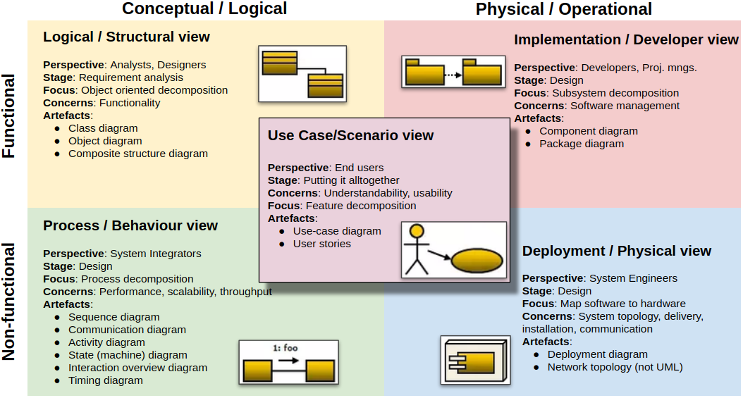
The 4+1 Architectural view model was created by Philippe Kruchten and published, back in 1995, in his paper titled “Architectural Blueprints—The “4+1” View Model of Software Architecture“.
This way of visualising a software application architecture is based on 5 views/perspectives of the application, telling us what diagrams can be used to document each of those views.
REPORT THIS AD
<iframe frameborder="0" scrolling="no" width="300" height="250" style="width: 300px; max-width: 100%; border: none; margin: 0px; overflow: hidden; height: 250px;"></iframe>REPORT THIS AD
It’s important to note that the 4+1 architectural view-model does not mandate that we use all mentioned diagrams, and not even all the views. We always need to understand the tools, and use no more and no less than what we need.
The Architecture Decision Records (ADR) are actually not really about documenting the current, or future, state of an application architecture, but instead the reasons that led to it. They are specially important because they intend to tell others, and our future selves, why the architecture is what it is.
An ADR is a log entry about the architecture decisions that have been made and that lead to the state of the architecture as it is now or as it is intended to be in the future. They contain the why behind the the diagrams that describe the architecture.
To start, there are a few artefacts that we need to know:
I have seen a few templates for creating ADRs, and I saw nice things in several of them, so I created my own template. You can, and maybe should, create yours as well, one that makes sense to you and your team.
For me, the most important thing for a template is that it’s simple, and it has some documentation in it to help fill it in and even to help make pragmatical and unbiased decisions.
The best way to use an ADR is not simply as a document written after having a discussion and making a decision. The best is to use it as the starting point for the discussion, as an RFC (Request For Comments), which is an idea/proposal that we submit to the other members of the team/department requesting their input/opinion/approval. The intention is really to use it to start a discussion, brainstorm, make the best decision possible, and use the proposal document itself as the decision log entry (ADR). The fact that the ADR is written before hand, doesn’t mean that it is immutable, it must be updated/improved as the discussion unfolds. I find it specially important that all the options under consideration be written down with their pros and cons, as to spark discussion and a clear decision.
<iframe frameborder="0" scrolling="no" width="728" height="90" style="width: 728px; max-width: 100%; border: none; margin: 0px; overflow: hidden; height: 90px;"></iframe>REPORT THIS AD
So, this is the template I came up with:
 https://docs.google.com/document/d/1Xe5erulKsdaha3uwU6tNWsAWxjQK-Rcrr_iJeOCXuSQ/edit?usp=sharing
Feel free to copy it from google docs.
If you want to explore this subject more, I recommend heading to the Joel Parker Henderson github repository about ADRs.
The C4 model was introduced by Simon Brown, and it’s the best idea about software architecture documentation that I’ve come across so far. I’ll quickly explain the main idea in my own words, although using his own example diagrams.
<iframe frameborder="0" scrolling="no" width="300" height="250" style="width: 300px; max-width: 100%; border: none; margin: 0px; overflow: hidden; height: 250px;"></iframe>REPORT THIS AD
<iframe frameborder="0" scrolling="no" width="300" height="250" style="width: 300px; max-width: 100%; border: none; margin: 0px; overflow: hidden; height: 250px;"></iframe>REPORT THIS AD
The idea is to use 4 different granularity (or zoom) levels for documenting software architecture:
This is the highest granularity diagram. It has little detail but its main goal is to describe the context in which the application is. So, it will be composed by one single box for the whole application, and it will be surrounded by other boxes that refer to the external systems and users the application interacts with.
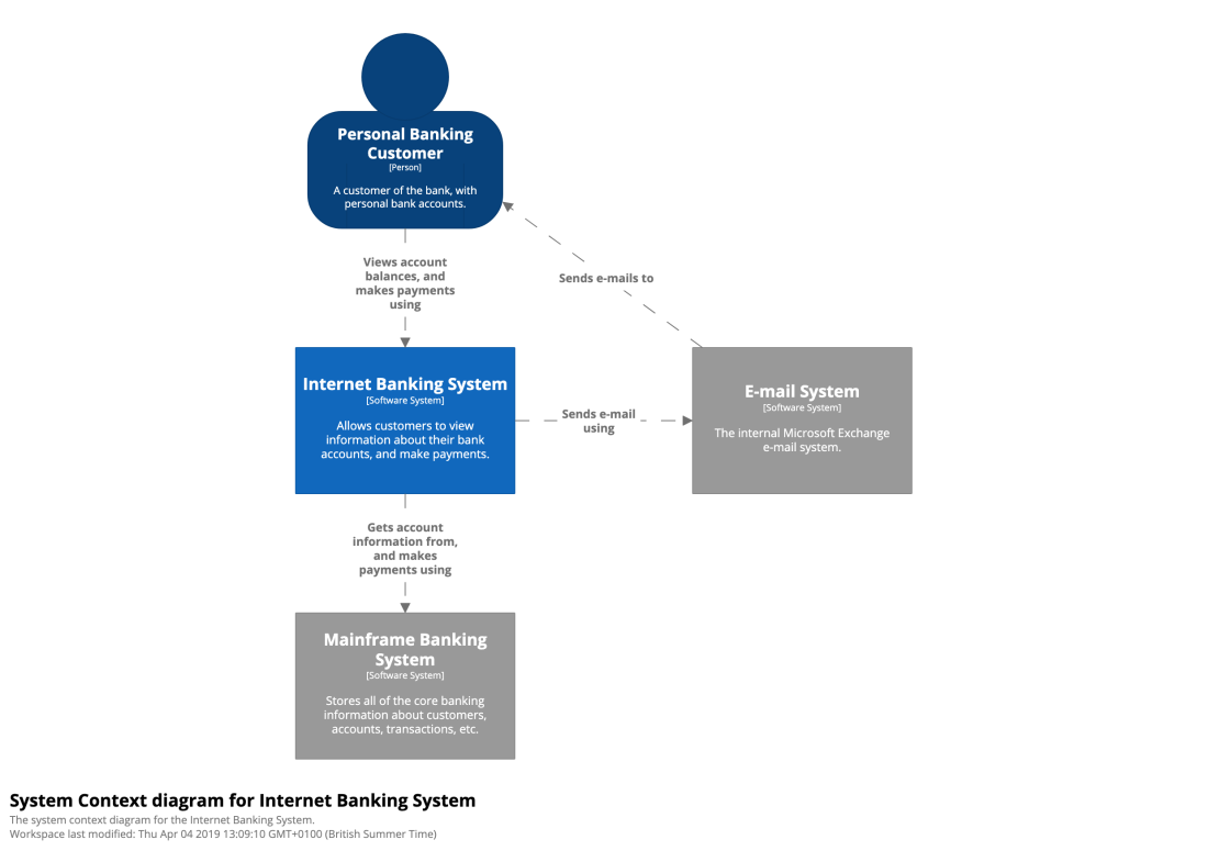
Now, we zoom into our application, the blue square in the diagram above which maps to the dashed square in the diagram below.
At this level of granularity, we will see the containers of the application, where a container is any independent technical piece of the application, for example a mobile app, an API or a database. It also documents the major technologies used and how the containers communicate.

The component diagram shows us the components inside one container. In this context, each component is a module of the application, not restricted to domain wise modules (ie. billing, users, …) but also including purely functional modules (ie. email, sms, …). So this diagram shows us the main cog wheels of a container and the relations between those cog wheels.

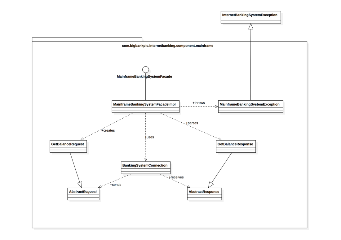
The most fine grained diagram, aimed at describing the code structure inside a component. For this level, we use an UML diagram with class level artefacts.
To know more about it, you can read Simon Brown’s own explanations about it here and here, or even watch him talk about it here.
I think the C4 Model is a great way to document applications architecture, it is great to understand the architecture of the application to a certain level, but I still find it insufficient, although it took me some time to put my finger in what is missing.
<iframe frameborder="0" scrolling="no" width="300" height="250" style="width: 300px; max-width: 100%; border: none; margin: 0px; overflow: hidden; height: 250px;"></iframe>REPORT THIS AD
<iframe frameborder="0" scrolling="no" width="300" height="250" style="width: 300px; max-width: 100%; border: none; margin: 0px; overflow: hidden; height: 250px;"></iframe>REPORT THIS AD
There are three limitations I see in these diagrams:
I have found two categories of diagrams that can help us with that.
The dependency diagrams are useful to tell us about the dependencies that exist in the different types of code in our codebase.
Crucially important here is that these diagrams be automatically generated directly from the code, otherwise the diagram will reflect only what we think the code looks like, and if that was accurate we wouldn’t really have much need this type documentation.
Furthermore, maybe more important than the diagrams themselves is the ability to use these dependencies analysis to stop a build in the case of a break in our predefined dependency rules. So, the tool used to generate these diagrams should also be usable as a testing tool and included in our CI pipeline, just like unit tests are, preventing unwanted dependencies to reach production, which maintains and enforces modularity, which in turn helps reach high changeability rate and therefore high velocity of feature development.
Within this category of diagram, I find it useful to have 3 different types of diagram, to assert about different dependency types.
In the case of the examples I have below, they were all generated by deptrac for my pet project (explicit-architecture-php), which I use for experimenting. You can find the configuration used to generate them in the repository root.
Do note, however, that I added the colours myself as to make it easier to read in this blog post. The colours represent different layers in the application, in accordance with the layers I wrote about in previous blog posts:

REPORT THIS AD
<iframe src="https://c0.pubmine.com/sf/0.0.1/html/safeframe.html" id="safeframe-sf-inline-ad-6-compound-1" frameborder="no" scrolling="no" allowtranparency="true" hidefocus="true" tabindex="-1" marginwidth="0" marginheight="0" style="width: 300px; max-width: 100%; display: block; height: 250px; left: 0px; position: absolute; top: 0px; visibility: inherit; z-index: 0;"></iframe>REPORT THIS AD
The intention of this diagram is to visualize and make sure that the code in each layer can only depend on the layers inner or below it.
So, in the diagram below we can see, for example, that the Infrastructure layer, being one of the top outer layers, can depend on any other layer. On the other hand, the Domain layer, being the top center layer, can only depend on the layers below, namely the SharedKernel-Domain (which is part of the Domain as well) and the PhpExtension (whose code is used as if it was part of the language itself).
 Layer dependencies diagram generated by deptrac for https://github.com/hgraca/explicit-architecture-php
The Layer dependency diagram analyses the dependencies between layers, but within a layer there are still dependencies that must not occur.
The Class dependency diagram is useful to analyse the dependencies between the different types of class we have in our codebase, specially if they are in the same layer.
For example, if we want our events to be serializable, so that we can put them in a queue, we probably don’t want them to contain an entity because it would be problematic to unserialize it and persist it using an ORM. It would also not make sense for an event to depend on a service. With this type of diagram, or more accurately with the tool to test dependencies, we can easily detect such cases and prevent them from reaching production.
 Class dependencies diagram generated by deptrac for https://github.com/hgraca/explicit-architecture-php
REPORT THIS AD
A component is a domain wise module, a module that contains both Application and Domain layers. A component can be, for example, “Billing” containing all its use cases and Domain logic.
Components can be mapped to DDD bounded contexts and/or Microservices, which means they must be completely decoupled, physically and temporally, from other components. If we have a monolithic application with fully decoupled components, it will be fairly easy (code wise) to transform it into a Microservice Architecture.
Furthermore, applying the same decoupling requirements to the other non domain wise modules, we can guarantee that we can easily replace any module.
The Component dependencies diagram is aimed at making sure that the application components and modules are decoupled.
Note, in the diagram below, how the modules in the same layer (nodes with the same colour) are all unaware of each other, at least directly.
Specially important is that the two components (User and Blog, in mid-blue colour) are decoupled. If this application had a Microservices Architecture, these two components would be the microservices.
 Component dependencies diagram generated by deptrac for https://github.com/hgraca/explicit-architecture-php
About a year ago, I realised something else I was also missing in these documentation options: All these diagrams, they tell us what are the building blocks of the application, which blocks interact with each other and how they are related, but they don’t tell us what they do**, nor** how and when they interact with each other. For that we need to either know the application very well from the user perspective, or the codebase from the developer perspective. The previous diagrams don’t tell us what use cases we have in the application, nor what events are triggered by what use cases, nor what are the consequences of those events. If we show those diagrams to a Product Owner, he will find them mostly useless for his role.
So I came up with an idea for a new documentation diagram, which I call an Application Map, that can replace the C4 Model Component diagram.
The Application Map is aimed at being truly a map of the application, defining its “cities” (Components), its “local roads” (use cases), “highways” (events), etc.
The difference between modules and components is that a module is any modular piece of the application, while a component is a domain wise module of the application. So, while an ORM is a module of the application, it is not a component because it only deals with technical concerns. On the other hand, a “Billing” module is a component because it deals with domain concerns.
<iframe src="https://c0.pubmine.com/sf/0.0.1/html/safeframe.html" id="safeframe-sf-inline-ad-8" frameborder="no" scrolling="no" allowtranparency="true" hidefocus="true" tabindex="-1" marginwidth="0" marginheight="0" style="width: 728px; max-width: 100%; display: block; height: 90px; left: 0px; position: absolute; top: 0px; visibility: inherit; z-index: 0;"></iframe>REPORT THIS AD
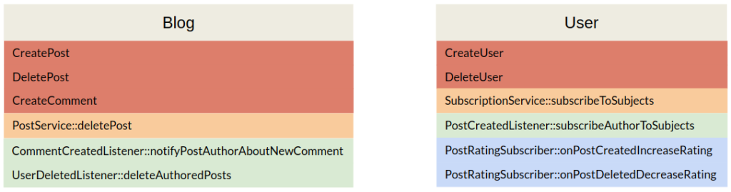
An Application Map starts by defining the components of the application, the domain wise modules, like “Billing”, “User”, “Company”, “Orders”, “Products”, and so on. In the case of a simple blog application, we could have two components, the “User” and the “Blog” components:

In each of those components, we define what are the commands that can be issued to them. The “User” component can create and delete users, while the “Blog” component can create and delete posts, and create comments to a post.

Next, in each component, we list any relevant services. These services are relevant because, for example, they trigger an event or are used directly by another component. This is important because the application map should make visible the connections between components as well as what they mean and any followup side effects, and for this we need to expose the services that wiring to other components and their names (which should express what they do).

Following the services, we list all the event listeners in each component, even if they are not actually used, which is handy because then we can detect it and either fix whatever needs to be fixed or remove the unused code.
By listener I mean a class whose public methods are all independently triggered by only one type of event, they focus on the event.

We will also list the event subscribers in each component, for exactly the same reasons as we list the listeners.
An event subscriber is similar to an event listener, except that its public methods are triggered by different events, they focus on a composite task, an example of a subscriber can be a class listening to different framework events in order to control when to start, commit or rollback the Request transaction.
At this point, we have all the components and their capabilities in the map. This is very valuable because it tells us, or any non technical person, what each component can do.
<iframe frameborder="0" scrolling="no" width="728" height="90" style="width: 728px; max-width: 100%; border: none; margin: 0px; overflow: hidden; height: 90px;"></iframe>REPORT THIS AD
However, it still doesn’t tell us how all these capabilities relate to each other, for example “what happens as a consequence of a user creating a blog post?”.
In order to achieve that, the first step is to list what happens in a component when a specific capability is triggered.
In the image below, we can see that deleting a post (“DeletePost”) will trigger the deletePost() method in the PostService, which is also triggered by a listener listening to the event that notifies that a user has been deleted. This tells us that our application deletes posts as a result of either a direct command from a user or when a post author has been deleted.
In the User component, we can see that when a post is created, its author is automatically subscribed to that post subjects (tags).

Now we have the information about the flow within a component, but we are still lacking the information about cross component flow, so lets add the events being triggered and listened to:
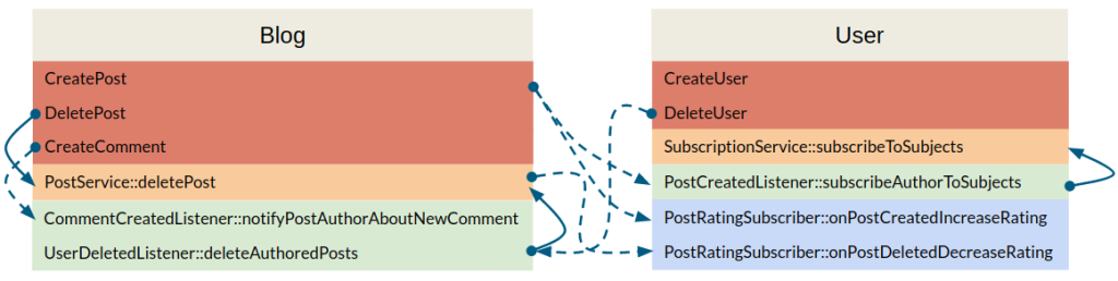
We can see, for example, that:
With all this information in our map, we can navigate it. Any technical or non-technical person can clearly visualise what happens when any of the use cases of the application is triggered. This can help us clarify our code, and our idea of the application behaviour.
But, when used in a big application, this diagram will still have problems common to the previously mentioned diagrams:
To solve the first problem, we need to be able to generate the diagram from the code, on-demand. This will make it effortless to create such a diagram, remove the need for maintaining it, and make it virtually immediate to create it.
To solve the second problem, we need to be able to selectively generate only part of the diagram. For example by providing the name of the use case that we want to analyse, which would result in only generating the sections of the diagram that somehow are related to the given use case.
So we need a tool… which does not exist… yet!
Or does it?! 
Some time ago I started creating it, and I got to the point where only the component internal flow is missing, but it lists all the commands, services, listeners, subscribers and events. It is still very alpha because of the missing information, but also because it is not flexible when it comes to the code base it needs to analyse but, from the codebase of the company where I currently work at, it can generate something like this:
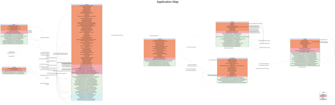 Example of an (incomplete) application map, as generated by https://gitlab.com/hgraca/app-mapper
If you are curious about the project, you can check it out here, however be advised that it is still very alpha, its just a proof of concept and I haven’t worked on it for a few months already. If you feel it’s a worthy project and you have free time to contribute, let me know and I will try get you up to speed and create tasks that you can pick up to bring it to the next level、