# v-calendar
**Repository Path**: yeomanli/v-calendar
## Basic Information
- **Project Name**: v-calendar
- **Description**: A lightweight, dependency-free plugin for building attributed calendars in Vue.js
- **Primary Language**: Unknown
- **License**: MIT
- **Default Branch**: master
- **Homepage**: None
- **GVP Project**: No
## Statistics
- **Stars**: 0
- **Forks**: 0
- **Created**: 2020-02-02
- **Last Updated**: 2020-12-18
## Categories & Tags
**Categories**: Uncategorized
**Tags**: None
## README
# Welcome to V-Calendar
V-Calendar is a clean and lightweight plugin for displaying simple, attributed calendars in Vue.js. It uses attributes to decorate the calendar with various visual indicators including highlighted date regions, dots, bars, content styles and popovers for simple tooltips and even custom slot content.
Any single attribute may contain one of each object and can be displayed for single dates, date ranges and even complex date patterns like every other Friday, the 15th of every month or the last Friday of every other month.
It has date picker support out of the box with single date, multiple date and date range selection modes. Because `v-date-picker` is simply a wrapper for `v-calendar`, both can be extensively customized using props, slots and theme styling, just like `v-calendar`. And of course, V-Calendar is responsive and mobile friendly. For example, it supports touch swipes for month navigation.
## Calendar
`v-calendar` is the core component. By default, it has a neutral design that should blend nicely within any web application, with various options for configuring the basic layout:
* Single or double paned
* Can be expanded to fill the width of its container
* Header title can be left, right or center-aligned
* Slot support for custom header and header subcomponents
* Navigation transitions (horizontal slide, vertical slide, fade)
Along with the calendar panes, `v-calendar` employs a semantic-inspired navigation pane when the header title is hovered or focused by the user.
### Attributes
Attributes are the most important concept to understand. They provide a powerful way to communicate visual information to your users quickly and effectively. Fortunately, they are also easy to specify.
#### What to display
The first thing to understand about attributes is what they are capable of displaying.
* Highlights
* Dot Indicators
* Bar Indicators
* Popovers
* Content Styles
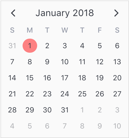
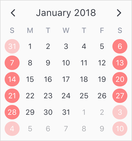
For now, let's just start by displaying a simple highlight on today's date.
```html
```
```javascript
export default {
data() {
return {
attrs: [
{
key: 'today',
highlight: {
backgroundColor: '#ff8080',
// Other properties are available too, like `height` & `borderRadius`
},
dates: new Date(2018, 0, 1)
}
],
};
},
};
```
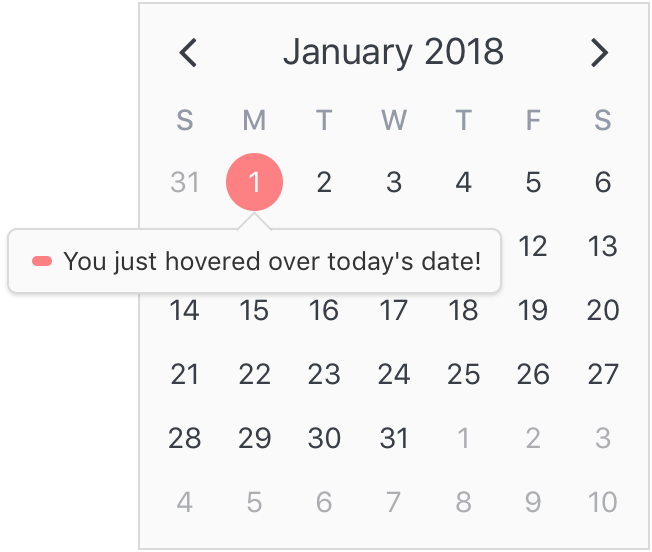
To add some contrast to the highlighted date, we can use a content style, which is simply a style object that gets applied to the day content text.
```javascript
export default {
data() {
return {
attrs: [
{
key: 'today',
highlight: {
backgroundColor: '#ff8080',
},
// Just use a normal style
contentStyle: {
color: '#fafafa',
},
dates: new Date(2018, 0, 1)
},
],
};
},
};
```
Finally, let's see how simple it is to add a popover label (or tooltip) to the calendar when this highlight is hovered over. To do that, we just need to add a popover section to our attribute.
```javascript
export default {
data() {
return {
attrs: [
{
key: 'today',
dates: new Date(2018, 0, 1),
highlight: {
backgroundColor: '#ff8080',
},
// Just use a normal style
contentStyle: {
color: '#fafafa',
},
// Our new popover here
popover: {
label: 'You just hovered over today\'s date!',
}
},
],
};
},
};
```
#### Where to display
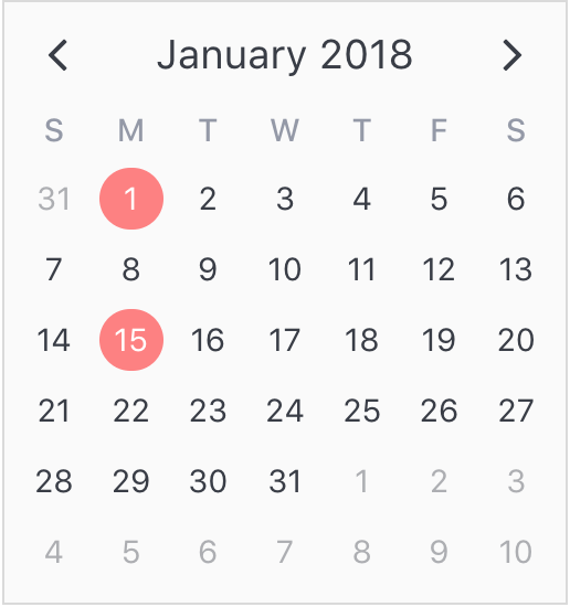
The second aspect of attributes is specifying where to display them. In the previous example, we saw that all we had to do was use a simple date object assigned to the `dates` property. Note that we aren't limited to using single date or date range objects. We can also use an array of dates.
```javascript
...
dates: [ new Date(2018, 0, 1), new Date(2018, 0, 15) ]
...
```
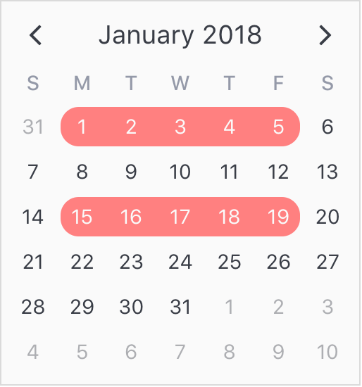
Or date ranges...
```javscript
...
dates: [
{ start: new Date(2018, 0, 1), end: new Date(2018, 0, 5) },
{ start: new Date(2018, 0, 15), span: 5 } // Span is number of days
]
...
```
Or date patterns.
```javascript
...
dates: { weekdays: [1, 7] } // On the weekends
...
```
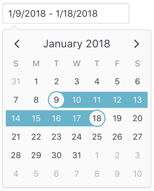
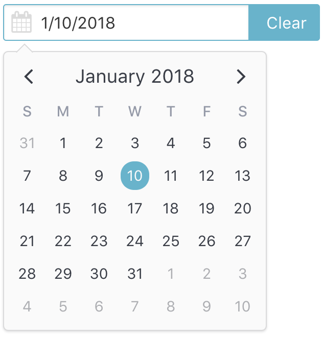
## Date Picker
The `v-date-picker` component is a flexible date picker component wrapper around `v-calendar`, which means it supports all props and events that `v-calendar` does. Using the `mode` prop, it is capable of 3 selection modes:
* Single dates
* Multiple dates
* Date ranges
Date pickers can be displayed inline or as a popover for an input element which can be classed or styled.
```html
```
```javascript
export default {
data() {
return {
selectedDate: {
start: new Date(2018, 0, 9),
end: new Date(2018, 0, 18)
}
};
},
};
```
Also, a custom slot element can be used to display your own input element. This example uses [Buefy](https://buefy.github.io) for a custom styled input component.
```html
You can disable dates, date ranges and date patterns using the following props:
* Explicitly via `min-date` or `max-date`
```html
```
* Explicitly via `disabled-dates` (still works with `min-date` or `max-date`).
```html
```
* Implicitly via `available-dates`. Any dates not included in `available-dates` are disabled.
```html
```
## Formatting & Parsing
Dates are formatted and/or parsed for the following component sections:
| Component(s) | Target Area | Default Format |
| ------------ | ----------- | -------------- |
| `v-calendar` `v-date-picker` | Calendar header title | *MMMM YYYY* |
| `v-calendar` `v-date-picker` | Weekday headers | *W* |
| `v-calendar` `v-date-picker` | Month labels in navigation dropdown | *MMM* |
| `v-date-picker` | Input element when `is-inline === false` | *L* |
| `v-date-picker` | Day popover when user hovers selected date | *WWW, MMM D, YYYY* |
By default, `v-calendar` uses Javascript's Internalization API ([which is increasingly well supported](https://caniuse.com/#search=Intl)) to derive the month and weekday names for the user's locale. This helps keep the package size to a minimum while utilizing an API that should only improve with time. It also uses the most appropriate long date format (`L`) for that locale (derived from [moment.js](https://github.com/moment/moment/tree/develop/src/locale)).
To use your own custom formats, configure and pass the `formats` object
* As a prop to `v-calendar` or `v-date-picker`
```html
```
```javascript
export default {
data() {
return {
myDate: null,
formats: {
title: 'MMMM YYYY',
weekdays: 'W',
navMonths: 'MMM',
input: ['L', 'YYYY-MM-DD', 'YYYY/MM/DD'], // Only for `v-date-picker`
dayPopover: 'L', // Only for `v-date-picker`
}
}
}
}
```
* As a default when using VCalendar
```javascript
import Vue from 'vue'
import VCalendar from 'v-calendar'
Vue.use(VCalendar, {
formats: {
title: 'MMMM YYYY',
weekdays: 'W',
navMonths: 'MMM',
input: ['L', 'YYYY-MM-DD', 'YYYY/MM/DD'],
dayPopover: 'L',
}
})
```
### Parsing dates for input element
You'll notice an array was used to specify the formats for `v-date-picker`'s input element. This is because it uses the supplied format(s) to parse, as well as display, the selected date. The first supplied format is used to display the date selection, while all formats can be used to parse the date string. The first successfully parsed date is used as the selected date. This provides more flexibility for the user when manually typing in dates.
By default, `v-date-picker` will first try and use the localized long date format to parse the date, but will also try to parse formats that are globally unambiguous (*YYYY-MM-DD* and *YYYY/MM/DD*). Furthermore, because `v-date-picker` uses its own parsing logic ([rather than relying on the browser's inconsistent `Date.parse` function]()), it can properly parse ISO-8601 dates to the user's local time zone instead of converting to UTC. If you plan on targeting browsers from multiple locales, it is probably best to defer to the default format settings.
### Format Tokens
Use the following tokens to configure your custom formats:
| Category | Token | Output |
| -------- | ----- | ------ |
| **Month** | `M` | 1, 2, ..., 12 |
| | `MM` | 01, 02, ..., 12 |
| | `MMM` | Jan, Feb, ..., Dec |
| | `MMMM` | January, February, ..., December |
| **Day of Month** | `D` | 1, 2, ..., 31 |
| | `DD` | 01, 02, ..., 31 |
| | `Do` | 1st, 2nd, ..., 31st |
| **Day of Week** | `d` | 1, 2, ..., 7 |
| | `d` | 1, 2, ..., 7 |
| | `dd` | 01, 02, ..., 07 |
| | `W` | S, M, ..., S |
| | `WW` | Su, Mo, ..., Sa |
| | `WWW` | Sun, Mon, ..., Sat |
| | `WWWW` | Sunday, Monday, ..., Saturday |
| **Year** | `YY` | 70, 71, ... 69 |
| | `YYYY` | 1970, 1971, ..., 2069 |
| **Long Date** | `L` | 01/21/1983 (en-US), 21/01/1983 (en-GB), ..., 1983/01/21 (*civilized*) |
---
## I19n
VCalendar utilizes the [well supported](https://caniuse.com/#feat=internationalization) Internationalization API to derive month and weekday names and formatting. This helps keep the package size down, as well as supporting multiple locales in the most performant and isomorphic way.
At the moment, this API still cannot provide all recommended default settings per locale (such as 'first day of the week'), so those settings are provided out of the box for a reasonable number of locales, with a decent fallback for those locales that aren't included.
With all of this in mind, it is probably best that you rely on the the plugin's built-in methods for detecting the user's locale. However, if you would like to force a specific locale for all users, you may supply your own [default locale](#custom-defaults) using the [*language-region*](https://lingohub.com/documentation/developers/supported-locales/language-designators-with-regions/) format.
---
# Installation
[Vue.js](https://vuejs.org) version 2.5+ is required.
### 1 Install via npm
```bash
npm install v-calendar
```
### 2 Import and use VCalendar
#### 2A. Plugin Method (**Recommended**)
This is the most common use case.
```javascript
import Vue from 'vue';
import VCalendar from 'v-calendar';
// Use v-calendar, v-date-picker & v-popover components
Vue.use(VCalendar, {
firstDayOfWeek: 2, // Monday
..., // ...other defaults
});
```
#### 2B. Components Method
Or, you can just import and use the calendar if you don't need the `v-date-picker` or `v-popover` components. Keep in mind that `setupCalendar` still needs to be called (passing optional defaults) using this method.
```javascript
import Vue from 'vue';
import { setupCalendar, Calendar} from 'v-calendar'
import 'v-calendar/lib/v-calendar.min.css';
// Remember to setup calendar (passing in defaults if needed)
setupCalendar({
firstDayOfWeek: 2, // Monday,
..., // ...other defaults
});
// Register component(s)
Vue.component('v-calendar', Calendar);
```
### 3 Reference in your component templates
```html
```
```javascript
```
### Or use a CDN
```html
```
### Polyfill
`v-calendar` is transpiled for ES5, but it still needs a polyfill for `Array.prototype.find` (<= IE11) or even `Intl` (Javascript's internationalization object, <= IE10) if you wish to target older browsers. Two options for accomplishing this are:
1. **Easy way:**
Insert the following script into your html before loading `v-calendar`. The polyfill will get loaded automatically *only if* the browser needs it.
``
2. In Node/Browserify/Webpack environments, use [babel-polyfill](https://babeljs.io/docs/usage/polyfill/) to insert the polyfill for you.
## Custom Defaults
Custom defaults can be provided on initialization. Note that almost all of these defaults can be overridden by props on `v-calendar` or `v-date-picker` components.
```javascript
Vue.use(VCalendar, {
firstDayOfWeek: 2, // Set first day of week to Monday
...
})
```
| Property Name | Type | Description | Default |
| ------------- | ---- | ----------- | ------- |
| `locale` | String | Locale identification in [*language-region*](https://lingohub.com/documentation/developers/supported-locales/language-designators-with-regions/) format. Not all regions supported. | `undefined` |
| `componentPrefix` | String | Custom prefix to use for plugin components. Replace if `v-calendar` and `v-date-picker` interfere with other component libraries. | `"v"` |
| `firstDayOfWeek` | Number | Day number for the first day of the week (1: Sun - 7: Sat) | `1` |
| `formats` | Object | Formats to use when display and parsing dates for various calendar sections | Reference code |
| `navVisibility` | String | Visibility state for calendar navigation panel (`"focus"`, `"hover"`, `"visible"`, `"hidden"`) | `"focus"` |
| `titlePosition` | String | Position of the title in the header (`"left"`, `"center"`, `"right"`) | `"center"` |
| `titleTransition` | String | Transition type for title when navigating to a new page (`"slide-h"`, `"slide-v"`, `"fade"`, `"none"`) | `"slide-h"` |
| `weeksTransition` | String | Transition type for weeks when navigating to a new page (`"slide-h"`, `"slide-v"`, `"fade"`, `"none"`) | `"slide-h"` |
| `paneWidth` | Number | Width of a single pane, in pixels. | `256` |
| `showLinkedButtons` | Boolean | When calendar `is-linked` and `!is-vertical`, show the inner header navigation buttons that are usually hidden. |
| `datePickerTintColor` | String | Background color of the selected and dragged highlighted regions (`opacity: 0.5` for dragged). This setting is overridden by `select-attribute` and `drag-attribute` if specified. | `"#66B3CC"` |
| `datePickerShowCaps` | Boolean | Show caps and the end of the highlighted and dragged regions when `mode === "range"` | `false` |
| `datePickerShowDayPopover` | Boolean | Show popover for dragged and selected regions | `true` |
| `popoverExpanded` | Boolean | Popover wrapper for input or slot is expanded to the full width of its container. | `false` |
| `popoverDirection` | String | Direction that popover displays relative to input or slot element (`"bottom"`, `"top"`, `"left"`, `"right"`) | `"bottom"` |
| `popoverAlign` | String | How the popover is aligned relative to input or slot element (`"left"`, `"right"`, `"top"`, `"bottom"'`) | `"left"` |
| `popoverVisibility` | String | Visibility state of the popover (`"hover"`, `"focus"`, `"hidden"`, `"visible"`) | `"hover"` |
| `popoverContentOffset` | String | Distance that the popover content is offset from the input or slot element | `"10px` |
| `popoverKeepVisibleOnInput` | Boolean | Keep the popover visible after a valid input has been selected | `false` |
| `maxSwipeTime` | Number | Maximum time in milliseconds allowed for a swipe gesture to complete | `300` |
| `minHorizontalSwipeDistance` | Number | Minimum distance in pixels allowed for a horizontal swipe gesture | `60` |
| `maxVerticalSwipeDistance` | Number | Maximum distance in pixels allowed for a horizontal swipe gesture | `80` |
| `maxTapTolerance` | Number | Maximum distance in pixels allowed for a tap between `touchstart` and `touchend` events | `0` |
| `maxTapDuration` | Number | Maximum time in milliseconds allowed for a tap between `touchstart` and `touchend` events | `200` |