


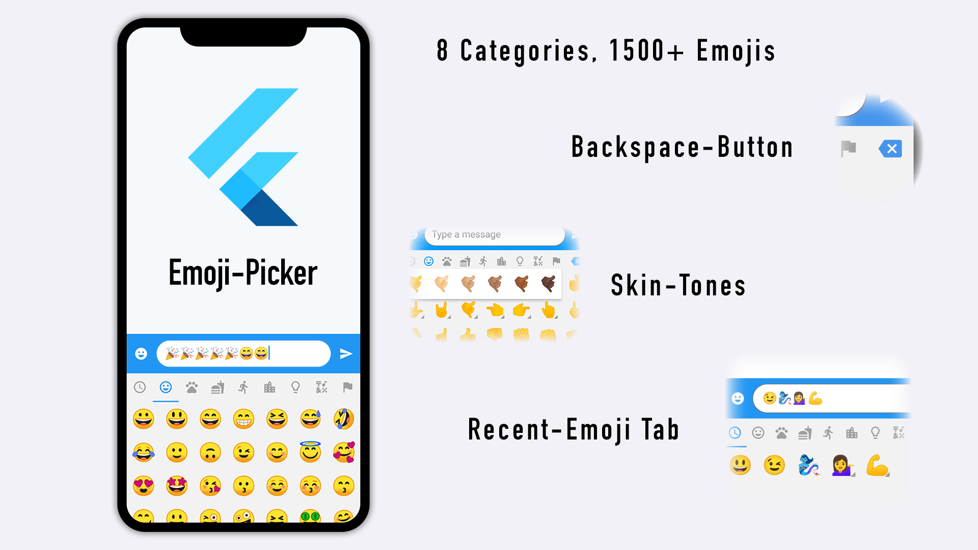
 ## Key features
- Lightweight Package
- Faster Loading
- Null-safety
- Completely customizable
- Material Design and Cupertino mode
- Emojis that cannot be displayed are filtered out (Android Only)
- Optional recently used emoji tab
- Skin Tone Support
- Custom-Font Support
## Getting Started
```dart
import 'package:flutter/foundation.dart' as foundation;
EmojiPicker(
onEmojiSelected: (Category category, Emoji emoji) {
// Do something when emoji is tapped (optional)
},
onBackspacePressed: () {
// Do something when the user taps the backspace button (optional)
// Set it to null to hide the Backspace-Button
},
textEditingController: textEditingController, // pass here the same [TextEditingController] that is connected to your input field, usually a [TextFormField]
config: Config(
columns: 7,
emojiSizeMax: 32 * (foundation.defaultTargetPlatform == TargetPlatform.iOS ? 1.30 : 1.0), // Issue: https://github.com/flutter/flutter/issues/28894
verticalSpacing: 0,
horizontalSpacing: 0,
gridPadding: EdgeInsets.zero,
initCategory: Category.RECENT,
bgColor: Color(0xFFF2F2F2),
indicatorColor: Colors.blue,
iconColor: Colors.grey,
iconColorSelected: Colors.blue,
backspaceColor: Colors.blue,
skinToneDialogBgColor: Colors.white,
skinToneIndicatorColor: Colors.grey,
enableSkinTones: true,
recentTabBehavior: RecentTabBehavior.RECENT,
recentsLimit: 28,
noRecents: const Text(
'No Recents',
style: TextStyle(fontSize: 20, color: Colors.black26),
textAlign: TextAlign.center,
), // Needs to be const Widget
loadingIndicator: const SizedBox.shrink(), // Needs to be const Widget
tabIndicatorAnimDuration: kTabScrollDuration,
categoryIcons: const CategoryIcons(),
buttonMode: ButtonMode.MATERIAL,
),
)
```
See the [demo](https://github.com/Fintasys/emoji_picker_flutter/blob/master/example/lib/main.dart) for more detailed sample project.
## Config
| property | description | default |
| --------------- | ------------------------------------------------------------------ |------------|
| columns | Number of emojis per row |7 |
| emojiSizeMax | Width and height the emoji will be maximal displayed |32.0 |
| verticalSpacing | Vertical spacing between emojis | 0 |
| horizontalSpacing | Horizontal spacing between emojis | 0 |
| gridPadding | The padding of GridView | EdgeInsets.zero |
| initCategory | The initial Category that will be selected |Category.RECENT |
| bgColor | The background color of the Widget |Color(0xFFF2F2F2) |
| indicatorColor | The color of the category indicator | Colors.blue |
| iconColor | The color of the category icons | Colors.grey |
| iconColorSelected | The color of the category icon when selected | Colors.blue |
| backspaceColor | The color of the backspace icon button | Colors.blue |
| skinToneDialogBgColor | The background color of the skin tone dialog | Colors.white |
| skinToneIndicatorColor | Color of the small triangle next to multiple skin tone emoji | Colors.grey |
| enableSkinTones | Enable feature to select a skin tone of certain emoji's | true |
| recentTabBehavior | Show extra tab with recently / popular used emoji | RecentTabBehavior.RECENT |
| recentsLimit | Limit of recently used emoji that will be saved | 28 |
| replaceEmojiOnLimitExceed | Replace latest emoji on recents list on limit exceed | false
| noRecents | A widget (usually [Text]) to be displayed if no recent emojis to display. Needs to be `const` Widget! | Text('No Recents', style: TextStyle(fontSize: 20, color: Colors.black26), textAlign: TextAlign.center) |
| loadingIndicator | A widget to display while emoji picker is initializing. Needs to be `const` Widget! | SizedBox.shrink() |
| tabIndicatorAnimDuration | Duration of tab indicator to animate to next category | Duration(milliseconds: 300) |
| categoryIcons | Determines the icon to display for each Category. You can change icons by setting them in the constructor. | CategoryIcons() |
| buttonMode | Choose between Material and Cupertino button style | ButtonMode.MATERIAL |
| checkPlatformCompatibility | Whether to filter out glyphs that platform cannot render with the default font (Android). | true |
| emojiSet | Custom emoji set, can be built based on `defaultEmojiSet` provided by the library. | null |
| emojiTextStyle | Text style to apply to individual emoji icons. Can be used to define custom emoji font either with GoogleFonts library or bundled with the app. | null |
## Backspace-Button
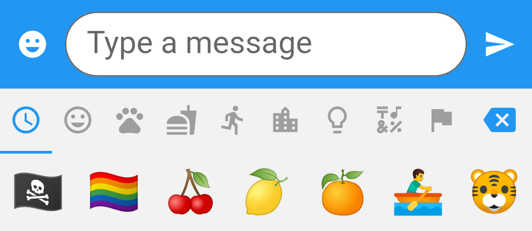
You can add a Backspace-Button to the end category list by adding the callback method `onBackspacePressed: () { }` to the EmojiPicker-Widget. This will make it easier for your user to remove an added Emoji without showing the keyboard. Check out the example for more details about usage. Set it to null to hide the Backspace-Button.
 ## Custom view
The appearance is completely customizable by setting `customWidget` property. If properties in Config are not enough you can inherit from `EmojiPickerBuilder` (recommended but not necessary) to make further adjustments.
```dart
class CustomView extends EmojiPickerBuilder {
CustomView(Config config, EmojiViewState state) : super(config, state);
@override
_CustomViewState createState() => _CustomViewState();
}
class _CustomViewState extends State